Wednesday, April 1, 2015

Social Movement Tactics--Integrating Symbols for Mutual Benefit

I had a recent unfortunate Facebook encounter. I posted the image above, and an interlocutor argued that the function of the image was to "erase" the Black civil rights movement by the "co-opting" of the iconic imagery of segregated water fountains by the LGBTQ movement. The catalyst for the image was the March passage of the Indiana's version of the Religious Freedom Restoration Act, causing a tidal wave of opposition nationwide, and is rightly seen primarily as a counter-offensive against the increase in LGBTQ rights, including a recent federal court decision striking down Indiana's attempt to enforce anti-gay marriage law. I have seen similar arguments appear based on individuals using other Black civil rights symbols in the current series of protests against Indiana's RFRA law. Language such as "co-opting," "dilution" and "erasing" of the symbols of racial injustice are being deployed to prevent LGBTQ activists from using any such imagery. Granted, I believe that such a practice has occurred in the wake of the Ferguson, "Black Lives Matter" slogan, when its counterpart, "All Lives Matter" became a point of controversy.

The issue in that case seems to be based on the false narrative of "reverse racism." This idea relies on an overly-simplistic understanding of the concept of "racism," which presumes that any type of discrimination or prejudice by one "race" or ethnic group against another can be called "racism." However, racism is neither a behavior, nor a belief/opinion--it is a systemic pattern of oppression built on unequal social power relations. While this blog post is not the place to argue that complex case, and while it is true that members of any race can have prejudices about another, and can discriminate against another, there is no such thing as "reverse racism," nor is there such a thing as "Black against White racism," specifically because of the fundamental structural inequalities between Blacks and Whites in the United States. Racism is about broad structural power, not individual acts.

So when the "Black Lives Matter" language was altered to "All Lives Matter," I believe that activists rightly argued that this represents an erasing of the importance of the race component of the broad social problem that started the "Black Lives Matter" movement. Given that the "Black Lives Matter" slogan was 1) new, so did not have the culturally iconic nature of symbols from the 1950s civil rights movements, such as the image of the segregated water fountains; and 2) that the revised slogan failed to link to any oppressed group or specific incident of injustice, I believe the opposition to "All Lives Matter" was justified. In that sense, "dilution" and "erasure" seem like an appropriate description. While it's certainly true that "All Lives Matter," movement success depends on the ability to highlight specific repression and motivate target groups. The revised slogan seems, at best, to merge all social problems into an abstraction, and at worst, tries to argue that, "sure, Black people get harassed by police, but so do White people, and you don't see us whining about it." That argument, ubiquitous among those who enjoy, but fail to identify, White privilege, fails to recognize the profound and specific disenfranchisement of race minorities in the US, and rightly needs to be vigorously confronted and rebutted.

I don't know where the specific image above came from--it seems to be a recent design. I can only track it back to a Facebook page from March 26, 2015. A similar image from 2010 points back to the 2008 California Proposition 8 campaign to prevent gay marriage in that state. However, the process of integrating movement symbology is not new. For example, the Black Power movement's primary symbol of the raised fist, which we see used at the 1968 Olympics by Tommy Smith and John Carlos, and other Black Power motifs of the 1960s-1970s, draws from a long history of "raised fist" imagery.

It more widely represents movements of mass solidarity against repressive states. For example, the following images are from the early 1900s, for the Russian Communist party, a 1917 union poster, and the cover of a 1948 Mexican resistance magazine. The Black Power movement's utilization of this early imagery I would argue, neither functions to, nor is intended to, "dilute" or "erase" the prior movements that had used these symbols, but rather, to pay homage to the fact that the movements are sharing in similar repression, and thus functions to link into the broader social consciousness and reinforce the connections between the movements.

Within social movements theory, a widely recognized phenomenon is the "protest cycle," where several movements often arise in tandem with each other, often preceded by the creation of a salient "master frame." For example, in the mid-late 1800s, Black civil rights gained significant ground during the Reconstruction Era, only to get quickly submerged and largely rolled back. The first wave feminist movement had much success in the late 1800s-early 1900s, then seemed to disappear. In the 1950s, the Black civil rights movement was revived, and the inclusion of university students into the movement, plus other explicit strategies to link it to other groups, broadened the movement into a national force, and created much broader and long-lasting effects than had the previous, and isolated movements. A broad anti-nuclear weapons and peace movement had been simmering in response to WWII, the Korean War, and the Cold War. Martin Luther King, Jr. was successfully able to connect those movements, largely White, middle class, together in a broader discussion about minority repression in the US, as is evidenced by his focus on non-violent actions in the protests he organized. This linked his movement constituency and goals to much wider groups than had been previously incorporated.

Specifically, the master frame that developed within this cultural milieu was rooted in the idea of civil rights and justice for all people, and was able to link many movements together--peace movements argued true peace requires social equality and justice; environmental movements argued that civil rights included a sustainable set of public policies that created livable spaces for all people; clearly, women and sexual minorities were able to draw from this frame to understand their own treatment by society, and join the broader movement for rights; similarly, class disenfranchisement can be understood as a basic civil rights-type issue of being treated with equality. When these varied groups were able to see each of their forms of repression under a common rubric, or 'frame,' then they were able to more effectively share experiences, leadership and tactics to resist, to protest, and to work together for broader social change. This synergy helped to produce the decade of mass protests in the 1960s, a 'protest cycle.'

Rather than "diluting" or "erasing" each other, these varied movements were able to create a larger mass movement by sharing their symbols, integrating them, and working together. The image at the top of the page is unmistakably a reference to the iconic image of the 1950s segregated water fountains, and the Black civil rights struggle that went into remediating the "separate but equal" fallacy. In a similar way, the Indiana RFRA creates the fallacy that all people will be treated equally, even though certain groups of people may be relegated to separate facilities of public accommodation, if one of those facilities is operated by a private individual who is offended by members of specific social groups. While it is claimed that current law prohibits discrimination based on race, so purportedly, even a religious objection to interracial marriage would not allow a restaurant to restrict access to an interracial couple (this is a disputed contention), no such protections exist for sexual minorities, so such groups, or any other non-protected classes of people, could legally be excluded from facilities of public accommodations--i.e., privately owned businesses which serve the public.

The historic image of the segregated water fountain overlaid with LGBTQ symbolism, points to the connections between these movements that were recognized at least as far as the 1960s. The linkage reminds the audience of the racist history of the United States, especially in the context of the current upsurge in recognition of continued race minority disenfranchisement in the wake of the Black Lives Matter movement. That reminder sensitizes the audience to that movement, while also raising the spectre of a revisitation of the past, both for the potential implications of this law for LGBTQ individuals, as well as any other minority group, including race minorities. I would argue, therefore, that, while there are ways that the majority can dilute and erase the power of minority resistance to oppression, such as the "All Lives Matter" counter-campaign, there are also powerful ways that movements can link arms together to support each other, show their solidarity with each other, and therefore benefit from each other's power. The segregated water fountain graphic above, from my perspective, works toward the goal of solidarity by connecting, in the popular consciousness, the same master frame of civil rights that unites all oppressed groups, and broad social repression that they face.

Wednesday, March 18, 2015

Campaign Finances: City-County Council Elections, 2015 (Update to yesterday's post)

Yesterday I posted an analysis of prior votes in the Indianapolis city-county council (CCC) elections, to make predictions about this November's election. Those predictions were based solely on prior voting estimates from the 2011 CCC election (the boundaries have since changed, so only an estimate is available), and the 2014 state elections (updated boundaries are applicable). In a sociology textbook from which I used to teach, the author quoted a common political science dictum, that the candidate who gets the most contribution money, wins 90% of the time. A recent analysis at the federal level, indicates that in the 2012 election, "94 percent of biggest House race spenders won," and "82 percent of biggest Senate race spenders won."

I don't know how that translates to local elections. In our case (Indianapolis), based on city published financial records of city-council filers as of 3/12/2015, of those who have filed reports, those with the largest war chests are likely to win anyway, either being an incumbent, the only filer in the race, or already having a wide historical voting margin. In that sense, the financial data as of mid-March doesn't give us much new information.

Below, I provide two tables of the same information, both of the major party candidate filers (the deadline has passed, so this is the final list, unless independents, or minor party candidates file)--the table on the left is sorted by contribution amount, and the table on the right is sorted by district. In both tables, I have highlighted the district in red if Republicans seem likely (or assured, by virtue of being the only candidate) to win the seat, blue if a Democrat is likely (or assured) to win the seat, and green if prior voting history does not give me confidence to predict the race--there are three districts in that category: 2, 3 & 21. Of those, only district 3 has candidates with more than $1,000 in contributions so far reported, and there are two incumbents running (Hickman and Scales). Historically, district 3 has voted largely Republican, and combined, the current 2 filers have almost 250% more money than the Democrat. So far, no empirical data is looking good for Ms. Hickman.

At the far right, there is a small table with the total Republican vs Democrat finances--so far Republicans have reported more than twice the contributions as Democrats.

Tuesday, March 17, 2015

Indianapolis City-County Council 2015 Election Predictions

I am making an early attempt at predictions for the Indianapolis City-County Council (CCC) elections for this Nov 3, 2015. Currently, Democrats have a majority--15 to 14. However, two factors are radically changing the status quo, and may put Republicans back in power: 1) the Republican supermajority Indiana state legislators eliminated the 4 "at large" seats in Marion County, and 2) the Republican political attorney, David Brooks, created the district maps that will be used until early 2020s. The latter was the source of lawsuits, as Democrats alleged that the maps were drawn prior to the designated time, in order to get them passed before the Democrats took office, not to mention the quarter of a million dollars spent for the creation of the maps, that likely could have been created for a fraction of that cost by non-partisan city employees in our current GIS (mapping) office. One might also mention that the Republican City Council President at the time, Ryan Vaughn, while losing his CCC presidency in the following election due to the majority shifting to the Democrats, he was subsequently hired by Republican Mayor Ballard to be his Chief of Staff.

The other issue, the elimination of the "at large" seats, was also controversial, widely viewed as a partisan attempt to eliminate the consistently Democrat-elected at large council seats, and an invasion of city affairs by state legislators. Not counting the current 4 Democrat "at large" seats, Republicans on the Council would currently have the majority, 14 to 11. Both of these factors are partisan efforts that give Republicans an advantage in future CCC elections. Spoiler alert: my conclusion is that Republicans have a good chance of regaining the majority in 2015.

Some districts are easy to predict: there is only one candidate who filed by the major party deadline last February, or both filers are from the same party, in districts 1, 7, 8, 9, 10, 11, 14, 23 and 24. Two of those are Republicans, and seven are Democrat. Theoretically, a minor party candidate or independent could file by July 15, 2015, but a win would be highly unlikely, considering Libertarians, legally a "major party" rarely exceed 5% in city council elections.

Several other races have a natural advantage because an incumbent is running. The changing of the district boundaries make the incumbent advantage less important than it might otherwise, since, in some cases, the incumbent's previous voters may have been largely shifted into another district, or in 3 cases there are two incumbents running against each other: districts 3, 13 and 22. Some of the districts where an incumbent is running, and past voting gives that same party an advantage, I am predicting as "likely for that party." In most other races, I largely use past voting to predict the outcome.

Generating past voting data for the current CCC election is difficult for two reasons. First, it is an off-off cycle election: not only is it not on the 2-year mid-term cycle where we elect many of our state and federal officials (non-presidential election year), always an even year election, the Indianapolis city elections are on an odd year cycle, and there are no other candidates on the ballot other than for local races. Historically, this gives an advantage to Republicans, since there is exceptionally low turnout by all voters, but especially the Democrat base voters. I looked at the most recent, 2014 election (as did Paul Ogden in his race predictions), which would have a similarly low turnout compared to the presidential-year elections, but odd year elections suffer from even worse turnout than what one would find in mid-term elections. The second problem is that one can't look directly at the previous CCC election, because of the boundary changes described above. Below (Appendix 1), I summarize how I estimate the voting for current districts from the 2011 CCC election.

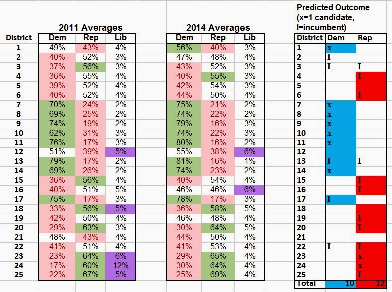
The following tables show the district-level votes for the 2011 and 2014 elections. The 2011 percentages (left-hand table) are unweighted averages of the combined district-level and at-large council races--these are estimates, generated with the process described below (Appendix 1). The 2014 percentages (middle table) are unweighted averages of the auditor, treasurer, and secretary of state races--these are the actual voting percents (not estimates). I have highlighted in red those party outcomes with less than 45% of the vote, and green for those party outcomes of greater than 55%. I have also highlighted in purple those Libertarian wins of over 5% (calculations were done in MS Excel). As can be seen, there is a satisfying consistency between the 2011 estimates and the 2014 actual voting averages.

The right-hand table has my predictions for the 2015 race, based on past election results. Currently I am estimating 10 likely or secure seats for Democrats, and 12 likely or secure seats for Republicans, with 3 seats I am not willing to predict (districts 2, 3 & 21). Most of the districts where a substantial lead exists for either party, there is only one filer, so the race is not contested (except by multiple filers from the same party--districts 1 & 8, both Democrat)--those are designated with an "x" in the appropriate party column for the respective district (7 Democrat, 2 Republican). There are several races with an incumbent in a district where past voting gives that same party an advantage (1 Democrat, 7 Republican).

There are also several races with multiple incumbents running against each other--1 of those races seems to favor Democrats, and 1 Republicans, based on prior voted margins. District 2 has a Democratic incumbent, but prior voting gives Republicans a significant advantage (12%) in my 2011 CCC estimates, but only a small advantage in the 2014 election (1%). District 3 gives Republicans a significant advantage in previous elections (19% & 9%), but one incumbent is a prior at-large council-person (Hickman, Dem), against a district councilor (Scales, Rep). I do not know if that will impact voting decisions, so am leaving that race unpredicted. Finally, district 21 gives Democrats an advantage in the 2011 voting estimates (5%), but Republicans an advantage in the 2014 election (6%). The difference could be a preference for specific candidates, or an estimate error on my part. Either way, I am unwilling to predict that election, although if pressed, I would be likely to say it leans Republican based on the 2014 voting, the same as I might guess for district 3.

In any case, if my "likely or secure" predictions are accurate, Democrats would have to win all 3 of the unpredicted elections to retain the majority for the 2016 CCC, which seems unlikely. However, my predictions are based solely on previous elections. I refer the reader to Paul Ogden's site mentioned above, since he brings in pertinent local information, such as personality and funding factors.

Update: 1) Subsequently I posted campaign finances for the CCC candidates as of 3/12/2015. 2) I corrected an error in the 1st paragraph--I said that Vaughn lost the election, when I meant that he lost the majority presidency.

Appendix 1: 2011 Election Estimates Procedure Summary

For the 2015 prediction of CCC races, I used some geospatial mapping (QGIS) techniques to estimate how the past voting patterns would look based on the new precincts. Briefly, 1) I used GIS shapefiles of the old precincts with the 2011 CCC voting data, 2) overlaid that onto block-level census Tiger shapefiles, 3) calculated a factor variable that estimated the approximate mean number of voters for each block for each of the 2011 city-wide elections (mayor, at large CCC, district-level CCC) by party (Dem, Rep, Lib), 4) overlaid the new precinct-district maps onto the block-level voting estimates, and summed those values to get first precinct-level estimates, and then district-level estimates. To check the reliability of this method, I tested the correlation for straight-party voting for both Republican and Democrat by precinct, compared to the actual voting data from the 2014 election, obtaining r=0.88. I also compared the 2011 voting district-level estimates to the 2014 election for "registered voters," with differences ranging from 6% to 24%, and an average difference of 16%. While in absolute terms these are large differences, presumably the relative disturbance effects when comparing Democrat vs. Republican voters would be small--since I am comparing party voting within each district, not comparing districts to each other. (Some of this current work is based on mapping work I did in 2011-2012 to explore the outcomes of the Brooks maps using the newly drawn district maps)

Sunday, January 11, 2015

Growth Rate of University Graduates by Country (2000-2012)

Quick Data Note: Based on a Facebook conversation about U.S. college attendance, I looked at OECD data for 2000-2012 to see how the U.S. compared to other high-income countries. While our average annual university graduate rate per capita is slightly above the OECD average for this time period (3.0%, compared to 2.5% per year in a 30-country average), the growth rate of the percent of graduates per year is far below average. From 2000-2005, compared to 2006-2012, the US tertiary education (all programs, including advanced research programs) graduation growth rates were 17.6%, compared to the OECD average of 27.4%). This implies that while we continue to produce university graduates per year at a slightly greater rate than average, that rate is dropping dramatically--almost half the rate of the average high-income country, and we are close to the bottom of the pack. Here is a chart of 15 countries compared. Given that U.S. university costs are between 2-3x the average for the high-income countries, most of which provide tertiary education completely free for their citizens, it is not unreasonable to suggest that our college graduation rates will continue to decline, unless we implement measures to dramatically reduce college costs, putting us at a further global economic disadvantage.

Wednesday, October 29, 2014

Soda, Telomeres, Aging, and Statistics

Anderson Cooper recently highlighted a pre-print analysis of "telomere length" and drinking sweetened carbonated beverages (soda, pop, or coke, in the vernacular) on his Ridiculist. He even includes an interview with neurosurgeon/health reporter Sanjay Gupta. I'm currently teaching a statistics course, so I'm always on the lookout for cutting-edge, peer-reviewed research that may have statistics at the appropriate level for my class, and data that would interest university undergraduates. I downloaded the paper and pulled out the Results table.

The researchers' hypothesis is framed with the theoretical belief that telomere length is related to aging. I won't address that issue in this blog post, except to say that it's a controversial (and, in my personal opinion, poorly defended) proposition. I will limit my comments just to the statistics presented in this research, and specifically, just to Table 3--spoiler alert, I wonder if the editors of AJPH were impaired when they let it into the journal.

In the table, we see Models 1 and 2, which they describe in the notes. Model 1 is just age, gender and energy (which I couldn't find that they define--perhaps it's simple daily caloric intake?), while Model 2 includes a mish-mash of "healthy habits," such as healthy eating, BMI, smoking and alcohol, as well as some extra socioeconomic demographics, such as race, education, poverty level, etc. They compare four drinks--carbonated sugar-sweetened, noncarbonated sugar-sweetened, diet, and 100% fruit juice. They provide the quartiles, the b (regression coefficient; similar to the "m" or "slope" in the dreaded high-school algebra linear equation "y=mx+b"), and the 95% confidence intervals.

My first clue that something is amiss is that there is not a consistent linearity in the quartiles (not to mention that they don't provide Q0, the minimum--we don't necessarily need the Q0, but then why provide Q4, the maximum if you're not going to provide the minimum? it's just a consistency issue that doesn't affect the analysis but makes the table feel unbalanced and sketchy to me). Their regression is self-described as linear. However, the quartiles themselves are decidedly NOT linear--at least not for anything except the noncarbonated sugar-sweetened beverages, and the combined sugar-sweetened beverages index. That is problematic for me.

Let's ignore the non-linearity question for a moment, and just look at their base analysis, which is comparing the median values of the four beverages with their published b coefficients and confidence intervals. Let's ignore Model 1, since it's just demographics. Once you control for the everyday behaviors of the people in their study (they use data from the NHANES), they only have one variable that they claim reaches the level of statistical significance: people who consume sugar-sweetened carbonated beverages apparently have shorter telomeres. While it would be nice to overstate the other Model 2 coefficients, such as claiming that people who drink fruit juice have longer telomeres, and people who drink diet drinks have neither positive nor negative impacts on telomeres, it's statistically inappropriate to make those claims, since neither of those measurements achieved statistical significance (p<0.05), therefore we can completely ignore them. So let's compare the two extremes, based solely on the published medians of telomere lengths: sugar-sweetened soda with 1.13 & 100% fruit juice (diet soda median is equal to fruit juice) with 1.08. On the surface it looks like those two numbers are "different"--clearly they are "different numbers," but that doesn't mean that in "reality" in the general population they are different, since this output is based on a sample, and therefore an estimate. That's what "statistical analysis" does by definition--creates reasonable estimates of the general population based on samples.

Let's assume the sample meets standard scientific guidelines of randomness, etc, so we just have to determine if 1.08 vs 1.13 translates into an "actual" difference when applied to a general population estimate. According to the p-value of the coefficients, it does indeed appear to be different, but we'll get to that later. For now let's stick to the medians. Notice the spread from Q1, Q2 (the median), Q3 to Q4. Since they aren't linear, I'm not quite sure what the Q2 value actually represents. As any of my undergraduate statistics students can tell you, one of the data assumptions that must be met before you can do a regression analysis is data linearity--this non-linearity of quartiles makes me suspicious. Putting that question aside, I wonder what if the differences between the quartiles are "actually" differences, or if the non-linearity indicates that these are merely natural variation and there actually are not regular increases in telomere lengths from Q0 to Q4? We can't know that based solely on this study, but to me personally, I don't see that assumption is met given this table. Let's then take a leap and say--what if the actual Q2 measurement is anomalous, and perhaps a better estimate of Q2 would be to take an average of Q1 vs. Q3? In that case, the "estimated" Q2 for sugar-sweetened carbonated beverages is not 1.13 at all, but [(1.04+1.09)/2] 1.065, which is shorter than the telomere length of the fruit juice telomeres. This is actually what the researchers, in fact, predict with their regression equation--shorter telomeres with sugar-sweetened carbonated beverages. But this isn't necessarily self-evident, since the actual median shows that soda/pop has longer telomeres than fruit juice. Based on the presented median lengths, one could interpret that drinking sugar-sweetened sodas are actually better for you than drinking fruit juice! Granted, I'm not going to make that claim--although there is significant evidence that drinking fruit juice is not much healthier, if at all, than drinking soda.

Finally, let's look at the b coefficients. I always make a point for my statistics students to ignore any published data that doesn't include confidence intervals, since hiding confidence intervals (by not publishing them) is a GREAT way to completely misrepresent a data analysis to your benefit. One can't interpret any parametric analysis (like a regression coefficient) without the confidence intervals. In this case, it seems that in Model 2, sugar-sweetened carbonated drinks shorten telomeres (b=-0.010) compared to fruit juice, which seem to actually lengthen telomeres (b=+0.016). BUT! Remember that these are statistical estimates, and not "real" numbers--the real numbers for soda-related telomere shortening are actually somewhere between -0.020 and -0.001, and we can't know "actually" where without a 95% confidence of making a Type 1 error (i.e., claiming this result is real, when it isn't). So in reality, the authors aren't claiming that the "actual" telomere shortening is exactly -0.010, but almost certainly somewhere between -0.020 and -0.001.

Similarly, the alleged telomere lengthening properties of fruit juice isn't "exactly" +0.016, but likely somewhere between 0.000 and +0.033. So for my Introduction to Statistics students, I have them look at the maximum confidence value of the lowest measurement, and the lowest confidence value of the highest measurement before making an assessment. This means that the lowest likely value of telomere lengthening of fruit juice is actually 0.000 (i.e., no change at all), vs. telomere shortening of soda is -0.001. While "statistically" if looking at the p-values, that appears to be a measurable difference. But in reality, personally, I would interpret that as not at all an important clinical difference (I won't get into "effect sizes" in this particular blog post, but since they don't post the standard deviations, we can't calculate those, which I would guess come out to be completely insignificant).

What makes this difference perhaps even less relevant, is if one looks at the decimal points and takes rounding into consideration. If the soda telomere maximum confidence level is b=-.001, potentially that could be -0.0005. Similarly, the minimum telomore shortening of b=0.000 could be -0.0005; in other words, they could be basically the same value, depending on how they rounded! On the one hand, I would have liked to have seen that one extra decimal place to rule out that possibility. On the other hand, one can simply eliminate a decimal place, and then the maximum soda level becomes b=0.00 and minimum fruit juice level would also be b=0.00. So, in actuality, I don't really need to see that extra decimal place at all--I don't think these results support their conclusions, going by this table alone.

Sunday, October 26, 2014

Just over a week left before the 2014 election, with major shake-ups likely for U.S. Senate and Governor races. Why are 6 seats important? Because that's all the GOP needs to take control of the senate by 1 vote.

Comparing 6 different prediction sites, all agree that Republicans will pick up at least 6 seats, with the most likely being Alaska, Arkansas, Iowa, Kentucky, Louisiana and South Dakota. The only exception is Real Clear Politics, which is making the most conservative estimates (scientifically conservative, not politically conservative) and declaring many of the polling so close that they are still within the margin of error, so keeping them as "Toss-ups" (although they have published a "no toss-up map" that agrees with the other 5 prediction sites, that the GOP will pick up 6 seats). Of the other differences between the sites, one is Kansas, where Politico and Washington Post are calling likely Republican, whereas 538 and Princeton are calling "leans Independent". Both of the latter along with the Washington Post say Georgia is slightly leaning Democrat, and both Colorado and Louisiana are leaning Republican, each of which the other 3 sites still call toss-ups. Sabato at the UVa Center for Politics is still counting Kansas as a toss-up.

However, that number "6" is contingent on a couple of things. First, it presumes that Republicans would be certain of keeping all of the seats they currently control. But three of these seats are actually far closer than expected--Georgia, Kansas and Kentucky. In Kansas, Governor Brownback has made the Republican brand so toxic that the incumbent Republican senator may get kicked out of office, replaced by an independent who has not stated for whom he would vote for Senate leader, but he would not support either Reid or McConnell. So while McConnell's seat may end up being safe from challenger Lundergan-Grimes, unless Republicans vote in a new Senate leader other than McConnell, Orman might refuse to caucus with them, potentially giving Democrats a hail-Mary if the race is closer than expected. The second problem for Republicans is Georgia, where they lost their safe incumbent Saxby Chambliss, and now that race may turn into a runoff which 3 of the prediction sites are calling a toss-up, and the other 3 are saying leans slightly Democrat.

The second "6 seats to victory" contingency is that the close races will cut evenly between Democrats and Republicans. If the 6 states listed above all go for the Republicans, which all of the sites agree is likely, and they keep Georgia and Kansas, then they are safe. However, if either one of these states goes for the Democrats, then Republicans will need Colorado and/or Louisiana for the definitive win. Three prediction sites (Politico, Sabato and RCP) are not calling either of these races, leaving them as toss-ups as of Oct 26, while the other three sites (538, Princeton and WaPo) are calling them likely Republican (in the "no toss-ups" model, RCP calls both of these for Republicans). If Republicans bring in BOTH Colorado AND Louisiana, then they don't need Georgia or Kansas for the tie-breaker. But if three of these 4 states (GA, KS, CO, LA) go for Democrats, then the situation gets complicated.

First, if the Senate decision comes down to one seat, then Georgia or Louisiana may have to break the tie, and neither of those races may be determined by this election due to the nature of their system. For example, in Georgia, if none of the candidates break 50%, it requires a runoff which would be held in mid-January. Louisiana's potential runoff would be in early December. Second, if 3 of these borderline states go to Democrats, then the Senate would be tied, meaning Vice President Biden would be needed to break any tie votes.

So what all of this means, if that the Senate goes the way that all of these 6 sites predict, based on polling as of October 26, then control of the Senate in 2015-2016 will likely be Republican. The spoilers are Georgia, Kansas, Colorado and Louisiana. Republicans only need 2 of these for the win. But if Democrats get 3, Biden will be needed for a tie-breaker, and if they get all 4, then Democrats remain in control of the senate.

Friday, October 17, 2014

Health and Human Services Spending since 2003

The recent Texas Ebola outbreak has caused a political frenzy with mutual-blame casting by Republicans and Democrats. I looked up the official outlays as published by the U.S. Treasury. While we have had an increasing budget for several decades in terms of raw dollars, once adjusted for inflation and population growth, those budgets look increasingly anemic. Below are four separate budgets from the Health and Human Services, which is the agency most tied into U.S. health, as well as specifically preparedness for infectious disease control. The first two graphs are the total relevant budgets for the the National Institutes of Health, and Centers for Disease Control from 2003-2014, adjusted for inflation (in 2014 $), and population growth. Both budgets have dropped during the time period shown, from 2003-2014. The CDC budget has dropped from $20.07 per person in 2003 to $19.95 today. The NIH budget has dropped from $101.33 per person in 2003 to $97.57 per person today.

The second set of charts organizes the data slightly differently. Within the Health and Human Services Budgets, there are three separate agencies that engage in "health care research and training": NIH, CDC and HRSA. Two of these, the HRSA and CDC also have budgets for "health care services." I have aggregated these two categories of outlays, and depicted both the inflation-adjusted spending per-capita, and spending as a percent of real GDP. The health care research and training budget (inflation adjusted per capita) has doubled since 1979, but when compared to real GDP, spending on health care research and training as actually gone down, from 0.76% to 0.65%. Per capita, this budget has declined since 2003. Similarly, the HRSA and CDC budgets for direct health care have gone up (inflation adjusted per capita), not quite doubling from $24.35 to $40.21, but has decreased when compared to our real GDP, from 0.37% to 0.25%. Per capita, this budget has remained approximately the same since 2003.

YearCDC Outlays (Inflation-Adjusted/Capita, 2014$)NIH Outlays (Inflation-Adjusted/Capita, 2014$)CDC Total Outlays (in millions)NIH Total Outlays (in millions)Health Care Research and Training (CDC+HRSA+NIH; Inflation Adjusted Per Capita)Health Care Research and Training (as % of Real GDP)Health Care Services (CDC+HRSA; Inflation adjusted per capita)Health Care Services (as % of Real GDP)Health Resources and Services Administration-Health care servicesHealth Resources and Services Administration-Health research and trainingCenters for Disease Control and Prevention-Health care servicesCenters for Disease Control and Prevention-Health research and trainingNational Institutes of Health-Health research and trainingCPIPopulation (in millions)
19793.6343.67238335286956749.410.76%24.350.37%141701432164818294755388286956768.3225.06
19803.4642.64261502322230548.940.75%22.480.35%150039241274119836263140322230577.8227.22
19813.5242.23300028360380548.520.74%19.810.30%147010645751922034179687360380587229.47
19823.4639.24323137366469544.220.68%19.080.29%154556337831523637686761366469594.3231.66
19833.7038.36361590374964942.370.61%15.090.22%117438933060830083960751374964997.8233.79
19843.5140.47360128415729442.700.58%14.660.20%1202976171545303007571214157294101.9235.82
19853.4343.52368489467026445.920.60%14.260.18%1223635195573306481620084670264105.5237.92
19863.8245.46429378511453748.170.61%14.290.18%1249201234533358427709515114537109.6240.13
19874.0545.34466027522219448.100.58%14.220.17%1234942254067402556634715222194111.2242.29
19885.0852.38613764633394154.770.64%15.380.18%1308047226809551422623426333941115.7244.5
19896.4554.72823573699199057.290.65%15.240.17%12298632230207176851058886991990121.1246.82
19907.6155.111034752749189457.560.65%16.700.19%13705161988568995831351697491894127.4249.62
19917.7552.671128102766715654.900.61%17.060.19%146746521155710153931127097667156134.6252.98
19927.9155.341198123838074357.840.61%19.150.20%183169924846710689901291338380743138.1256.51
19938.9260.211412925954031962.800.65%20.510.21%199351925414912565521563739540319142.6259.92
19949.5561.7515709391015527864.320.64%22.370.22%2257521271948142113514980410155278146.2263.13
199510.4463.6117860001088300065.950.64%22.430.22%2213000239000162500016100010883000150.3266.28
199612.1957.4621670001021700059.970.56%31.180.29%3537000288000200800015900010217000154.4269.39
199712.1360.3922490001119900063.150.56%27.530.25%3023000345000208200016700011199000159.1272.65
199812.6565.5924100001250000068.150.58%27.440.23%3042000265000218700022300012500000161.6275.85
199912.4070.4924300001381500073.050.59%29.030.24%3481000280000220800022200013815000164.3279.04
200012.4475.7125320001541500078.360.62%30.470.24%3884000328000232100021100015415000168.8282.16
200115.2780.8832570001725300084.370.66%33.050.26%4065000472000298500027200017253000175.1284.97
200216.3693.9135630002045000098.530.76%37.490.29%5012000596000315200041100020450000177.1287.63
200320.07101.33452300022834000106.170.78%41.790.31%5323000661000409400042900022834000181.7290.11
200418.60110.54431100025626000116.720.84%40.800.29%54820001097000397600033500025626000185.2292.81
200518.79112.58452800027123000116.650.81%42.110.29%5884000712000426000026800027123000190.7295.52
200618.25109.79461500027771000114.050.77%40.350.27%6087000582000411900049600027771000198.3298.38
200721.02107.95548000028138000111.950.75%42.070.28%5886000644000508000040000028138000202.42301.23
200820.95106.13574900029123000109.310.75%43.070.30%6268000672000555000019900029123000211.08304.09
200922.14107.79613000029847000110.970.76%44.890.31%6465000713000596400016600029847000211.14306.77
201023.81115.40682200033068000119.390.80%48.410.32%7078000111600067940002800033068000216.69309.33
201122.00117.17645400034370000119.780.79%48.320.32%75440009420006630000-17600034370000220.22311.59
201221.59107.77656700032781000112.480.73%45.080.29%7755000824000595700061000032781000226.67313.91
201320.2999.52631600030976000104.830.66%40.880.26%7303000753000541900089700030976000230.28316.16
201419.9597.57636400031124000103.920.65%40.210.25%76670008230005159000120500031124000233.92319

Saturday, October 11, 2014

District 29, 2014: Delph vs. Ford

Last February, the current state senator from District 29, Mike Delph, had a twitter meltdown about the same-sex marriage constitutional amendment shenanigans at the Indiana state house, that arguably (along with some other issues) caused the Senate leader to impose several sanctions against Delph, which included moving him to the back of the chamber thus forced to sit with the Democrats, removing him from leadership roles, and taking away his press secretary. Shortly thereafter, a Democrat competitor arose from his district, JD Ford.

The district has traditionally been solidly Republican, but with the 2010 redistricting, and steady urbanization of that region, I wondered if the situation would have changed. Using Tiger geographic redistricting shape files , Indiana election results for 2012, and ACS population data, I created some estimates of who voted for whom at the precinct-level in 2 specific races--Attorney General, and School Superintendent. As background for these races, AG Zoeller was running for his 2nd term, being active in far-right political cases (like submitting anti-gay-marriage amicus briefs to various cases around the country), and School Superintendent Tony Bennett had been a charter-school activist while in office. Zoeller won his 2012 run, but Bennett lost to Glenda Ritz, despite the GOP sweeping the rest of the offices in the state, including electing a supermajority in both Senate and Representatives chambers.

In what is now the newly redistricted D29 for senate (some of these counts are estimates based on precinct line changes), Zoeller (R) won approximately 57% of the vote, while Ritz (D) won approximately 51% of the vote. There are several factors working in Delph's favor. First, he has an incumbent advantage. Second, he has the party advantage for the "6 year presidential itch;" i.e., in the 6th year of an incumbent president's term, the "other" party (in this case, Republicans) tend to have an advantage. Third, he has a turnout advantage--midterms tend to favor GOP. Fourth, he has the numbers in this district--Zoeller beat his competitor by a wide margin.

However, several factors may also come into play. The hit that he took by the senate majority leader, and Delph's very public meltdown about the same-sex marriage issue, which was accompanied by several very insulting remarks about what makes a "true" Christian (i.e., "any professed Christian minister that teaches any sin is acceptable is NOT acting in true love but in eternal condemnation #truth"), and arguably "crazy" comments on several other issues, may cause voters in his district to question is ability to represent them. While midterms already have miserably low turnout (usually about 1/3 of registered voters come out to midterms in the Marion County area), some typically stalwart GOP in his district may be incentivized to stay home rather than be forced to choose between Delph and the gay Democrat. And as demonstrated in the 2012 elections, D29 voters are more than willing to vote for the Democrat if they like the candidate, rather than simply doing a party-line vote.

Any of these factors could shift the vote in Ford's direction. Additionally, the demographic numbers that we have for that district are largely from the 2008-2012 ACS--but that entire area is dramatically and rapidly changing, largely in the direction of younger voters, and race minorities, so the influx of new residents, if they register and vote, will mostly be potential Ford voters, especially when given the choice between Delph and Ford.

In terms of raw numbers, there are about 100k residents in D29 over 18 (2012 ACS 5-year estimate), with an average age of 36, 52% female, and 69% White. But these estimates are 2-6 years old--a lot has changed in 2 years in that area. According to my redistricting estimates above, there were about 60k votes cast in the 2012 election, so perhaps half of that will show up for the midterms. Much of the new housing in the area, because of the recession and housing price bust, has been apartments, which will bring in voters more inclined towards Democrats (younger, poorer, single females).

Maps of the redistricting, by % of vote for AG and School Superintendent, are below.

Sunday, September 14, 2014

Indiana Gubernatorial Elections: 1980-2012

There was much abuzz about former Indiana governor Bayh running again for governor--recently deflated when he announced definitively that he was not running. For the last decade, Indiana has been solidly red, and since I was in California & Illinois for several years prior to that, I had little memory of Indiana politics before Mitch Daniels. Presuming I can trust the voting record supplied by Wikipedia (don't tell any of my students), I plotted the Indiana gubernatorial elections since 1980 by number of votes. I also included the winning governor's name, and highlighted if he was an incumbent (bold, and "-I"). In 2012 Republican Mike Pence won with less than 50% of the vote, although the Indiana Republican representatives won a super-majority in both houses.

While there was a 3rd (and once, a 4th in 1984) party candidate on the ballot for all years except one (1988), none of the races could have been won for the losing candidate if all of the 3rd party votes were cast for him instead.

What is interesting as I look at the graph, are the three surges, one for Democrats in 1992, which saw an 18% jump in Democrat voters compared to the previous election (with a 22% fall in Republican voters), and two subsequent Republican surges in 2004 & 2008, with, respectively, a 30% & 17% increase over the previous election, and very little fall in Democrat votes. In 2012 there was a plummeting of Republican votes, with a 23% fall, and a slight increase in Democrat votes. On the one hand, Indiana likes to re-elect their governors (at least for the last 32 years), indicating that Pence should win a second term in 2014. On the other hand, given that Pence won with less than 50% of the vote, and his policies since then have been very unpopular, it may spell trouble, especially given the demographic shifts as the youth cohort which has been voting strongly Democrat, only continues to increase.

What would be interesting is to elucidate the factors that caused the 2004 & 2008 Republican voter surges. The 2012 drop is understandable, since the election after the incumbent leaves typically shows a significant drop, while the second year typically shows a significant increase, except for Orr's reelection in 1984.

Friday, September 12, 2014

Al Jazeera News Loading Problems

For quite awhile (at least a year or two) I've had network problems accessing Al Jazeera news--I don't know if it's a bad interaction with my server, if it's their server, if it's my computer/browser, the CIA, etc--but whenever I try to click on a link for Al Jazeera news, I get a blank screen for about 30 seconds until it finally loads, which means, for all practical purposes, I stopped using Al Jazeera once this started happening. Historically, for my Africa class, I liked to get Al Jazeera articles about Africa news to have the students discuss, to represent a non-US perspective the students likely aren't exposed to. Today I wanted to see what they had been saying about ISIS, and had the same problem. I noticed in the bottom left corner of Chrome that "waiting for j.maxmind.com" appeared while the screen was blank for the 30 seconds wait. The maxmind.com website wasn't very informative--I have no idea why Al Jazeera is calling on maxmind, or why it isn't allowing the Al Jazeera news to load into my browser. Regardless, I used adblock to completely block anything from maxmind, and Voila!! Al Jazeera now loads immediately.

Sunday, August 31, 2014

My Experience with a Windows Phone--and Subsequent Invasion into my Personal Life by Microsoft

When my last phone, an Android, got accidentally laundered when I forgot to take it out of my pants pocket, of course the phone came out of the washer dead and unrevivable. Looking through reviews for cheap phones, the Nokia Lumia 520/521 had positive experiences listed on several sites, so that's what I went with. While I saw that it was a "Windows" operating system, I didn't realize what that meant, nor how fundamentally different it was from the Android system. Not only was the interface completely different, but the phone is locked down in different ways that prevent users from creatively interacting with their purchased device outside of the tight grip of Microsoft surveillance and control. For example, with my Android phone, I was able to root it and side-load apps. For the uninitiated, this means that, rather than going to Google Play, or other "approved" sites, and logging in with my contact information (which includes my phone number, credit card, etc), I could download apps anonymously and install them manually on my phone. While this may seem like an unimportant feature to a youth cohort who seems to have no concept of privacy, for those of us old enough to have experienced "life before the internet," and who have read Foucault, it seems only intuitive for us that it's no corporation's or government's business what we do with our own private property, including our phones.

My personal response to the many ways that my new Windows phone was locked down and fundamentally connected to the Microsoft surveillance system, was to delete every app that I didn't absolutely need, and shut down everything else--I kept the text function, and phone calls, that's about it. The lockout of side-loading, and the inability to do anything without being formally connected to the Microsoft system was similarly frustrating, and felt incredibly invasive. But even prior to learning about those privacy issues, my very first experience was traumatizing, when I learned that the Windows system was fundamentally incapable of importing my previous phone information from Android (actually I had installed Cyanogenmod)--therefore, I lost ALL of my contacts and text messages in the phone switch. Less than a year after I purchased the phone, the buttons stopped working. This information transfer problem was compounded when I wanted to ditch the Windows phone to go back to Android, and again, NOTHING could be transferred. Web page after Web page, and phone call after phone call to help desks to the various relevant companies, said the same thing--Windows Phone doesn't have a way to export text messages to be saved onto your computer.

In my exploration for options to save my text messages, the closest option I found was to "sync" my phone with "the cloud." Given that I grew up with a phone attached to the wall with a cord, and we carried our information around on floppy disks, where clouds meant rain, and water destroys floppy disks, I have an inherent distrust of mixing my digital information with "clouds," not to mention the utter lack of privacy or digital safety when my personal information is stored on a remote server--especially one operated by Microsoft, the #1 practice target for hackers. Because of this lack of trust, as well as a refusal to assist the various corporations of the world to piece together my complete biography and daily movements via my phone, I do not have a "microsoft" account where my information is cloud-stored. Of course, without this account, I was unable to download ANY apps to my smart phone, as previously mentioned, already inherently limiting the utility of the device. But in this emergency situation, where the only possible way to save my text messages was to sync them to Microsoft cloud, I began the journey into invasiveness.

First, in order to create this e-mail account (a live.com account), I had to hand over to them "other" completely irrelevant personal information--like my phone number, another e-mail number, my birthdate, gender, etc. Suddenly my ONE e-mail link to Microsoft became FIVE personal links. I googled the phone number of an enemy, and gave them that phone number. Then I created a bogus account with yahoo that I would only use for this one-time event. And just in case they were recording my IP address to get my home address, I used TOR Browser, which gave them an IP address in the Netherlands. Of course Yahoo also now demands a phone number and alternate e-mail--more fake information was supplied to fulfill their demands.

Second, once you create the account, Microsoft doesn't let you use your new account. In order to make sure that your supplied phone and email aren't fakes, you have to go to that alternate email to get a special code they send to that email, before Microsoft will let you do anything with the Live account, which contains several online Microsoft Office software, such as Outlook, OneNote, Excel, etc. In order to save my text messages, I had to sync my phone with this online version of Outlook. Much to my chagrin, this feature of Outlook, where you could then obtain your phone text messages, had been removed!!! After more Googling, the process was still in Outlook, but hidden. So with some convoluted fixes to the "options" button, I was finally able to get ONLY the last 2 weeks of text messages, which could not be mass selected for copying to a text file--not even entire conversations could be selected. They could only be opened one message at a time and copy/pasted into a document. Regardless, nothing interesting happened in my life during the previous 2 weeks, and since the prior 8 months of texts were ultimately unavailable, the entire day's effort was wasted and all of my previous information was lost. The exception was my contacts--this process allowed all of my contacts to be "synced" to the "cloud," but I couldn't do anything else with them except manually type them into the new phone. The help desk for my phone company, however, had an alternative solution--link the old and new phones together using bluetooth, and export each contact ONE AT A TIME. That was eventually what I had to do to save my contacts.

At this point I was done with Microsoft and wanted to erase the tracks I had created on their databases. I had already killed my fake Yahoo account that I had supplied to Microsoft to open the Microsoft account. Now that I wanted to delete my Microsoft Live account as well, I was faced with yet another invasive roadblock--even though I had supplied the appropriate password to get into my Microsoft Live account, they would not let me get into the area of my Live account where I could cancel the account, without sending ANOTHER security code to the stored alternative e-mail address to verify my identity!!! Since I had already killed that account, I had to create a second fake yahoo account to receive my security code. However, Microsoft had installed a 30-day waiting period between switching alternate e-mail accounts--they would not send my security code to my new alternate e-mail since I was within that 30-day window (this was within about a 12-hour period). This feature prevents me from doing ANYTHING on the Live account now that I had attempted to switch e-mails within that 30-day period, unless I re-verify myself from that old e-mail address that I had already terminated. So not only was I forced to create this Microsoft account linked to my personal phone in my attempt to export my personal text messages to my computer, but I was forced to give invasive personal information and unrelated user accounts, now they were preventing me from terminating the account!!!

I'm sure, to anybody younger than 25, I sound like the archetypal old man with his cane who yells "get off my lawn you darned kids," on the one hand, or on the other, the crazies who build nuclear shelter bunkers in their backyards. But this invasiveness, just to use a phone, is unacceptable. The ways that our personal lives are being forced to be connected into corporate databases is unacceptable. Humans are not commodities, nor is our information, or personal communications. In the college classes I teach, where I require a research project, students often choose to look at the impact of social media, and are astonished to discover that graduates personal social media information is available to employers and possible employers--those pictures of you throwing up at a frat party are in "the cloud" and when you submit job applications, human resources offices check that cloud for reasons why you shouldn't be a part of that company. What astonishes me, is that anybody is astonished that when you put your entire life into public domain and into the hands of corporations, that it can have tremendously negative impacts on your private life.

Saturday, July 19, 2014

Craigslist RSS feed

I learned something new today from the Pocket Your Dollars web site, googling "craigslist notifications." In my house renovations, last week in my dining room I finally ripped out the cheap, 40-yr old cabinets that had been installed and somebody came to take them away today (courtesy of a frustrating week getting no-shows from my craigslist ad). The family who moved here in the 70s relocated the kitchen into the original dining room, since it's a larger space, and installed these cabinets. I'm making it back into a dining room, as was in the original house design. In the space where the cabinets were, I'm going to put a buffet, which I am hoping to find from Craigslist--specifically, a nice Victorian-style buffet. Of course the ones currently listed are all in the $400 range, and my budget is about $50. Thanks to the aforementioned Google search, I discovered that you can tell Craigslist to send you an RSS feed. What is an RSS feed--I don't know either, I just followed the instructions to connect the Craigslist RSS feed to my Microsoft Outlook, and sure enough, a new section appeared in my Outlook, so everytime somebody posts here in Indy for a cheap buffet, it automatically notifies me!!! I'm very excited.

Black vs. White Student Suspensions-Preschool Discrimination

This year in March, a Department of Education study showed that Black preschool students faced higher rates of suspension than White students (full report here). In my Introduction to Sociology class, two sub-tasks I have is to 1) introduce the concept and issue of race/ethnicity, and 2) introduce the concept and use of statistics. This year I am using the findings from this study as the basis to accomplish those goals. In the process, I brought in some additional data--the percent of Black legislators per state, and the Black/White income disparity ratio per state. The larger pedagogical goal is to reinforce the concept of "structural" causation. We in the U.S. are far more likely to presume individual-level causation, which is already an inherently human feature that psychologists have described as the Fundamental Attribution Error. However, our culture magnifies this effect compared to other, more communitarian-type cultures. So while the U.S. 'person-on-the-street' may look at the profound differences between Black-White student suspensions and automatically presume individual-level causation (especially if you are White), i.e., "Black students must misbehave at higher rates than White students," the utility of structural-level analysis can show that a large percent of the state-level variation in school suspensions can be explained by factors other than individual-level behavior. Here I present an introduction to structural-level analysis, by way of different types of graphs and a mini-introduction to regression analysis--basic tools of the trade for quantitative sociologists.

First, the recent Department of Education report indicates that the difference between Black-White student suspensions starts as early as pre-school. Graph 1 shows that data as presented in the original report. The first column shows basic differences in pre-school enrollment between various race/ethnic groups in 2011-2012, and subsequent columns show rates of suspension, also divided by race/ethnic group, the first-tie such data was collected at the pre-school level. The original data can be found at the Dept of Ed web site. While state-level data is available, unfortunately, it is not in a single spreadsheet, but reported separately for each state, so the process of compiling state-level dataset for all 50 states is tedious, but it is what I use for the analysis below. Using the difference between enrollment and suspensions, I create a variable, "Black student suspension ratio," which is the level of suspensions as measured against enrollment. For example, in the national pre-school graphic below, Black student enrollment is 18%, while Black student 'Out-of-school suspension (multiple) is 48%, leading to a ratio of 267%--i.e., Black students were suspended at a rate of 267% more than their enrollment. Conversely, White student enrollment was at 43%, while suspensions were at 26%, leading to a ratio of 60%--i.e., White students were suspended at a rate of 60% of their enrollment. An 'individual-level' interpretation of this data might be 'White students misbehave at far lower rates than Black students,' presuming that no racial discrimination occurs in the process of assigning student suspensions. The following analysis tests that hypothesis--or rather, tests whether structural-level factors provide a better explanation for individual-level factors

As Graph 2 shows, also directly from the Dept of Education report, racial disparities in student suspensions occur beyond the pre-school level. The data I use for this analysis relies on the reported suspensions for all grade levels. Graph 3, which I have produced using Microsoft Excel, is an "area graph" that compares two variables at the state-level--the Black student suspension ratio (blue, indexed to the left along the y-axis) and the percent of Black state legislators (orange, indexed to the right). I also had Excel plot a trendline for both of these variables, which is the dotted line above the colored areas. One can notice several things from this graphic. First, I have sorted the state data from lowest to highest rate of Black student suspension ratio, with Maryland having the lowest rate, and Minnesota having the highest rate. Comparing this with % Black state legislators, a general trend can be seen--the higher the % of Black state legislators, the lower the rate of Black student suspensions, and vice-versa. This does not necessarily imply causation, but a relationship is apparent (more about this later). Second, one might notice that all 50 states are not represented on this graphic. One of the problems with voluntary data collection is that not all states report. In this case, many states simply did not report suspension data. I have not attempted to impute or recover missing data in this analysis, but use only the data reported to the Department of Education for 2009-2010.

Graph 4 shows a scatterplot of this same data--also using Excel. In this case, the presumed independent variable, % of Black legislators, is reported on the x-axis, and the presumed dependent variable, Black student suspension ratio, is reported on the y-axis for this plot. Each dot represents a state. The correlation is reported on the graphic as -0.68, which is a strong negative relationship between these variables. This means that as the % of Black state legislators increases, the ratio of Black student suspensions go down, and vice versa. The trendline helps visualize that pattern. Interpreting the relationship between these variables require additional data and hypothesis testing, and in class I facilitate a brain-storming session, where the students come up with various explanations, each of which, I clarify, become 'testable hypotheses' that typically require the collection or analysis of additional data to decide which hypothesis among them has the strongest support. In this case, my personal hypothesis is that political representation grants a greater level of equality at the group-level. In other words, states where the Black population has more political representation at the state legislative level, have a greater capacity for the implementation of policies that ensure the implementation of racially-fair policies in schools. Alternatively, or reciprocally, the greater percent of Black legislators can also imply that group has, in general, a greater reserve of organizational capacity and community-level political activism, which can be seen in agitation for equal treatment in local schools.

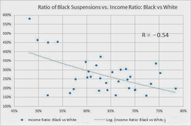
The next variable I add into this analysis is data from the 2010 American Community Survey, specifically, a comparison between Black median income, and White median income. Just as the comparison of Black suspensions vs Black enrollment generates a ratio, the income data also generates a ratio that can be plotted. Graph 5 shows the scatter plot between the presumed independent variable on the x-axis, Black-White median income ratio, vs the presumed dependent variable on the y-axis, Black student suspension ratio. As above, each dot represents a state. For example, in the top left-hand corner is a dot that represents Minnesota, with the highest Black student suspension ratio for those states reporting, with 582%, meaning that Black students are suspended at almost 6x their rate of enrollment, as well as the lowest Black-White median income ratio of all states, with 48%, meaning that the average Black worker in Minnesota makes less than half of the average White worker. The state with the highest (most equal) Black-White median income ratio is Arizona, where the average Black worker makes 78% of the average White worker, and are also represented on the lower half of Black student suspension (197%). Like the graph above, for % Black state legislators vs. Black student suspensions, there is a negative relationship between these variables (r=-0.54), meaning that the lower the Black-White median income (i.e., the lower the level of racial income equality), the higher the Black student suspension ratio. Like the in-class process above, I show this graph to the students and facilitate a brain-storming session where they come up with various testable-hypotheses to explain the relationship between these variables.

It is important to remember that correlation never implies causation. Like the fundamental attribution error mentioned above, when we intuitively 'want' variables to be related by causation, we tend to see the above graphs and presume that % state legislators, and income inequality are contributing to causing unequal Black student suspension ratios. However, since correlation never implies causation, we must resist the urge to presume a causative mechanism. On the other hand, regression analysis, a separate (but mathematically related) statistical process, can be used to imply causation. In this final section, I pull together all three of these variables into 'multiple regression.' While I typically do not personally use the IBM software SPSS for my statistics (I use the open-source software R), SPSS has a relatively easy learning curve, and is available at our campus bookstore (and online) for the IUPUI students, so for the in-class example, I use SPSS to generate the graphic for this analysis, and walk the students through the meaning of several of the key output statistics. The equation for this model, roughly is thus:

Black student suspension ratio = X * % Black state legislators + Y * Black/White Median income ratio

The implication, based on the above correlations, is that there is a relationship between these three structural-level variables. Further, the mathematical/social interpretation of regression, if found to be statistically significant, is that causation can be implied between the independent variables (% Black legislators and Black/White income disparity) and the dependent variable (Black suspensions), which makes it a fundamentally more useful analysis than simple correlation, where causation cannot be implied. In the SPSS output show, I have circled several important parts. First, the "Adjusted R Square" of 0.713 implies that around 71% of the variation in Black student suspension rates in the Unites States can be explained *SOLELY* by these two structural variables of political representation and racial income inequality. Put more clearly, one does not need to presume individual causation in order to obtain a reasonable prediction of what a state's Black student suspension rate will be--i.e., one does not need the (implicitly racist) original hypothesis that "Black students misbehave at higher rates than White students" to explain Black student suspensions. The implication of this is that persistent racial discrimination is adequate to explain the differential rates of suspensions, and not "individual student" factors. What may, at first intuition, seem to have relatively little relationship with school suspension rates--political representation and income inequality--turn out to be powerful predictors, and, in fact, causative forces. Second, and finally, for this "brief introduction" to SPSS for my intro class, I also have them look at the "Standardized Coefficients-Beta" column in the graphic. Respectively, they are -0.665, and -0.703. Without going into a complicated discussion of how to interpret these numbers, they imply that both of these independent variables contribute approximately equally to the Black student suspension ratios, and both are related in negative ways. In other words, like the correlation results, the 'negative' relationship implies that as % Black legislators, and income equality ratio goes up, that Black student suspensions go down, and vice versa, and both of these factors have approximately equivalent causative force. If, for example, % Black legislators had been -0.3. while income ratio had been -0.9, it would imply that income ratio is far better predictor, about 3x more important, than % Black legislators. Here, however, the numbers are close, implying similar levels of predictive use.

For book-length treatments of these issues, I have used two relevant ethnographies in various classes. First, Bad Boys: Public Schools in the Making of Black Masculinity , by Ann Ferguson, who studied the ways that Black and White students were treated differentially in the classroom. Second, a more recent contribution from a Berkeley researcher, Punished: Policing the Lives of Black and Latino Boys , by Victor Rios, who embedded himself with youth in Oakland, CA.

Saturday, July 12, 2014

US Education Data

I spent three frustrating days trying to find data that one would think would be readily available--any kind of education data to compare states going back before 1980.   In fact, I had a hard time finding a good way to compare states prior to a decade or so ago, since standard metrics have changed multiple times.  Even contacting federal education data centers, I was given disappointing answers.  While I thought the Census factfinder web site would be a reasonable resource, their education data only goes back to 2005, prior to which it becomes very much more sparse.  While other resources for education exist on the Census site, much of the pre-1990s data is simply poorly scanned pdf files from the original paper Census books!!  Below is data that I collected for a separate research project (time-series analysis of variables related to political polarization)--I post it simply for anybody else for whom it may prove useful, without having to manually enter page after page of pdf-scanned census data from a different book for each year.  The top table is the original data that I compiled, while the 2nd table contains mostly interpolated data for my other research project.  The easiest data for me to gather consistently was the percent of the population that had a bachelor's degree or higher. Note that Washington DC and Louisiana are not in this dataset--they are absent from the polarization comparison data I was using (but present in the original education data). Due to the limitations of the "blogger" web site, the table likely will look awkward, extending far into the border on the right-hand side of the screen (at least it does on my Chrome browser).

ORIGINAL DATA1970197719801981198519871989199019941998200020022004200520062009
Alabama7.812.211.615.715.220.61922.722.321.420.822
Alaska14.121.123.42324.824.224.725.625.527.227.726.6
Arizona12.617.422.220.319.921.923.526.32825.524.525.6
Arkansas6.710.814.813.312.416.216.718.318.818.91918.9
California13.415.719.621.324.723.526.423.424.726.426.627.931.729.529.829.9
Colorado14.923272728.53432.735.735.535.536.435.9
Connecticut13.720.727.527.22731.431.432.634.5353635.6
Delaware13.117.519.421.421.925.12529.526.927.526.228.7
Florida10.31114.914.816.619.719.818.32122.522.325.72625.127.225.3
Georgia9.212.514.618.41719.118.219.324.520.724.32527.627.228.127.5
Hawaii1420.323.922.924.32426.226.826.627.932.329.6
Idaho1015.817.117.721.820.321.720.923.823.325.123.9
Illinois10.314.516.217.520.220.221.12123.525.826.127.327.429.231.230.6
Indiana8.39.912.510.915.213.313.815.61517.719.423.721.121.221.922.5
Iowa9.113.917.116.919.320.321.223.124.323.824.725.1
Kansas11.41722.321.122.728.525.829.13028.231.629.5
Kentucky7.211.114.913.616.820.117.121.62119.320.221
Maine8.414.418.518.821.219.222.923.824.225.726.926.9
Maryland13.920.427.426.52631.831.437.635.234.635.735.7
Massachusetts12.614201926.126.528.127.230.13133.234.336.736.940.438.2
Michigan9.410.614.315.316.116.517.317.419.122.121.822.524.424.726.124.6
Minnesota11.117.421.521.826.33127.430.532.530.633.531.5
Mississippi8.112.315.614.719.819.516.920.920.118.721.119.6
Missouri913.113.91515.117.921.617.821.322.421.626.728.12424.325.2
Montana1117.521.119.824.323.924.423.625.526.425.127.4
Nebraska9.615.519.718.921.120.923.727.124.827.227.227.4
Nevada10.814.417.215.316.920.618.222.124.520.720.821.8
NewHampshire10.918.223.524.426.226.628.730.135.431.832.132
NewJersey11.813.418.317.921.723.325.724.928.130.129.831.434.634.235.634.5
NewMexico12.717.620.620.424.123.123.525.425.125.126.725.3
NewYork11.913.617.917.822.123.222.823.125.126.827.428.830.631.232.232.4
NorthCarolina8.510.913.216.717.216.618.317.41923.322.522.423.425.125.626.5
NorthDakota8.414.822.218.119.922.52225.325.225.428.725.8
Ohio9.310.913.713.916.11517.61719.821.521.124.524.623.223.324.1
Oklahoma1015.117.117.820.320.520.320.422.922.522.922.7
Oregon11.817.920.220.624.527.725.127.125.927.728.329.2
Pennsylvania8.79.413.614.614.617.218.617.919.522.122.426.125.325.726.626.4
RhodeIsland9.415.420.221.323.927.825.630.127.229.330.930.5
SouthCarolina913.416.616.61821.320.423.324.922.922.624.3
SouthDakota8.61418.417.217.321.821.523.625.524.725.325.1
Tennessee7.912.615.71616.216.919.621.524.321.82223
Texas10.912.816.917.319.819.821.720.320.823.323.226.224.525.225.525.5
Utah1419.924.222.322.827.626.126.830.827.82728.5
Vermont11.51926.724.327.727.129.430.834.232.53433.1
Virginia12.314.319.119.223.123.527.324.526.430.329.534.633.133.232.134
Washington12.71924.122.925.128.127.728.329.93031.431
WestVirginia6.810.411.112.311.416.314.815.915.31715.917.3
Wisconsin9.814.818.917.720.922.322.424.725.62524.625.7
Wyoming11.817.221.918.816.819.821.9 19.622.523.220.823.8


INTERPOLATED DATA1970.01972.01974.01976.01977.01978.01980.01981.01982.01983.01984.01985.01986.01987.01988.01989.01990.01992.019941996.01998200020022004200520062008 (est)20092010
Alabama7.88.28.79.19.310.812.221.015.810.513.316.016.016.013.811.615.715.515.217.920.619.022.722.321.420.821.222.024.8
Alaska14.114.114.014.014.017.621.121.516.110.816.121.522.022.523.023.423.023.924.824.524.224.725.625.527.227.727.326.624.5
Arizona12.613.213.714.314.616.017.415.411.67.714.421.019.017.019.622.220.320.119.920.921.923.526.328.025.524.524.925.623.7
Arkansas6.77.27.88.38.69.710.89.47.14.79.414.012.511.012.914.813.312.912.414.316.216.718.318.818.919.019.018.922.5
California13.414.114.715.415.717.719.621.316.010.717.724.724.123.525.026.423.424.124.725.626.426.627.931.729.529.829.829.930.7
Colorado14.916.418.019.520.321.723.027.020.313.519.625.726.427.027.027.027.027.828.531.334.032.735.735.535.536.436.235.936.1
Connecticut13.714.615.516.416.818.820.725.018.812.520.027.526.826.026.827.527.227.127.029.231.431.432.634.535.036.035.935.639.5
Delaware13.113.714.214.815.116.317.518.213.79.114.018.818.818.719.119.421.421.721.923.525.125.029.526.927.526.227.028.731.0
Florida10.310.510.710.911.013.014.914.811.17.412.016.618.219.719.819.818.319.721.021.822.522.325.726.025.127.226.625.325.6
Georgia9.210.111.112.012.513.614.618.413.89.213.117.018.119.118.718.219.321.924.522.620.724.325.027.627.228.127.927.527.9
Hawaii14.014.715.416.116.418.420.320.015.010.016.022.021.521.022.523.922.923.624.324.224.026.226.826.627.932.331.429.628.4
Idaho10.011.112.313.414.014.915.817.012.88.512.616.717.418.017.617.117.719.821.821.120.321.720.923.823.325.124.723.922.6
Illinois10.311.512.713.914.515.416.217.513.18.814.520.220.220.220.721.121.022.323.524.725.826.127.327.429.231.231.030.637.0
Indiana8.38.89.39.810.011.312.511.08.35.510.315.014.013.013.413.815.615.315.016.417.719.423.721.121.221.922.122.526.9
Iowa9.19.710.210.811.112.513.914.510.97.311.916.516.316.016.617.116.918.119.319.820.321.223.124.323.824.724.825.131.4
Kansas11.412.012.513.113.415.217.014.611.07.314.421.519.317.019.722.321.121.922.725.628.525.829.130.028.231.630.929.532.8
Kentucky7.27.68.08.48.69.911.19.47.14.79.915.013.011.013.014.913.615.216.818.520.117.121.621.019.320.220.521.024.7
Maine8.49.09.710.310.612.514.414.911.27.512.818.217.817.317.918.518.820.021.220.219.222.923.824.225.726.926.926.928.4
Maryland13.914.715.416.216.618.520.421.215.910.618.225.825.324.726.127.426.526.326.028.931.831.437.635.234.635.735.735.737.7
Massachusetts12.613.013.413.814.017.020.019.014.39.517.826.126.326.527.328.127.228.730.130.631.033.234.336.736.940.439.738.248.0
Michigan9.49.710.110.410.612.514.315.311.57.711.916.116.316.516.917.317.418.319.120.622.121.822.524.424.726.125.624.628.3
Minnesota11.111.812.513.213.615.517.417.813.48.915.121.220.820.320.921.521.824.126.328.731.027.430.532.530.633.532.831.537.5
Mississippi8.18.59.09.49.611.012.310.47.85.210.415.513.812.013.815.614.717.319.819.719.516.920.920.118.721.120.619.620.3
Missouri9.010.211.312.513.113.513.915.011.37.511.315.116.517.919.821.617.819.621.321.922.421.626.728.124.024.324.625.230.7
Montana11.011.812.613.413.815.717.518.013.59.014.319.519.118.819.921.119.822.124.324.123.924.423.625.526.425.125.927.430.9
Nebraska9.610.411.212.012.414.015.513.610.26.813.219.517.816.017.919.718.920.021.121.020.923.727.124.827.227.227.327.433.2
Nevada10.811.211.612.012.213.314.412.89.66.411.216.015.014.015.617.215.316.116.918.820.618.222.124.520.720.821.121.821.0
NewHampshire10.911.812.713.614.016.118.219.014.39.516.323.022.522.022.823.524.425.326.226.426.628.730.135.431.832.132.132.035.7
NewJersey11.812.312.713.213.415.918.317.913.49.015.321.722.523.324.525.724.926.528.129.130.129.831.434.634.235.635.234.541.2
NewMexico12.713.414.014.715.016.317.616.012.08.014.320.519.318.019.320.620.422.324.123.623.123.525.425.125.126.726.225.319.6
NewYork11.912.412.913.413.615.817.917.813.48.915.522.122.723.223.022.823.124.125.126.026.827.428.830.631.232.232.332.441.3
NorthCarolina8.59.29.910.610.912.113.216.712.58.412.817.216.916.617.518.317.418.219.021.223.322.522.423.425.125.625.926.528.7
NorthDakota8.49.19.810.510.812.814.812.29.26.113.120.017.515.018.622.218.119.019.921.222.522.025.325.225.428.727.725.835.5
Ohio9.39.810.210.710.912.313.713.910.47.011.516.115.615.016.317.617.018.419.820.721.521.124.524.623.223.323.624.129.3
Oklahoma10.010.911.912.813.314.215.117.012.88.512.416.317.218.017.617.117.819.120.320.420.520.320.422.922.522.922.822.723.3
Oregon11.813.014.215.416.017.017.920.015.010.014.719.320.221.020.620.220.622.624.526.127.725.127.125.927.728.328.629.229.5
Pennsylvania8.78.99.19.39.411.513.614.611.07.311.014.615.917.217.918.617.918.719.520.822.122.426.125.325.726.626.526.434.5
RhodeIsland9.410.010.711.311.613.515.415.811.97.913.619.218.818.319.320.221.322.623.925.927.825.630.127.229.330.930.830.535.6
SouthCarolina9.09.510.010.510.712.113.416.712.58.412.316.316.015.716.216.616.617.318.019.721.320.423.324.922.922.623.224.327.1
SouthDakota8.69.310.010.711.012.514.012.09.06.011.817.515.814.016.218.417.217.317.319.621.821.523.625.524.725.325.225.129.8
Tennessee7.98.59.29.810.111.412.613.510.16.811.115.515.315.015.415.716.016.116.216.616.919.621.524.321.822.022.323.026.7
Texas10.911.412.012.512.814.916.917.313.08.714.219.819.819.820.821.720.320.620.822.123.323.226.224.525.225.525.525.526.0
Utah14.014.715.416.116.418.219.920.015.010.016.022.021.521.022.624.222.322.622.825.227.626.126.830.827.827.027.528.528.5
Vermont11.512.413.414.314.816.919.016.212.28.116.825.522.319.022.926.724.326.027.727.427.129.430.834.232.534.033.733.134.3
Virginia12.312.913.414.014.316.719.119.214.49.616.423.123.323.525.427.324.525.526.428.430.329.534.633.133.232.132.734.037.5
Washington12.713.514.215.015.417.219.019.014.39.515.521.520.920.322.224.122.924.025.126.628.127.728.329.930.031.431.331.030.7
WestVirginia6.87.48.18.79.09.710.411.08.35.58.110.711.412.011.611.112.311.911.413.916.314.815.915.317.015.916.417.322.8
Wisconsin9.810.411.111.712.013.414.813.09.86.512.518.516.815.017.018.917.719.320.921.622.322.424.725.625.024.625.025.729.7
Wyoming11.812.413.113.714.015.617.215.011.37.514.020.518.817.019.521.918.817.816.818.319.821.919.622.523.220.821.823.825.0