Sunday, December 9, 2012

Federal Spending in the U.S.—Healthcare in Crisis? Townsley on the Zakaria Interview of James Baker (12-9-12)

For his show today, Fareed Zakaria interviewed James Baker, former Chief of Staff to Reagan (and the final year of GHW Bush), Secretary of Treasury (Reagan), and Secretary of State (GHW Bush). Zakaria asked him about several foreign and domestic issues. While it is unsurprising that I disagreed with most of his domestic advice, I was surprised to be in agreement with all of his foreign policy advice.

Our first area of domestic policy disagreement was about taxation and spending claims. Regarding the debt and deficits, he was adamant that the problem is not undertaxation, but that we are overspending, parroting the standard Republican dogma. However, I have never understood this position, since the data seems to tell the opposite story. First, as I have shown elsewhere our tax revenues are at the lowest rates since WWII (currently around 15%, compared to 20.6% under GHW Bush; previous low around 16.5% under Eisenhower) and while top marginal rates were as high as the 90s during quite robust GDP growth (post WWII), we are now fighting over a range of the low to mid 30s. Second, spending as a percent of GDP in 2011 was just 1% above Reagan’s spending in 1982-1983: Obama’s 23.9% to Reagan’s 22.9%. Looking at data going back to 1966, you can see in Graph 1, the average spending to GDP ratio for these time periods, which clearly do not evidence a precipitous increase.

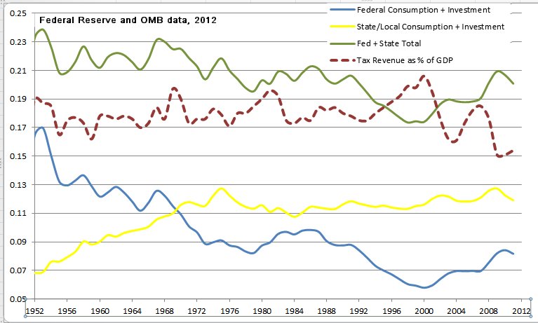
Third, it is true that certain accounts have been moving steadily upward. Graph 2 shows the top 4 budgets as a % of GDP, along with federal consumption/investment. The latter, as I have described elsewhere, is what can be described as the “size of government”—i.e., it is the amount of money that is paid to federal employees, for buildings, roads, NASA, etc. This is discretionary spending that can be enlarged or contracted each year, and since the end of the Reagan years, this spending has declined. As Graph 2 shows, since 1975, federal consumption/spending has gone from a high of 9.8% of GDP, to a low of 5.8% in Clinton’s final year, and as of 2011 was 8.2%. Similarly, “welfare” programs (housing security, food security, unemployment insurance) have remained relatively constant, increasing from 3.9% in 1975 to 4.8% in 2011, with a sudden recent increase associated with the recession.

In contrast, it is the long-term social insurance programs, Medicare, Medicaid, and Social Security that have increased, collectively rising from 3.8% in 1975 to 8.8% in 2011. But it is specifically healthcare costs that have risen the most, with Social Security rising from 2.3% to 3.1% of GDP, while the combined healthcare programs rose from 1.6% to 5.7% of GDP. Given that the solvency of Social Security is not in question by economists, the CBO, nor the Social Security Trustees, and the easiest way to ensure long-term solvency is to remove the cap for Social Security tax (currently at $110k, beyond which you are not taxed), healthcare is the only federal program whose rising costs since 1975 seem to be cause for concern. Baker specifically refers to the dramatic increase in spending, the same phenomenon about which Republicans and Libertarians have been, en masse, frantically referring. But I have not seen data to support this panic.

Healthcare spending is a concern. Zakaria asked Baker how he would solve this problem, and—I am not making this up—Baker answered confidently, “FIX IT!” Zakaria gave him the opportunity to elaborate, but Baker’s response was the standard response from those who claim to want to “slim government,” which is that we must “cut entitlements.” What exactly this means, or what it would look like, Baker left unaddressed.

I do not believe the healthcare spending situation is at a crisis point, nor do I believe the solution involves “cutting entitlements.” Most economists do not believe this either, if what you mean by "cuttting entitlements," is to eliminate or dramatically reduce health care services to the elderly and impoverished families. For example, the Republican talking point of “cut entitlements” presumes that the problem of healthcare costs is that people are consuming too much of these goods on the federal dime. However, medical economists argue that we are simply spending far too much for our healthcare, and that there is too much costs within the for-profit insurance system. The basis of comparison is other industrialized economies, where, not only do they have superior healthcare outcomes, but they do it far more cheaply. Graph 3 shows, that of the top 20 OECD countries, we spend 150% more than the next nearest country for health care per capita, and double the OECD average. If our health outcomes were twice as good as the OECD average, this might seem acceptable. However, many of these countries have a greater lifespan than we do in the U.S., and dramatically lower infant mortality rates. Japan, who currently has the greatest lifespan in the world, spends 2nd to the last of these top 20 countries per capita for healthcare, almost a third of U.S. expenditure. Of the advanced economies, the U.S. is one of only three countries without universal healthcare (along with Turkey and Mexico). So not only do we outspend all other advanced economies in healthcare, and have poorer outcomes for the expense, the other countries are able to cover all of their citizens, while maintaining democratic societies with equivalent or stronger economic growth than the U.S. Thus, the idea that the way to solve the U.S. debt/deficit problems are to “cut entitlements” (i.e., cut government funded health care services to the elderly and poor children) is not based on a reasonable assessment of the data, and thus, Baker’s response to Zakaria’s question is faulty.

Another answer that Baker gave to Zakaria as a solution to our budget problems, with which I disagree, is his belief that a better solution will come from “behind the door” closed meetings. However, I struggle with what he seems to be affirming in this statement. My concern is that he is arguing for less transparency in government, at a time when most people recognize that more transparency is vital for a democratic society. My concern is also, that while there is a vibrant movement that wants to limit government spending (Tea Party), there are a far larger number of voters who expressed their wishes about raising taxes on the highest earners, simplifying the tax code, getting us out of military engagement overseas, and expanding healthcare. National polls find similar results. Is Baker’s hope that if our legislators can shut out the voice of the people, they will vote his way, instead of their way?

Surprisingly, despite these objections to Baker’s domestic policy suggestions, we have three points of agreement on foreign policy. The first, is his affirmation, similar to national polls referenced above, that we need to get out of our overseas military engagements. He believes they lower our standing globally, since they make other countries angry with us and put us in international situations we do not need to be in, not to mention funding issues involved in our bloated military budget. Second, Baker and I agree on the Israel—Palestine conflict--as he states it, “Israel cannot continue to be … a democratic … state if it stays in occupation of all of those Arab lands." He affirms that they need to stop settlements in Palestinian territory and start the engines of peace. He similarly affirms that the U.S. has a large role to play, and that we need to be far more hands-on with the issue, attempting to generate peace through working with both Israel and Palestine. Finally, he believes that Republicans need to revamp their priorities in the coming years if they are to remain a vibrant party, specifically, his belief that they need to focus on economic issues and drop their current focus on regressive social issues. Indeed, Republicans would undoubtedly have done far better in the Senate, and likely Romney's electoral standing, had several Republican Senate candidates not been so outspoken on women's reproductive rights, and how their (mistaken) beliefs would translate into their social engineering policies.

Wednesday, November 28, 2012

Palestine, the UN, the International Criminal Court, and Susan Rice

Palestine will be seeking to upgrade its status in the UN to "non-member observer state." The upgrade is that it will implicitly be recognized as a "state" and will suddenly be granted rights not previously afforded.

Previous attempts to gain official member state status has been thwarted because such efforts must pass the security council. Any permanent member can veto any proposal, a long-standing conflict that blocked any UN Security Council progress during the Cold War, since either the US or SU could halt anything, and neither agreed on anything. In this case the US is the primary state objecting to Palestine's recognition of member status as a state, despite the fact that most of the rest of the world affirms their status. Such a measure would undoubtedly pass in the General Assembly, but fail in the Security Council because of the U.S.

However, non-member status can be granted solely by a vote in the General Assembly. France has recently confirmed it will vote in favor. The UK is confirming that it might vote in favor *if* they promise not to seek standing in the International Criminal Court. This deeply troubles me. It is as if the U.K. has announced to the world--"we know that your people have been suffering grave human rights abuses, and that if you are able, you will engage the international criminal justice system to enforce protections for your people. We can't allow that, so we will only vote for your state's recognition if you promise not to avail yourself of protection from human rights abuses."

Palestine likely doesn't need the UK vote to pass the General Assembly, but having it, now that France publicly supports them, is a critical symbolic step in creating a politically stable environment for the Palestinians.

Further complicating this issue, especially for those opposed to Palestinian statehood (primarily the U.S. and Israel), the dominant voice at the table is going to be the US ambassador, Susan Rice. She is currently under severe attack from Republicans for mistaken comments she made about the recent terrorist attack on Benghazi. Ironically, just at the moment that Republicans need her most--to voice opposition to official recognition of Palestine--they are undermining her capacity to argue for the unwelcome U.S. anti-Palestine position (framed synonymously as "pro-Israel", as if these positions were mutually exclusive).

Monday, November 26, 2012

Benghazi and Rice: Taste of Washington

The most recent politicizing of tragedy, Sandy not-withstanding, has been the scapegoating of UN Ambassador Susan Rice on her Sept 16th appearances on multiple political news shows, answering questions about whether the Benghazi attack that killed Ambassador Stevens and several other U.S. citizens, was a pre-planned terrorist attack, or a spontaneous demonstration in response to an offensive youtube video, The Innocence of Muslims.

The early responose to Rice's claims, first political, then public, had twitter and facebook feeds chattering about an Obama conspiracy, and if nothing else, Rice's incompetence and complicity with some kind of conspiracy. The motivation? Who knows, but a certainly a conspiracy none-the-less. Senators McCain and Graham spearheaded the rhetorical campaigns, first accusing Rice of a lead role in the cover-up, and then agreeing that they would not support her nomination to replace Hilary Clinton as Secretary of State. The fervor whipped up by the anti-Rice/pro-conspiracy theorist dogmatists, created both a media and political glut that continues only slighty abated today. McCain has finally relented and says he would consider Rice, arguably, once he realized that his position was losing factual credibility.

Indeed, the issues involved are of fact, and not opinion, presumably facts that can be determined, despite being complex. Part of the complexity is the failure of many in the U.S. to recognize that "Muslim" is not a single group of clone-minded people, that "al Qaeda" is not a single group of clone-minded people, and that "terrorists" are not a single group of clone-minded people. While most reasonable people recognize that neither all Muslims are terrorists, nor all terrorists are Muslim, there seems to be some confusion that, similarly, not all terrorists are al Qaeda. In this case, the propensity to hear "Muslim terrorist" automatically as "al Qaeda" creates a cognitive stumbling block that has made the Benghazi attack more difficult to frame than is necessary. In this case, the group that has claimed responsibility for the attack is not al Qaeda "proper", but Ansar al Sharia.

While the differences may seem trivial, it becomes fundamentally important to understand the them. Take the distinction bewteen Sunni and Shia--while both groups are Muslim, one cannot understand the Arab-Persian conflicts without grasping this fundamental distinction. Take a U.S. example. Let's say that the primary religious affiliation of individuals who attempt to murder abortion providers is Southern Baptist. First, the investigator must be able to grasp that there are many "kinds" of Southern Baptists--those that self-label as such, but only consider a handful of congregations as God's chosen people, on the most extreme side, and on the other, the denomination that comprises all congregations who are members in good standing of the nationwide organization. There are profound differences between the former and the latter. So to claim that any Southern Baptist should be profiled as a potential abortion provider murderer would be an inefficient profile, because of the differences between sub-identity and larger group. Second, the investigator must also recognize the distinction between various types of Baptists. For example, American Baptists are far more likely to affirm same-sex relationships, while Southern Baptists are not. Third the investigator would need to recognize the distinction between various Protestant groups--Baptists tend to be far different from Lutherans, although both are within the larger group of Protestants. Fourth, the investigator would need to distinguish the sub-types of Christian--for example, Protestant vs. Catholic--very different types of Christian and important belief/behavior differences can be expected. To put the shoe on the other foot, if an African journalist or politician were to claim that "Christians have a propensity to muder abortion providers" or "Protestants have a propensity to murder abortion providers" or, etc, none of those statements would be entirely accurate, since they gloss over a fundamental definitional problem--the minority of "crazies" that one may find in certain sectarian Southern Baptist congregations are not by any means representative of Southern Baptists as a whole, of Protestants, or of Christians, but represent a very specific and unique sub-type of religous adherent.

Back to Benghazi--the question asked of Rice, is whether al Qaeda attacked Benghazi. The answer is likely no. We don't have the full transcript from Petraeus' Friday testimony to Congress. But we know that he gave an answer that contained complexity--the intitial reports indicated anger about the video, and spontaneous demonstrations, but that other early reports indicated planned terrorist activity. We know from other sources that the al Quada-"ish" group, Ansar al Sharia, claimed responsibility for the attack--within hours e-mails surfaced identifying this group. Was this al Qaeda, and was it a planned attack? Maybe, sort-of, kinda.

Scenario one. If the Westboro Baptist Church pickets the funeral of a miltary service person, is it accurate to say that "Baptists picket military funerals?" Only if you really dislike all Baptists and don't mind bearing false witness about them.

Scenario two. If you have weapons in your house, somebody breaks into your house, and you shoot him dead, is it accurate to say that you planned to kill the intruder? Well, you had weapons, and you presumably planned to use them, and you presumably didn't morally object to the use of lethal force--but it would likely be a stretch to say that you actually "planned" to kill the individual.

Scenario three. If the Westboro Baptist Church protests the clinic of an abortion provider, you, a non-Westboro affiliated Baptist, see that there is no police protection at the clinic, and that the scene is in complete disarray, so you go home to get your weapons, return and kill the abortion provider, would it be accurate to say that 1) the Westboro Baptist Church killed the abortion provider, or that 2) the Southern Baptist Church killed the abortion provider, or that 3) the murder represented a pre-planned attack? In the first two cases, likely not, despite there being some loose religious and political affiliation. In the third case, also probably not--the individual likely had wanted to commit the murder, and already had weapons available, and simply opportunistically took advantage of the situation for his own benefit of something he had, in the abstract, wanted to do at some point in the future. That represents a different frame than if the individual had made a specific, coordinated plan to kill the abortion provider on this given date, using this specific procedure.

In the case of Benghazi, the unfolding narrative, seems to be that there were both anti-video demonstrations, *and* the availability of opportunity for an al Qaeda-"ish" group, Ansar al Sharia, to wreak some havoc. Joe Klein reports this narrative based on his interviews, defended it this morning on Morning Joe, and while ridiculed by Scarborough, seems to be the narrative of the administration. The Navy Times reports extensively on Petraeus' testimony to congress, as well as the evidence to date, which seems to support Klein's narrative. Similarly, regarding the charges of "conspiracy," the New York Magazine says that, yes, a conspiracy existed, but a conspiracy to catch terrorists, which is what the Petraeus testimony supports. From the beginning of the evolving situation, even Fox News reported that Ansar al Sharia was behind the attack, affirming some of the early intelligence, as well as its status as a local, isolated "militia," not al Qaeda proper, and not part of a "pre-planned" orchestrated action. The chronology seems to have been, that the anti-video demonstrations created a situation that was rife with possibility for Ansar al Sharia, and the multiple-waves of activity reports support the narrative that Ansar al Sharia returned in the subsequent waves to perpetrate the attack, once they realized that security was lax.

So the larger question, as Klein emphasizes, is not whether there was an Obama-led conspiracy, but why was there lax security for the diplomat. On the one hand, he argues that Stevens wanted it that way, because of his opinion that the effective diplomat had to be out and among the people. On the other hand, is that a reasonable strategy in a country like Libya. In the end, Klein's question is about the kinds of conversations we need to be having in Congress and the State Department about diplomat security. On the one hand, our military budget is 20% of the federal budget, while the State Department budget is 1%. In addition to paying the diplomats themselves, security for diplomats also comes out of the State Department budget. Even the conservative Christian Science Monitor reports that the same Republicans who were attempting to blame the Obama administration for failed security at Benghazi, are the ones who have been lobbying to "aggressively cut spending ... for embassy security in particular." Not to be partisan (I didn't vote for Obama), but it seems that there may be a conspiracy after all, but on the part of Republicans attempting to wield rhetorical swords to incite public wrath against an opponent, not on the part of the Obama administration. But, that's just the taste of Washington. Nov 29 Update: In a meeting with McCain, Graham and Ayotte, Amb. Rice stated that the early intelligence was incorrect, that there was no protest in Benghazi the day of the attack. Acting CIA director Morell confirmed the incorrect early intelligence, and is similar to Petraeus' testimony (linked above, and again here) stating that "initially was unclear whether militants infiltrated a demonstration to cover their attack." After the hearing, McCain and Graham renewed their early opposition to Rice's unsubmitted nomination for Secretary of State. On the contrary, Sen Inhofe, GOP reprentative of the Foreign Relations Committee, an early critic of Rice, has shifted his views in the opposite direct after Rice's testimony, who now believes she was told an incomplete version of events, and bears no responsibility for the mistaken early comments. Sen Collins, soon to be GOP head of the Foreign Relations Committee, currently on the Homeland Security Committee will have a meeting later this week with Rice. Unlike Graham and McCain, she and Lieberman have not been willing to make public statements against Rice.

Thursday, November 22, 2012

The Men Who Built America (History Channel Documentary Series)

The History Channel aired a 6-part series called "The Men Who Built America," creating a compelling narrative about the mid-1800s capitalists, emphasizing the importance of entrepreneurialism in the development of the modern United States, in addition to how those early businesses succombed to power and wealth to create destructive monopolies. Below is a summary of the show, based not on the linear chronology of episodes, but by the men the show highlights. Vanderbilt Ferries to railroads. Built the only railroad bridge into NYC. For revenge, he shut down the bridge, choking off the only way from NYC to the rest of the country. The competing RRs began to collapse, selling their stocks for almost nothing, Vanderbuilt bought them all, controlling 40% of the existing RR. He continued to build, creating 180k jobs and allowed the industrial revolution to distribute their goods. The process of buying a controlling amount of stock is Vanderbilt’s idea, called the hostile takeover. Rockefeller Paired with Vanderbilt to have the exclusive transportation of refined kerosene, calling it Standard Oil. Kerosine was the method of lighting homes, and Rockefeller refined it. Having made a deal with Vanderbilt’s competitor to create a corner on the oil transportation business, he bought out other refineries, to control 90% of US oil at 33 yrs, creating a monopoly. This also allows him to manipulate the prices he pays for transporting the oil. Vanderbilt creates alliances with the other railroads to try to force Rockefeller to pay market rates. This forces Rockefeller to innovate, developing overland oil pipelines. In 1873, this forced 1/3 of RRs into bankruptcy, the worst stock exchange crash in history, closing for 10 days, putting the US into a depression and major unemployment. Rockefeller takes advantage of this by buying the bankrupt companies. After electricity eliminates the need for kerosene, he funds the research to discover a use for a former waste product, gasoline, to produce the internal combustion engine for factories, and then for cars. After his empire is broken apart by federal anti-trust lawsuits, he became the wealthiest man in the world from being a shareholder in each of the subsequently derived companies. Carnegie His mentor, Scott, was the rival RR owner to Vanderbilt, who allied with him to bring down Rockefeller. However, Rockefeller cut off Scott’s supply of oil, bankrupting his company, and leading him to poor health, then death. Scott originally contracted Carnegie to build a bridge across the Mississippi to St. Louis, leading Scott to the discovery that steel would be the only way to do it, and pioneering ways of mass manufacturing of steel, previously limited to small items like silverware. With the success of the bridge, demand skyrocketed until the RRs failed, the main purchaser of steel. Carnegie had huge supplies, but falling demand, so found a new use for steel as unemployed flocked to cities to find work—building structures, and thus the skyscrapers were born. When JP Morgan bought his steel company, it made him the wealthiest man in the world. JP Morgan Morgan took industries that were market failures, like RR, and brokered deals between the failing competitors to buy their shares and lease them to a single RR owner-Morganization, or the restructuring of companies to eliminate waste, minimize competition and workforce, and maximize profits. He discovered Edison’s genius, and financed his research, wiring his house for electricity to use some of the first light bulbs, creating a “display house” for electricity—the first in the world. Edison becomes busy electrifying the homes of the elites, like Vanderbilt—but not Rockefeller. Morgan and Edison together form the Edison Electric Light Company, and Morgan funds the infrastructure to electrify of Manhattan using DC. Rockefeller wages an anti-electricity publicity campaign of fear. Tesla, a jr employee of Edison, invents AC and finds an investor in Westinghouse, since Edison refuses to acknowledge the innovation. Westinghouse wins the contract to power the Niagara Falls power plant, which intended to power the entire northeast. Morgan acquires Tesla’s patent rights, and buys all the stocks in Edison’s company, changing the name to General Electric, converting it to AC. Morgan twice bailed out the US government, saving it from financial collapse. Morgan bought Carnegie’s steel company for a price larger than the US federal budget, renaming it U.S. Steel, the monopoly for steel for 100 years. He later helped finance the Panama Canal. The Progressive Movement The monopolies/trusts were taking over. Public opinion and politicians, such as William Jennings Bryan, moved to legislate against the monopolies and prosecute them. The average worker earns around $1/day, 1/11 steel workers die on the job, the average family lives on <$100/mo. The threat brings Rockefeller, Carnegie and Morgan into an alliance to get McKinley, also an industrialist, elected instead of Bryan for the 1896 presidential campaign. Industrialists threaten workers with layoffs if Bryan won—90% of eligible voters turned out—McKinley won, leading to 36 years of Republican control (except for Woodrow Wilson). McKinley rolls back regulations and corporate profits again skyrocket. With the vice-presidential role historically being quite powerless, McKinley is convinced to put Teddy Roosevelt, a great enemy to big business, as VP, but the plan backfires when an anarchist assassinates McKinley shortly after he won his 2nd term. Roosevelt sued Morgan, the 1st federal anti-trust case, winning, breaking apart the RR monopoly, followed by a similarly successful anti-trust suit against Rockefeller’s Standard Oil based on the Sherman Anti-Trust Act of 1890. Ford Ford wanted to extend cars to the population, at the time under control of ALAM, the “auto cartel.” He continues produce cars, facing a lawsuit by ALAM, while positioning himself as anti-trust and pro-competition. He paid his workers a $5/day, gave them an 8-hr day, 5-days a week, in a safe working environment, as well as creating the assembly line to produce cars 8x faster than the next leading car manufacturer. As Rockefeller’s empire is broken apart by the anti-trust lawsuit, Ford wins his case against ALAM.

Sunday, November 18, 2012

Is the "Debt Crisis" a "Crisis" (Part 2)

Last year as the Tea Party blocked the congress from submitting a budget because of their belief in the dangers of an impending debt crisis, I posted several charts that I use in my Intro Class, in "Is the 'Debt Crisis' a 'Crisis' Part 1. Now that we are again approaching budget talks, with the narrative of the "fiscal cliff" and "overwhelming debt that turn the U.S. to Greece," I am posting a second analysis of the non-crisis of the "debt-crisis."

There are several assumptions in the "debt-crisis" narrative that create a viable story, all of which are faulty, most of which are beyond the scope of this post. For example, the idea that we have a spending crisis, because of the belief that Obama has dramatically raised spending, when in fact, as I have shown in an earlier post, federal consumption+investment spending has, for the last 20 years, been consistently at its lowest rates since WWII. This is the "flexible" spending that presidents get to do, and is more technically the "size of government," since it pays for road repair, other immediate infrastructure, federal bureaucrats, federal buildings, etc.

Another common misconception is that the "entitlement" programs are on a clearly unsustainable trajectory, whether you are talking about safety net support for the poor (food security is consistently 2-3% of the federal budget), or Social Security+Medicare+Medicaid, which, as a % of GDP, has indeed doubled since 1970 and is only expected to increase. However, medical economists have shown that half of the rise in Medicare+Medicaid costs are from poorly controlled healthcare costs, not simply a dramatic rise in coverage. Several studies (summarized last month in this PBS report) have shown that we pay twice as much per capita for healthcare than our nearest price-neighbors (Japan and the UK), and our health outcomes are worse. A large chunk of the rise in these federal health programs can be fixed by getting our healthcare costs to expected market levels. Similarly, the Social Security Trustees have reported that with no changes, the fund is solvent until 2033, and by uncapping the $108k current tax limit, the program would be solvent until 2050. There are several other very easy fixes for Social Security's long-term solvency.

A more "wonkish" question is whether the "debt crisis" is, from an economics perspective, a crisis. I address this in several ways from the "Part 1" essay. I have done some more work on the problem, still using the cross-country analysis. The International Monetary Fund has recently compiled a very cool database ("cool" to the nerds among us) that lists the debt to GDP ratio of every IMF member state much farther back than other databases list. For example, the database lists the UK's ratio back to the 1600s!

I used this database, along with the OECD GDP Growth rate data for the top 30 countries to look for a relationship. Using "R" and the "PLM" package for analyzing cross-sectional time-series (panel) data, I looked at the years available from the OECD, 1993-2011. Using a 2-year lag for each individual country (i.e, to see if, for example, the Australian 1993 debt:GDP impacted the 1995 growth rate for Australia) and a fixed-effects (within) model, I found a small, but significant positive relationship between debt and growth. This is counter to the claims made by the fiscal-terror narrative. Specifically, I found an estimate of +0.025 (p=0.009), implying that for every percent the debt:GDP ratio increases, growth tends to increase by 0.025 the 2 years after.

Intuitively, there is bound to be a limit. However, consider Japan, which has had, for several years, by far the highest debt:GDP of all the top economies, averaging 192% over 2005-2009!! In 2009 their growth rate plummeted to -5.5%, but the following year bounded back up to 4.4%, with their debt:GDP ratio only continuing to increase during that time. Poland's growth over the last 5 years has been the strongest of the 30 countries, averaging 4.3%, while its debt:GDP is 17th of 30, averaging 48%. Isreal's growth rate is ranked 3rd for that time period, at 3.8%, while its debt:GDP places it in the bottom 5, averaging 82.6%. In contrast, Denmark's growth is near the bottom, averaging -0.5, while its debt:GDP is among the best, averaging 41%. The relationships are undoubtedly complex, and likely are influenced by regional and local effects. However, if the presumption by the Tea Partiers is that high debt:GDP means economic disaster, there is no evidence for that at all, and in fact, my time-series analysis seems to indicate the opposite.

Below I have included a chart that demonstrates some of the complexity. I have chosen several of the top and bottom GDP growth countries. For the 17-year period in question I have plotted their debt:GDP (y-axis) against their GDP growth (x-axis). The closer the dots to the top of the plot, such as Japan, have the highest debt:GDP ratio, and near the bottom, such as Australia, are the lowest ratios. The dots closer to the left of the graph have negative growth rates, and moving right means higher growth. The trend-lines for each country indicate the relationship between debt:GDP and growth. Take Japan's line, near the top--it has a slightly negative slope, indicating that the higher its debt:GDP ratio, the slower the growth. On the other hand, take Australia's line near the bottom-right. The positive slope indicates that higher debt:GDP is followed by higher growth. For clarity's sake, I did not plot all 30 countries, but the majority have positive slopes. In fact, a simple correlation supports both of these findings, with the average correlation being positive (r=0.22), again, indicating that higher debt:GDP tends to be followed 2 years later by GDP growth.

Friday, November 2, 2012

US Party vs Economics Stats

A quick data post. The following charts have a lot of information in them (they are identical, except the top has been Hodrick-Prescott smoothed; the 2nd is the raw data graph)--3 economic plots, and the background colors represent party majorities. Dark red means Republicans in the presidency, house and senate. Dark blue means Democrats in the presidency, house and senate. Light red mean Republicans held 2 of the 3, light blue means Democrats held 2 of the 3. GDP Growth is '% change from previous quarter' (each quarter plotted as 3 months with the same number), Employment Growth is '% change from the previous month' and Unemployment is total unemployment rate. I only took the data back to 1990. The period from 2001-2002 when there was a tie in the senate, I count that as a Republican hold, since the Republican VP could break a tie. The period where Independents tend to caucas with Democrats, giving them the majority, I count as a Democrat hold.

Friday, September 14, 2012

Need a Job? Move Here

Need a job? According to the BLS data out this month (as of July), several metropolitan areas in the country have an unemployment rate of less than 5% and getting better. Bismarck, ND, started the year with 3.8% unemployment, and as of July, is at 2.5%. However, their labor force is less than 65,000 people, and not ever having been there, I don't know how many workers they could absorb. On the other hand, Oklahoma city has an unemployment rate of 4.8%, down from 5.9% in January, with a labor force of over half a million--surely they could absorb you if you headed out west. Here is a list of the recent data, my pick for the top 10 cities where you might be most likely to find a job--I haven't factored in cost of living, average wages, or the type of jobs that might be available, so caveat emptor.

MetropolitanJan-Mar UnemploymentApr-Jun UnemploymentJuly Unemployment Labor Force Employed
Bismarck, ND3.72.72.5 62,597
Fargo, ND4.23.33.3 117,788
Sioux Falls, SD4.73.94.0 126,914
Rapid City, SD4.94.34.3 66,573
Billings, MT5.14.74.6 84,983
Dubuque, IA5.84.54.6 51,893
Oklahoma City, OK5.44.54.8 564,666
Des Moines, IA5.95.15.1 300,821
Tulsa, OK6.45.35.4 419,866
Barnstable Town, MA9.16.05.6 141,342

Saturday, September 8, 2012

Marion County Redistricting 2012: The Sequel

Whenever a political party realizes future (or current) demographic trends are not in its favor, aggressive redistricting is an inevitable result, presuming it has the foresight and skill to analyze such data. According to the Marion County Election Board voting results, in all of the last three elections, voting has been predominantly Democratic, which is typical of large cities in all states. In the 2010 election, straight party voting was 57% Democrat and 42% Republican. in the 2008 election, straight party voting was 63% Democrat and 37% Republican. President Obama won the vote with an even larger margin. Off-cycle election, like the 2010 and 2011 elections tend to be dominated by older voters, who lean conservative, therefore so do those elections, while voting in the presidential cycle tend to represent the broader population--which, in large cities, is strongly liberal. So the fact that since even our off-cycle elections have a 15% Democrat lead, means potential voting problems for the Republican Party in Marion County.

Currently, in the employ of Marion County, we have professional geographers and trained GIS specialists, who work on various mapping projects for us tax-payers, and have decades of experience with the nuances of Marion County geography, property lines, and political boundaries at all levels (school corporations, neighborhoods, townships, cities, tax districts, etc). However, last year, rather than tasking these specialists to independently create Marion County voting districts, the Mayor and Republican-dominated city council paid a Republican activist attorney to do both the reprecincting and redistricting, based on the new 2010 Census data, a legal obligation for the county to update its voting districts to fairly represent its populace. This attorney's qualifications for mapping is, and I quote, "I attended a seminar on redistricting." Unsurprisingly, the new precincts are highly problematic, crossing many existing legal boundaries, and having wide, and unreasonable variations in population. That assumes his data is correct. However, I have been unable to replicate his population statistics. Of the 600 precincts, my analysis indicates that 275 have different populations than what he published. One of the city-council requirements of new districts is that all of the district populations are with 3% of each other. According to the published population data, the new districts satisfy this requirement. However, according to my analysis, the districts vary by far more than this, with two districts having a population deviation of over 40% (proposed districts 14 and 16), with an average deviation of 20% (over 7,000 from a population ideal of about 36,000). If my analysis is correct, then not only are the new proposed districts technically inaccurate, but they are illegal, since they do not meet the requirement of new districts. The city-council and mayor were also warned by city GIS experts that there were problems with the new precincts, but those warnings were ignored. Subsequent to the publication of the new districts, the newly elected Democrat-dominant city-council has been working to commission an alternate redistricting, but the mayor is refusing to authorize any funds for the project. Last year the city paid over $250,000 for the project, with the money going to this Republican lawyer with no training in GIS or geography.

Table 1
Current Proposed New Districts (Brooks, 2011)
Proposed
Districts
(Brooks, 2011)
Population%Black%HispanicDemRepPartisan
Difference
NEW-09 29,721 66%3%83%13%70%
NEW-07 39,942 47%7%77%19%58%
NEW-10 26,401 54%22%76%20%56%
NEW-13 38,201 64%7%76%21%55%
NEW-11 36,401 42%9%73%21%52%
NEW-14 36,843 57%13%73%23%50%
NEW-08 23,986 53%8%72%24%48%
NEW-17 33,536 43%10%68%25%43%
NEW-25 38,427 4%4%26%66%40%
NEW-20 37,113 3%5%30%61%31%
NEW-01 31,889 39%15%62%32%29%
NEW-24 27,787 3%7%31%60%29%
NEW-23 30,445 4%7%31%60%28%
NEW-06 38,211 30%22%56%37%19%
NEW-18 23,544 11%6%38%53%15%
NEW-22 31,164 11%12%38%53%15%
NEW-12 34,957 20%11%53%38%14%
NEW-05 27,415 15%10%41%52%11%
NEW-19 34,591 21%7%41%51%10%
NEW-16 31,967 11%13%42%48%6%
NEW-04 35,464 22%7%44%50%6%
NEW-03 35,228 20%4%44%50%5%
NEW-02 34,939 10%6%45%48%3%
NEW-15 40,321 26%15%48%45%3%
NEW-21 16,411 12%9%47%45%2%


In their effort to get alternative maps, the city-council worked with Common Cause to involve the public in the redistricting effort. Common Cause is a national organization whose goal is to maximize citizen participation in politics and organize non-partisan civic participation processes. For example, in matters of redistricting, they advocate for independent commissions to lead this process, rather than a Party. In support of this project, I created my own set of maps, with the goal of maximizing district competitiveness. I minimized other factors in my maps, like keeping intact communities of interest, compactness, and contiguity of districts. The latter terms represent attempts to minimize gerrymandering, by emphasizing that districts must "look reasonable"--i.e., rather than having meandering districts that are clearly designed to maximize partisan votes and exclude the minority party (or race), "nicely shaped" districts will ideally minimize these partisan shenanigans. However, several analysis of these factors indicate that they exacerbate problems rather than solve them. For example, by definition, once you enclose "communities of interest" into one district, you isolate them politically from their neighbors, and they will, more than likely, tend to vote similarly, producing highly partisan districts. Further, because of the natural clustering of communities of interest, the factors of compactness and contiguity can also produce the same effects. We see this in Indianapolis, in that the Democrat vote is clustered into an oval in lower northside, while the Republican vote is clustered in south Marion county and along the periphery. So while these three factors that are intended to subvert partisan gerrymandering have positive intent, they can create the same problems as intentional gerrymandering, but insidiously "look" like a neutral process. I argue that a more reasonable approach is to actively create competitive districts, which will then encourage politicians into political reasonableness as they hear from a diverse constituency, rather than forcing them to extreme positions when isolated constituencies have only themselves with whom to discuss political ideas.

MAP 1: VOTING PATTERNS (4 ELECTIONS AVERAGE, 2010-2011)

I have generated three maps and three tables. The first map (above) is simply a "heat map" of voting (based on an average of 4 elections from the last 2 years). The blue represents <40% Republican voting, while the red represents >60% Republican voting. Beige represents areas of political evenness, between 46-54% Republican voting. A similar map could be created to represent Democrat voting patterns, which looks almost identical. The first table (above) represents population and voting statistics of the districts created last year by the previous city-council (representing my analysis of the data, not the analysis that the attorney submitted to the council that accompanied his maps; ordered by least competitive). As can be seen, the new districts are 75% safe, with safety defined as one party having at least a 10% advantage over the opposing party. This is great for the favored party, who has to do little to win the district. For example, in many districts the minority party often chooses not to run a candidate, since there is no chance for a win, thus facilitating the establishment (or even the political requirement) of candidates who have extreme positions and may thus be unable to make any political compromises with the candidate in the neighboring district, creating legislative gridlock, none of which is in the public interest.

MAP 2: TOWNSLEY PROPOSED NEW DISTRICTS (COMPETITION OPTIMIZED)


Table 2
Townsley Proposed Districts #1: competitive Districts Optimized (2012)
Proposed
Districts
Population%Black%Hispanic%Dem%RepPartisan
Divide
D123659269%5%82%13%69%
D113652152%6%79%16%62%
D43683753%16%74%21%53%
D133621257%15%73%22%51%
D33656547%10%69%26%43%
D25358653%3%26%66%41%
D23368703%5%28%63%35%
D103625340%22%64%30%34%
D53624623%3%61%32%29%
D24360684%8%31%60%29%
D22358625%5%32%60%29%
D23569033%13%56%38%19%
D173576321%14%54%37%18%
D193618513%6%41%50%10%
D143582320%16%43%49%6%
D18353939%8%43%49%6%
D83681224%6%44%50%6%
D93650832%5%50%44%5%
D213654931%9%49%44%5%
D73570130%7%49%45%4%
D153552917%15%47%44%3%
D163564314%12%44%46%2%
D13565424%11%47%46%1%
D203530227%8%46%47%0%
D63665915%5%46%46%0%


The second map represents a set of districts that maximizes political competitiveness. I have to admit that I am not happy with the districts. As can be seen in Table 2, over half of the districts are still safe for the dominant party. However, in contrast to the districts proposed last year, which have 9 districts with over 40% safety, my maps only have 6 districts with over 40% safety, and 12 districts that can be considered competitive (7 for the proposal from last year). While it is theoretically possible to make all 25 districts competitive, what would be sacrificed is the "reasonableness" of how the districts looked. I attempted to compromise between competitiveness and the "compactness/contiguity" standards. The third map represents a compromise based on existing school districts, attempting to minimize district boundary violations with school districts. As expected, the population deviations from ideal between districts are far larger than the first map, but I was able to maintain a relatively high number of competitive districts.

MAP 3: TOWNSLEY PROPOSED NEW DISTRICTS #2: SCHOOL DISTRICTS OPTIMIZED


Table 3
Townsley Proposed Districts #2: School Districts Optimized (2012)
Proposed
District
Population%Black%Hispanic%Dem%RepPartisan
Difference
D123593024%11%84%14%70%
D113580019%7%80%17%63%
D43621951%78%76%21%55%
D133550743%15%75%23%52%
D253418353%64%27%70%43%
D33659339%25%69%26%43%
D103436529%8%67%32%35%
D233709851%10%28%63%35%
D223562725%11%32%61%29%
D243618520%21%31%60%29%
D53578643%30%62%33%29%
D23806837%53%53%35%18%
D17367134%8%53%36%17%
D19321975%6%46%57%11%
D14346163%4%45%51%6%
D18381643%7%39%45%6%
D93512321%9%52%46%6%
D213582320%25%50%45%5%
D83790733%12%43%48%5%
D73465217%7%51%47%4%
D15363829%9%46%43%3%
D163716712%17%42%44%2%
D63736420%4%46%45%1%
D13966564%5%42%42%0%
D203596815%13%46%46%0%

Tuesday, August 28, 2012

Marion County 2008 Presidential Election Mapped!


Did you ever wonder what the political distribution was in Marion County? This Thursday, Common Cause is hosting a "Redistrict Indianapolis" all-day session at IUPUI (11 a.m. until 7 p.m. in Room 409 of the Campus Center at 420 University Ave; http://drawmarioncounty.org/). In preparation for this event, I have been working on the redistricting project I began last year using Quantum GIS, and the block-level Census and ACS data from 2000-2010. The map above is the precinct-level voting pattern of Democrat vs. Republican for the 2008 Presidential election. Blue is Democrat, red is Republican. Dark colors were >70% votes for that party, light colors are between 55-69% for that party, and white is 46-54%, which I considered a "swing" precinct.

By comparison, below is a map of the mayor's election last year. Very profound differences...

Friday, August 24, 2012

Corporate and Property Taxes are the Devil. Or Not.

In their book, Taxing the Poor, Newman and O'Brien test a two-fold hypothesis. First, as the "good Liberals" they are, they test the idea that higher taxes are required to build infrastructure and maintain community functioning, using variables such as individual-level health outcomes. Second, counter to expectations, they assert that we need to severely limit welfare spending in the South, especially the working poor. Their surprising argument is that federal programs like WIC, food stamps, and the Earned Income Tax Credit, primarily distributed to the working poor, actually become welfare to corporations. They build the case that when the federal safety net provides benefits to the working poor, it incentivizes and allows corporations to continue paying their employees wages that are below minimal living standards. Currently, a full-time worker at minimum wage would earn less than $15,000 a year, most of whom do not obtain any benefits, like sick-days or health insurance.

Their case is built on reconstructing a history of taxation in the various U.S. regions. The North, historically, has higher corporate and property taxes, which are state-level taxes, and get used for state-level projects. The South, on the other hand, had a successful series of tax revolts, especially after freed Blacks started going to school, using public resources that required the formerly “whites-only” usage to extend to a broader base. These new public resource consumers, in this case, typically did not own property, so it was argued that they were not paying for these resources, like education, roads, and fire and police protection. These Southern-based populist anti-tax revolts were driven primarily by property owners, who legislatively shifted state tax revenues from property and business to general sales tax, with the idea that all citizens end up paying into the system based on use and value—except property. Two states, Mississippi and Alabama, even continue to tax food. “Regressive” tax patterns like this ignore the fact that if you are at or below the poverty line, a 5-10% sales tax ends up being a far larger percent of your income than if you are middle or upper class, especially when they are necessity purchases, like food.

Most of these same stats also have very low corporate tax rates. The political argument is that lower corporate tax rates will attract businesses, which create jobs, thus creating a strong economy. Newman and O'Brien's data indicate that while this is true--unemployment has historically been lower in the South than in the North--the South still consumes far more Federal welfare resources per capita than any other region of the country. This paradoxical situation is explained by the fact that the jobs found in the South are far more likely to be low-paying service-level jobs, and therefore are not making enough to sustain a family. Indeed, their data indicates that those states in the South with the lowest property and corporate taxes also have the highest populations who qualify for food and housing assistance because of low wages.


In the charts above, I recreate Newman and O’Brien’s findings, using current data, not only providing support for their thesis, but finding that these regional differences still exist. The first graph compares corporate tax rates in each state versus the percent of children in that state with no insurance. The other two graphs compare property taxes versus the percent of the population of that state who qualify to receive the Federal Earned Income Tax Credit (i.e., those people who worked in a given year, but did not earn enough to get them above the poverty line, thus qualifying for a "tax credit"), and the percent of the population who qualify for the Federal Women, Infant and Children program. The straight black line is the “trend line” (using a least squares estimate). In each of these three cases, there is a directional trend--the lower the state corporate and property tax rates, the higher that state's requirement for federal aid to support a low-wage population

The table below the graphs shows three regions--Northeast, Midwest, and the South, documenting several tax and social-economic indicators. These relationships document a similar pattern as the graphs, but show more variables, such as the percent of the population who qualify for food stamps, the general population with no insurance, per capita income, and economic growth for 2012. In each case, a clear progression is evidenced: the Northeastern states are doing better on all of these social-economic outcome measures, the South is doing the worst, and the Midwest is in the middle. The theoretical link between these outcome measures and state tax rates, both corporate and property, is Newman and O'Brien's thesis that these state revenue sources allow states to take care of its population, without having to rely on federal aid—this data supports Newman and O’Brien’s original findings.

A related argument, is the relationship between taxation and economic growth. The neoliberal hypothesis is that higher tax rates lead to lower growth, since higher taxes limit the "job creators" ability to re-invest in their business, and similarly disincentivizing external investors. They propose that higher taxes are also related to lower worker wages, and higher prices, when business owners pass their losses on to their employees and the buying public. Each of these is proposed to limit economic growth. However, contrary to this prediction, higher tax rates in the Northeast are related to stronger economic growth, as measured by both GDP expansion and per capita income, compared to lower tax rates in the South which are related to lower economic growth. This pattern is evidenced in international data as well (Brady, 2010, Rich Democracies, Poor People).

Finally, given that our federal tax revenues are as low as they have been in 60 years (see my analysis here: http://fallcreekrenovation.blogspot.com/2011/08/does-half-population-pay-nothing-in.html), does that mean all taxation is decreasing? Not at all--in fact what states have discovered is that as the national outcry against federal taxes becomes louder, national politicians respond by cutting federal budgets, leading to lower state subsidies—budgets requires for public goods such as roads, health, welfare, education and public safety. Given that these kinds of expenditures have a limited ability to be reduced and still allow for efficient public markets, states and cities have had to increase their budgets concordantly. The table below shows this trajectory. The blue-line, federal spending, has decreased substantially since 1952. However, the yellow line, representing state and local spending, has had to increase to keep up with federal losses.


Newman and O'Brien's argument is, on the surface, a typical "leftist" argument that there is nothing wrong with higher tax rates than what we currently have, and especially they argue for "progressive" tax systems that require the wealthy to put more back into the system than the poor. However, their secondary argument, is that businesses and property owners have a role in providing for the public good and the welfare of both their workers and the community in which they reside. The Southern pattern of attracting businesses by minimizing their tax rates is great for business profits, but it does little to provide funds for community infrastructure. Similarly, the data indicates that businesses that are willing to migrate to these low-tax states are often the same businesses who fail to provide a living wage or healthcare for their employees. This double-strike against communities becomes evident in the greater reliance on federal aid to supplement the wages that the businesses should be paying, and the health insurance that these businesses are not providing. In the end, while the expected "leftist" argument in the book might be that we need to strengthen the federal welfare system, the authors instead seem to argue that these resources should be provided at the local/state level, by requiring greater investment by corporations that do business in a given state, and property owners who enjoy the services of these low-paid workers.

Wednesday, August 15, 2012

Swinging in the United States

We are all familiar with "swing states"--those states that the pollsters and pundits believe are "up for grabs" for the presidential race, those states that cannot be predicted with some high degree of certainty which way they will vote, and thus to whom their electoral votes will go. On Jon Stewart tonight (Aug 15), Brian Williams of NBC news said that the road to the presidency is not even about "swing states," but is about "swing counties," and that there are about 12 of them. I just happen to have a spreadsheet with the presidential voting records for the last 3 elections by county. I did some analysis of this data.
I used the map from http://fivethirtyeight.blogs.nytimes.com/ to generate a list of the 9 states that they have listed with <81% probability who will win it: CO, FL, IA, MO, NC, NH, OH, VA, WI. Then I created 2 separate lists from my data set. The first list is all counties who had a swing in the last 3 elections, with just the last election having been a <5% win, and in swing states. The second list was of the counties in the U.S. with "close" elections for all of the last 3 elections (the victor having won with <5%), had "swung" in any of the last 3 elections to either side, and in swing states. Here are my two lists:
LIST 1LIST 2Swing States
Unemployment %
(June, BLS)
Electoral
Votes
FLFlaglerCOGarfieldNH5.14
IAGreeneIAGreeneIA5.26
IAPalo AltoIAIowaVA5.713
MOJeffersonMOBuchananMO7.110
MOWashingtonMOWashingtonOH7.218
NCCaswellVANorton CityCO8.29
NHHillsboroughFL8.629
NHRockinghamNC9.415
OHClark

Combining these lists leaves 14 likely swing counties. No county from WI made either list, so can be presumed an Obama win, despite Romney's pick of Paul Ryan for VP (Obama won WI the last election 56%-42%). Four MO counties are swing, and total, they comprise 6% of the state's voter turnout from 2008--all four went to Obama, but not by much.
Unemployment is often a key predictor for elections--the current national average is 7.5% (BLS, June). In this case, MO still goes to Obama, because they are below the national average with 7.1%. NH, IA and VA all have unemployment < 6%, so are likely Obama wins. OH is on the border with 7.2% unemployment, and CO, FL and NC are all above average, ranging from 8.2-9.4%. If we use these as predictors for the electoral votes, (above average unemployment states go to Romney, and below average go to Obama), then Obama wins 286-252. However, most pundit models give MO to Romney, in which case Obama still wins 276-262.
Despite my county-level-swing-state analysis, most pundit models have FL, CO and OH leaning towards Obama, generating an Obama win with >330 electoral votes (I haven't seen any models giving him <300 electoral college votes, as of August 15). Of course, swing counties aren't the only predictors, or even the primary predictors, since many of these counties represent <1% of the state's votes. Another important non-economic, non-demographic factor is whether candidates can generate turnout.

A bigger question for me, is if, as Brian Williams suggested, that strategists (people who do *real* analysis professionally, not my on-the-side hobby) have advised the candidates that there are 12 key counties in the United States that determine the presidency, what kind of democracy is this? This absurdity that we call the electoral college, that on the one hand, twice this century has given the presidency not to the person who won the popular vote, but to he who won the electoral college, and on the other hand, creates a situation where a handful of undecided voters in a handful of counties determine the fate of the entire country, and the candidates win these votes by pouring vast sums of money into those specific counties?

Coincidentally, last year, almost to the day, I posted an analysis of presidential voting patterns, the crux of which is that we almost always re-elect the sitting president, with the predictive variable being whether the economy was worse the 6 months prior to the election than when the president took office. Fortune-Telling the Presidency

Tuesday, August 14, 2012

GDP Growth Rates vs. Tax Rates


This is just a quick chart (for a Facebook conversation I'm having) that depicts U.S. growth rates (chained 2005 $, BEA data; units on the left) vs. top marginal income tax rates (units on the right) vs. GDP share taken by the top 1% (units on the left). The neoliberal hypothesis (i.e., lower tax rates will produce higher growth and a higher share of income by the most wealthy will allow them the confidence and capacity to invest, creating growth) is clearly not evidenced by the actual data. This hypothesis is based on an interpretation of the Laffer Curve, which presumes a bell-shaped curve--to the left of the peak of the curve, your tax rates are too low to sustain growth, and to the right, taxes are too high to sustain growth. The idea is to find the perfect "peak" for maximum efficiency. There is little empirical support for the Laffer Curve, and in fact, cross-cultural longitudinal data indicate that tax rates have very little impact on growth.

Monday, August 13, 2012

Federal Budgets By President


Based on a recent Facebook conversation about the federal budget where conservatives and I seemed to be talking passed each other, I generated a graph that helps explain our different languages. My earlier data analysis indicated that "government" has been getting dramatically smaller since WWII, as well as tax revenues. My conservative friends describe the exploding growth of government. Our language impasse seems to have been resolved by recognizing that my conservative friends were using budget "federal outlays" to talk about the growth of government, while I was using "federal consumption + investment" to talk about size of government. We are both a little bit right. Outlays represent every dollar that passed through federal hands, while consumption + investment represents just federal "spending." So, for example, federal consumption + investment money pays for the government workers, school programs, building roads, the buildings that house government, the military, etc. Outlays include other kinds of monetary transfers, like social security payments and interest on the federal debt. The government never sees that money other than to transfer it to the recipients. My conservative friends are correct, that these transfers have dramatically risen. However, these are projects that have been a long-time in the making. On the other hand, I am correct that the size of government, as well as tax revenues (see my earlier posting on that topic, represented by the dotted line) have shrunk. Both of which are at historically low rates, even under Obama, despite the rhetoric to the contrary. On the graph below, you will find the federal outlays (blue), the federal consumption + investment (red), and separated by presidential budget term. The vertical lines do not represent the year the president took office, but the year that his budget would have been enacted. So, for example, while Obama was elected in 2008, he doesn't generate his budget and submit it to Congress until the following year, and it doesn't get instituted until the end of that year. So I show his budget as being fully "enacted" as of 2010.

Wednesday, July 25, 2012

U.S. Manufacturing Jobs and a WTO-China Connection?

I saw a graphic today (Graph 1 below) being shared by a number of my Facebook friends. It seems pretty dramatic, and the timing appears more than coincidental, implying that the acceptance of China into the WTO caused a dramatic decline in U.S. manufacturing jobs. However, I am not sure it represents the best understanding of the relationships involved. Last year I wrote several essays about how the economy has been changing since WWII, namely, the switch from a manufacturing to a finance/information economy--in one post, I included a graph displaying the change in GDP from the various sectors of the economy (How has the Economy Changed since 1947?).

Graph 1


The China-WTO-US Jobs seems dubious. First, total private sector employment (Graph 2) started leveling off in 2000, the year before China joined the WTO, and China joined at the very end of 2001 (mid-November), not enough time to have such an impact on manufacturing jobs.  Moreover, the unemployment hit was all over, not just manufacturing. One could argue that the manufacturing hit is what the total job loss is showing, especially when including the supply-chain jobs subsequently lost by the manufacturing outsourcing. However, there simply is not enough time for that kind of ripple effect, plus, the total jobs rebounded, while manufacturing jobs did not. Second, as a percent of the total U.S. job market, manufacturing jobs have been declining steadily since the post-WWII period, in almost perfect tandem with manufacturing as a percent of GDP (Graph 3, scaled on the left). There is a slightly steeper decline in 2000-2002, but the change is barely significant in comparison to the 60-year pattern.

Graph 2:


Interestingly, manufacturing production has been steadily increasing (Graph 3, scaled on the right). The standard explanation for this apparently paradoxical situation is that the job loss is caused by automation and other increasing efficiencies in production. While this may be a boon to the factories who are able to lay off employees in droves and thereby scale back hiring costs, as we have seen, it has a devastating effect on the broader economy, contributing to mass unemployment. Is there a China-WTO connection to the loss in manufacturing jobs? Perhaps, but if so, the impact seems dwarfed by the larger changes in the U.S. economy.

Graph 3:

Friday, July 20, 2012

Social Spending in the U.S.: An International Comparison


For a decade, the OECD tracked patterns of “social spending” in its member countries, distinguishing between private and public social spending--the chart above shows those patterns for 2007 (explained further below). Public social spending is tax-based programs to support housing and food insecurity of fellow citizens in poverty. Private social spending is charitable giving by generous citizens for those same ends. As U.S. citizens we like to think we are generally a kind, generous people, who help the needy with our charitable giving, especially those who consider us to be a "Christian nation."

While in many cases it may be true that we in the U.S. are generous, especially when it comes to our family or community members, a fundamental shift in society has caused a breakdown in traditional ways of helping the needy and conceptualizing broader institutions of care. Take, for instance, traditional family structures—the new husband and wife moved into the parents’ household, and stayed there for life. Once the parents became infirm, the children took care of them. There were no nursing homes, and no need for Social Security or Medicare. Of course at that time we didn’t have the medical facilities to suck 17% of our GDP into treatment as we see in the U.S. today, we mostly worked on our family farms to sustain ourselves, and our average lifespan was in the 40s. Once industrialization brought us into cities, and hospitals started becoming the focus of healthcare, rather than the house-calling general practitioner who accepted chickens as payment, everything about our way of life had to change. Included in this change is how we conceptualize charity, the role of the churches in charity, and the role of non-family organizations in providing care. Homelessness was primarily centered around those with no living family members—in some cultures such unfortunates are expected to end their own lives, such as the practice of “widow suicide” where they throw themselves onto the burning pyre of their dead husband.

With the move into cities, and the “nuclear family” pattern becoming morally dominant, where the husband and wife often moved as far away from their parents as possible to raise their children, gone are the days of family-centered care for the multiple generations throughout the entire lifespan. Currently, it is often considered shameful for children to linger in their parents’ home, or for parents to move back in with their children, the opposite moral belief from previous generations. Enter new programs to deal with these changes—such as Social Security and nursing homes. Enter also a new way of thinking about the radical forms of individualism that we had institutionalized—a rejection of the extended family network in favor of my own “nuclear” family goals, and a rejection of the importance of the broader community to my own welfare. Within these new patterns, church charitable giving often refocused onto foreign missionary work, with the assumption that the poor in the U.S. have the opportunity to feed and house themselves if they could garner the moral fortitude, or more insidiously, continuation of the Victorian imperialist impulse to “civilize” and “evangelize” the moral primitives in other cultures.
So what of contemporary patterns of charitable giving and general social spending do we see today? Returning to the OECD data, 2007 was the last year data was collected in this area. Looking at 20 of the top industrialized countries, the chart shows how much those countries spend on social welfare “per capita” (PPP). Other than Luxembourg, the top spender, the other 19 countries are all within about $6,000 per capita spending of each other. The chart distinguishes between public and private spending, blue and red, respectively. In terms of total social spending, the U.S. is in the bottom third, ranked #14 out of 20. When looking at the private amount of per capita spending, i.e., charitable giving, the U.S. ranks even lower, #15 out of 20.

One of the implications of this data, integrated with many of our poor rankings in comparisons with other high-income countries in areas such as education, healthcare, poverty intensity, and social mobility, is that need to reconceptualize how we view social care in this country. One of the biggest political debates in the country today is about taxes, with the complaint from conservatives that we are paying exorbitant tax rates, much of which is going to a welfare system that only fosters dependency and inactivity. The assumption is that if there is true need, local systems of care, such as families and charitable organizations, should be taking care of them, not massive federal programs that are inefficient and bloated. In fact, even the Bush administration’s USDA study of the welfare system indicated that there is only 1% fraud, with total housing and food insecurity welfare aid representing only 3% of the U.S. federal budget, half of which goes to children—if either party is going to be motivated to find fraud within a social welfare program, it is the conservative party. I would call this neither bloated nor inefficient.

The problem with the conservative framing of care is that the traditional structures that have provided care, families, have been sundered by the very processes that conservatives have promoted economically, i.e., capitalist individualism with an emphasis on the nuclear family structure as the primary moral good. Both traditional sectors of care—the family and the churches—have moved away from caring for those left out of the opportunity structures in society. By way of example, consistent research indicates that 80% of children born into families in the bottom 20% of the socio-economic ladder will stay at the bottom, the cause of which is not laziness or moral ineptitude, but a lack of education and a lack of jobs, not to mention exploitation by lenders, and other predatory schemes/businesses, such as lotteries, liquor stores, and high-priced markets in neighborhoods with no transportation (public or private) to lower-priced stores. To compensate for shifting arenas of care (deficits created by the solidification of the nuclear family and decreased community investment by churches), large government programs took over, such as FDR’s New Deal, Johnson’s Great Society, and now Obama’s Affordable Care Act. Each were efforts to adapt regimes of care to fundamental structural changes in U.S. social and economic realities.

If conservatives assume that local, charitable giving is a better source of funding for such programs, then processes would need to be established to ensure that all local communities have generous donors to administrate and fund such programs. Other than the naïve assumption that such processes exist, the more fundamental problem is the pattern of social exclusion that has dominated inequality patterns in all societies. Taking the U.S. as an example, our history of racial exploitation and discrimination demonstrates the ease with which minority groups become excluded from wider structures of social support and opportunities. More profoundly, minority groups in our history have been excluded even from the political systems, by denying them the right to vote. More currently, felons fall into a group that faces extraordinary discrimination in the U.S., being excluded by law from receiving many kinds of educational grants/loans, public housing or food assistance, and voting rights, and excluded socially from most legal employment. The U.S. is the globe’s largest jailer, with 25% of the world’s prisoners, but being only 4% of the world’s population.

Either our established patterns of preparing good citizens and creating healthy communities have stopped working, or we have a series of inappropriate funding priorities—or both. While we are low on the ranking of social spending, both in terms of public spending, and especially private charitable giving, we are at the same time highest on the ranking of incarceration spending, and healthcare spending, while getting relatively little in return, in comparison to other high-income countries. We might think that we are a kind, generous people. The data seems to indicate otherwise.

Saturday, July 14, 2012

Who Votes Democrat/Republican/Third Party Today?

Two weeks ago I posted the results of a demographic analysis of Ohio voting for a recent election where there was a state-wide Socialist candidate. Here is a follow-up post about demographics of voting patterns for the major parties, as well as compared to "Other" (non-Rep, non-Dem). Both analyses utilize Census data from the 2010 American Community Survey (5-year estimates) and 2000 Census.

This analysis explores the last 3 presidential elections (2000, 2004, 2008) to look for demographic patterns. I do not take into account national factors such as incumbency, unemployment, etc. The Census has county-level demographic data for all US counties, and county-level voting data for all 3 of these elections is publicly available. I averaged the "percent" that voted for each candidate for these 3 elections and constructed a simple correlation using data mining of about 250 socio-economic variables. Below are the strongest correlations for who voted Democrat (almost identical, but opposite those who voted Republic, so I did not include them as a column), and those who voted for a third-party candidate--few of the correlations were above 0.40, and I include only those correlations greater than 0.25. These correlations are for counties high in these populations, and do not necessarily mean these groups themselves are more or less likely to vote in these patterns.

Briefly, those counties more likely to vote Democrat have higher percentages of the following: worked in professional jobs (science, education, management) and the arts; the unemployed; renters; female-headed, single-parent homes; those never married; those who have needed to use public services (food stamps, or public transportation to get to work); those with some member of the household in college or graduate school; and some race minorities (especially counties with high numbers of Blacks and Chinese).

Those counties more likely to vote Republican have higher numbers of the following: the self-employed; those in who work in "natural resources" (mining, agriculture) and construction; the married; those who own their own homes; whites; those with some college but failed to graduate; those with children in elementary school.

Interestingly, those counties whose residents have needed to rely on public services are unlikely to vote for a third party, even more-so than their reluctance to vote Republican, as are those separated from their spouse, female-headed-single-parent households, and those with some high school but who failed to graduate. Those more likely to vote third-party: those who walked to work or worked at home; those who are consistently employed; the never married; whites; those with a high school diploma or greater.

DemocratThird-Party/ IndependentDemographic
-0.35Self-employed in own not incorporated business workers
0.33Public transportation to work
0.43Walks to work
-0.38Car, truck, or van -- drove alone to work
0.36Worked at home (no commute)
0.41Unemployed
0.34Employed
0.29-0.31Requires food stamps/SNAP
0.28Professional, scientific, and management, and administrative and waste management services
0.24Arts, entertainment, and recreation, and accommodation and food services
0.25Educational services, and health care and social assistance
-0.43Agriculture, forestry, fishing and hunting, and mining
-0.360.33White
0.38-0.35Black
0.25Chinese
-0.43Some high school, no degree
-0.30Some college, no degree
0.41HS diploma or greater
0.48-0.36Female, Single-parent
-0.34Separated from spouse
0.520.33Never married
-0.57Currently married (not separated)
-0.30Have kids in elementary school
0.31Someone in household in college/graduate school
-0.28Owner-occupied housing
0.28Renters