For a decade I have been doing all my mapping in Quantum GIS. However, I recently tried to do some spatial regression, and could not figure out how to make QGIS do it. This forced me to try other options, and I discovered that there are great packages available for mapping in both Jupyter Notebook (using Python), and R, with the latter having several packages for doing spatial regression (I'm sure such packages exist in Python as well, but since I've been using R for 15 years, that's where I'm more comfortable).
A long-running project of mine is mapping police violence, specifically, the number of people killed by police in the United States every year. Importing data from Mapping Police Violence, and the U.S. Census I generated maps both in Jupyter and R. This first set of four maps is a county-level depiction of the rates of killings in each state--specifically, the number of people killed by police in that county in relation to the total estimated population in that county in 2015. The Mapping Police Violence data covers all of 2013-2018. These maps were generated in Jupyter, which automatically created the nice legend on the side. The first map shows killings of all race/ethnic groups combined, while the next three separate the killings by Black, Hispanic, and White.

This next map is a screenshot of a map created in R-Studio, using the packages rgdal & leaflet. What I like about this, is that not only is it mapping the county-level data as before, but you can easily overlay any available set of maps underneath it, in this case, I imported OpenStreetMaps, the leaflet default. This allows the user to zoom in & out, and scroll all around the country.

The next part of this project was to do some spatial regression. Several packages were available, and I chose spgwr, because it specifically included geographic-weighted regression, and a way to map it with the sp package. The first issue was the regression itself. Since just over half of US counties have no recorded killings by police from 2013-2018 (ignoring the shocking aspect that just under half of all US counties DO have recorded killings by police in this 6-year period), there are a lot of zeroes in this data. This means the usual Gaussian, OLS approach will not work, since transforming the data cannot make it look normally distributed. Several distributions allow modelling 'count' data, for example, Poisson, quasipoisson, and negative binomial, with the latter being the best fit for my data. Another reason I used the spgwr package is that it allows geographically modelling negative binomial approaches.
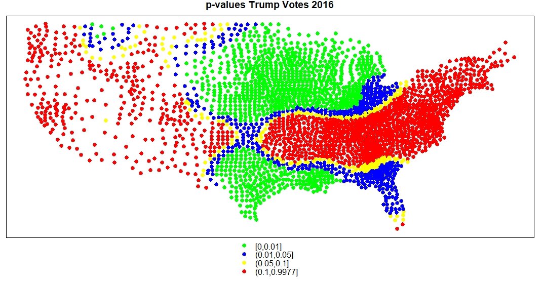
One final issue is that there is some statistical question whether p-values have any meaning with geographically-weighted variables, since spatial auto-correlation is a serious issue--ie, effects are unlikely to be discretely localized inside county borders, but rather, are likely to be spread out over many counties, if not across most of a given state and across state lines as well. More discussion can be found by the author of the spgwr program (Roger Bivand, Norwegian School of Economics) here, and the creators of ArcGIS here--both removed p-values from their software, after initially including them for negative binomial approaches to geographically-weighted regression.
On the other hand, they still include p-values for OLS models. Because of this, as well as just for comparison, I generated spatial regression models for both OLS and negative binomial, as well as maps, plus p-values for OLS (recognizing they couldn't be trusted, I just wanted to see what they looked like). Out of about 20 demographic variables I originally included for analysis (many of which have been shown to be predictive in previous research), the best model, where all predictor variables remained statistically significant at p<0.05, included seven county-level variables (generally from the 2015 American Community Survey estimates): divorce rates, education (those lacking a high school diploma at 25+ yrs), house crowding (house occupancy rates with greater than 1 family), poverty rates, inequality rates (GINI), segregation (measured by the White-NonWhite Exposure Index, the likelihood of these two groups regularly interacting with each other in their communities), and percent of Trump voters in 2016. Here are summaries of the OLS (left) and negative binomial models (right).
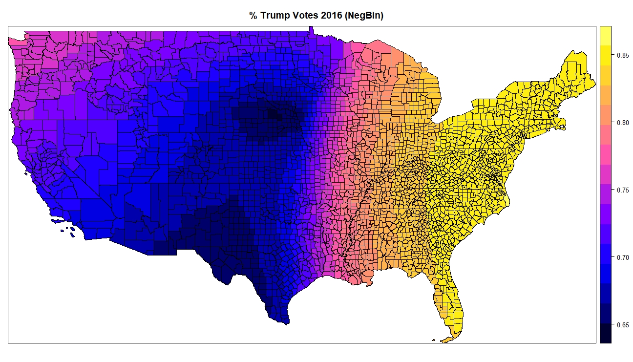
While all variables are significant in both, what is interesting is the sign-flips for Trump voters and poverty between the models. The OLS model indicates a negative relationship between poverty & trump voters, as predictors of the number of killings by police. In other words, the fewer Trump voters, the higher police killings, and vice versa--similarly for poverty. However, given that this model is unreliable since it doesn't meet regression assumptions (normally distributed variables), the negative binomial results are much more important, which indicate that higher rates of poverty, and a higher percent of Trump voters in any given county, is predictive of the number of killings by police.

Finally, I mapped these results. Given that there is no good way to visualize a regression model with seven predictor variables, I mapped each individual predictor variable listed above. Here, I show only Trump voters coefficients. First, the OLS map, which, as mentioned above, indicates that fewer Trump voters predicts higher killings by police in most of the country--this is indicated with the pink, purple and blue areas on the map. Only the orange and yellow areas are where a higher rate of Trump voters predicts police killings. After that map is the map of p-values for the OLS model. Since the software doesn't generate p-values for the negative binomial model, those can't be shown--I show the OLS model here, just to show what the package can do if your data met OLS regression assumptions. If one could trust the OLS model, the coefficients for Trump voters would only be statistically significant in the green and blue areas (or yellow areas, if you did not mind using p < 0.1). Finally, the last map shows the negative binomial map, indicating that everywhere in the country, the relationship between Trump voters in 2016, and killings by police in any given county, are positive, though the areas in blue have weaker predictive value, and the areas in yellow have the strongest. Since this model had seven predictor variables, they each are stronger or weaker in different areas of the country.