There are several assumptions in the "debt-crisis" narrative that create a viable story, all of which are faulty, most of which are beyond the scope of this post. For example, the idea that we have a spending crisis, because of the belief that Obama has dramatically raised spending, when in fact, as I have shown in an earlier post, federal consumption+investment spending has, for the last 20 years, been consistently at its lowest rates since WWII. This is the "flexible" spending that presidents get to do, and is more technically the "size of government," since it pays for road repair, other immediate infrastructure, federal bureaucrats, federal buildings, etc.
Another common misconception is that the "entitlement" programs are on a clearly unsustainable trajectory, whether you are talking about safety net support for the poor (food security is consistently 2-3% of the federal budget), or Social Security+Medicare+Medicaid, which, as a % of GDP, has indeed doubled since 1970 and is only expected to increase. However, medical economists have shown that half of the rise in Medicare+Medicaid costs are from poorly controlled healthcare costs, not simply a dramatic rise in coverage. Several studies (summarized last month in this PBS report) have shown that we pay twice as much per capita for healthcare than our nearest price-neighbors (Japan and the UK), and our health outcomes are worse. A large chunk of the rise in these federal health programs can be fixed by getting our healthcare costs to expected market levels. Similarly, the Social Security Trustees have reported that with no changes, the fund is solvent until 2033, and by uncapping the $108k current tax limit, the program would be solvent until 2050. There are several other very easy fixes for Social Security's long-term solvency.
A more "wonkish" question is whether the "debt crisis" is, from an economics perspective, a crisis. I address this in several ways from the "Part 1" essay. I have done some more work on the problem, still using the cross-country analysis. The International Monetary Fund has recently compiled a very cool database ("cool" to the nerds among us) that lists the debt to GDP ratio of every IMF member state much farther back than other databases list. For example, the database lists the UK's ratio back to the 1600s!
I used this database, along with the OECD GDP Growth rate data for the top 30 countries to look for a relationship. Using "R" and the "PLM" package for analyzing cross-sectional time-series (panel) data, I looked at the years available from the OECD, 1993-2011. Using a 2-year lag for each individual country (i.e, to see if, for example, the Australian 1993 debt:GDP impacted the 1995 growth rate for Australia) and a fixed-effects (within) model, I found a small, but significant positive relationship between debt and growth. This is counter to the claims made by the fiscal-terror narrative. Specifically, I found an estimate of +0.025 (p=0.009), implying that for every percent the debt:GDP ratio increases, growth tends to increase by 0.025 the 2 years after.
Intuitively, there is bound to be a limit. However, consider Japan, which has had, for several years, by far the highest debt:GDP of all the top economies, averaging 192% over 2005-2009!! In 2009 their growth rate plummeted to -5.5%, but the following year bounded back up to 4.4%, with their debt:GDP ratio only continuing to increase during that time. Poland's growth over the last 5 years has been the strongest of the 30 countries, averaging 4.3%, while its debt:GDP is 17th of 30, averaging 48%. Isreal's growth rate is ranked 3rd for that time period, at 3.8%, while its debt:GDP places it in the bottom 5, averaging 82.6%. In contrast, Denmark's growth is near the bottom, averaging -0.5, while its debt:GDP is among the best, averaging 41%. The relationships are undoubtedly complex, and likely are influenced by regional and local effects. However, if the presumption by the Tea Partiers is that high debt:GDP means economic disaster, there is no evidence for that at all, and in fact, my time-series analysis seems to indicate the opposite.
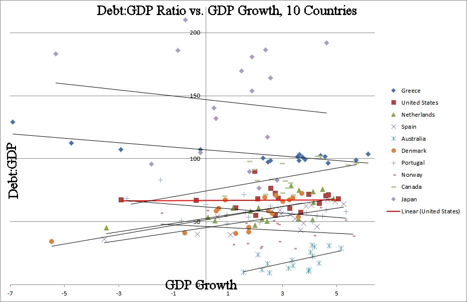
Below I have included a chart that demonstrates some of the complexity. I have chosen several of the top and bottom GDP growth countries. For the 17-year period in question I have plotted their debt:GDP (y-axis) against their GDP growth (x-axis). The closer the dots to the top of the plot, such as Japan, have the highest debt:GDP ratio, and near the bottom, such as Australia, are the lowest ratios. The dots closer to the left of the graph have negative growth rates, and moving right means higher growth. The trend-lines for each country indicate the relationship between debt:GDP and growth. Take Japan's line, near the top--it has a slightly negative slope, indicating that the higher its debt:GDP ratio, the slower the growth. On the other hand, take Australia's line near the bottom-right. The positive slope indicates that higher debt:GDP is followed by higher growth. For clarity's sake, I did not plot all 30 countries, but the majority have positive slopes. In fact, a simple correlation supports both of these findings, with the average correlation being positive (r=0.22), again, indicating that higher debt:GDP tends to be followed 2 years later by GDP growth.
No comments:
Post a Comment