Tuesday, December 24, 2013

Education Spending Disparities--international Comparison

I have heard several commentators lamenting that the U.S. spends more per student on education than any other industrialized country, but we are mediocre on international comparisons of math, reading and science. They base this claim on two sets of OECD data--spending per student, and PISA measures. A quick glance at the graphs often reproduced to support the education spending claims would seem to clearly support this assertion (see Graph 1):

The claim of "more spending per student than any other country" is often followed by the complaint about teacher's unions forcing us to pay more than any other country for teacher salaries, yet preventing us from firing bad teachers. While the former claim is partially true, the latter is not. Leaving that debate for another discussion, it is important to understand the spending data. First, Graph 1 shows "all" education spending, which includes pre-primary all the way through tertiary spending, including vocational spending. It also includes all funding sources--local government through federal, and includes private funding (spending is converted from national currency to PPP by GDP for interstate comparison).

However, separating tertiary spending from primary/secondary spending produces a slightly different picture (note also that this data is just from a one-year snapshot of 2010).

No longer the biggest spender in these categories, we are clearly in the top spending cluster, although all of the top 8-12 countries are relatively close to each other (except the top-spending country, Luxembourg, whose GDP/capita is just less than twice that of the US, by far the largest of the OECD countries). Looking at tertiary education, i.e., university and college spending (excludes vocational training), the comparison looks quite a bit different.

What we can now see, is that while our national conversation about education is typically centered around primary and secondary failings, linked to high levels of comparative spending, our actual spending compared to other countries is greatest for tertiary education. I will come back to the issue of primary/secondary school funding, to suggest a clarification for how we can still be at the top of the cluster of spenders, but still be producing poor results. As for tertiary spending--where is all that money going? While an excellent question, a number of recent analyses have indicated that US spending on college sports (and here, and here), as well as administration/bureaucratic costs (and here) far outpaces other countries, and has little benefit to student learning, which is arguably the main reason for the existence of the university. Note that the skyrocketing US tuition is not going to most faculty, especially the adjunct faculty who comprise over 50% of teachers in most state schools--many of those part-time faculty are on food stamps and receive no benefits or job security.

The above chart clearly shows that we in the US are spending far more than any other country on tertiary education--but why is that? Are there more of us going to college? Are we going to college longer? It's definitely not the former. In fact, we have one of the lowest college-participation rates of all of the OECD countries.

So we are spending far more than any other country on tertiary education, but sending almost the lowest proportion to tertiary education. The problem would seem to be the costs themselves. Indeed, most OECD countries provide free, or almost free, tertiary education: France, Denmark, Sweden, Iceland, Finland, Norway, Belgium, Spain, Italy, Austria, Poland, Turkey, Mexico, and Slovenia. The graph below separates the tertiary institutions into two categories--public and private--with average cost per student for each (countries with no bar data either are completely free, as listed above, have no private colleges, or did not supply data). As can be seen, the cost of a U.S. education, especially for private colleges, far supersedes any other OECD country.

Finally, getting back to the question of primary/secondary funding, if we are spending near the top of the cluster, there is the persistent issue that our students are performing at a mediocre level compared to other countries. Intuitively, this must be an issue of how the money is being spent. But perhaps a better question is "where" the money is being spent, speaking geographically. A recent analysis showed that, unlike almost every other OECD country, our money is being spent where our wealthiest students reside, while we strip funding for our poorest students. The OECD data shown below supports this proposal, to the extent that we have created an educational system whereby the majority of funding comes from local sources, predominantly property taxes, whereas other countries have far greater input from federal sources for more equitable distribution of national resources. Unlike the graph above for primary/secondary spending, which was only for 2010, the graph below is an average of 2006-2010, to generate a broader representation of spending. Here it is evident that we are close to Luxembourg for spending, far above the other countries. However, it is also clear that we shift the majority of our funding to local sources, with relatively little federal funding.

One might notice that several countries with high PISA scores also have a large percent of their education budget from local sources, such as Norway, Denmark, Finland, Iceland, Canada and the UK. The critical difference is that in all of these cases, their levels of inequality (GINI) are far lower than that of the US. So while all countries have areas that are poorer, and some are wealthier, in the US there is tremendous geographic inequality, large islands of poverty, and large islands of wealth. In areas of poverty, where education is funded by property taxes, there is very little money coming into schools, and relatively little federal money to make up the difference. On the contrary, areas of wealth have the ability to collect sufficient funding for a wide variety of educational supplements, infrastructure/development investment, and recruiting of the best teachers. In countries with low-GINI there are far higher levels of equality throughout the population and the geography, with far higher spending on social safety net systems designed to generate equality of opportunity and access to resources. I will leave this for another time to demonstrate myself--in the meantime, others have already analyzed the OECD and US data, arriving at the same conclusion.

Sunday, December 8, 2013

Indiana State Legislative Districts vs Census Population Density

In addition to publishing population data, the U.S. Census also publishes geographic electronic files showing the shape of various types of government boundaries, from city to state to federal. Between the GIS Tiger files repository that holds the shapefiles of boundaries such as state legislative districts, and the main census data repository, there is a wealth of information that can be gathered and mapped. An open-source (and free) software, Quantum GIS, is available to import the Tiger shapefiles, and combine those with the Census data. Below I have posted some of the possible mappings that are available from these resources.

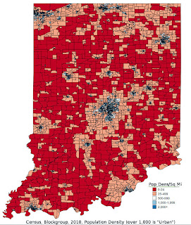
The first two images represent a "block-group" population density mapping of Indiana. The first of these images is an actual population density, derived directly from Census. While there is no variable for "population density," it can be readily calculated using "total population" divided by "land area." Population comes from the factfinder2 Census site linked above, and land area is embedded in the Tiger shapefile. There are various levels of measurement available from the Census, ranging from the entire US-level, all the way down to the block-level. In this case I have used the 2nd smallest unit available, the "block group" level, which is one step smaller than the "census tract" level. The calculated value can be transferred to the original Tiger block-group level shapefile and mapped through QGis. The Census definition of an urban space is one with 1,000 or more people per square mile. The Tiger shapefile gives the land area in square meters, so in order to get a square miles value, you must include a conversion factor. There are two primary sources in the Census for population--the annual ACS sample, and the decennial Census. The latter includes the entire population, while the former contains just a few individuals from each locality. The decennial Census allows more accurate reporting, and far smaller localities to be used. For this data I used the decennial Census.

The second image in this set is urban density, also derived solely from Census data. One of the values you can choose from the factfinder2 site, in addition to "population," is "urban" vs "rural." Within this set of information you can find 3 distinct values, in addition to the total population of the area. The first is "urbanized area" population, which is the number of people who live in regions with 50,000 or more people. The second is "urban cluster" population, with between 2,500-50,000 people. The third is "rural" population, with less than 2,500 people. The Census pre-defines these values based on the localization of the population density. This particular map is by block-group, and indicates the percent of people in each block group that occupy an "urbanized area." This is different from population density, in that the latter represents the total population/land area. Urban percent represents the percent of the population of an mapped feature (in this case a block-group) whose total incorporated area represents 50,000 or more people.

The final four images represent the Indiana state legislative districts, as highlighted by both population density and urban percent. The first two of these images is the lower house districts, while the last two are upper house districts. There are 100 lower house seats, and are analogous to the federal House of Representatives, while there are 50 upper house districts, analogous to the federal Senate. The Census Tiger shapefiles for these districts are drawn from the 2013 legislative maps. The population for the districts come directly from the Indiana web site, but the population density and urban percent had to be calculated by QGis, since the Census has not yet published either of these values for state legislative districts. I calculated these values by downloading the block-group-level population and urban data from factfinder2, and block-group-level shapefiles from Tiger, in addition to the state legislative shapefiles. In QGis there is a vector feature, "join attributes by location," which allows the user to spatially integrate various features. In this case, I used the spatial features of the state legislative districts, both upper and lower, respectively, as the digital shape targets, and "joined" to those shapes the population data in the block-group-level shapes from the second shapefile. Since there are many block-groups per legislative district, a join by "sum" allowed for a total population could be obtained for each of the districts.

The population density values were calculated directly from the land area given in the shapefiles for the legislative districts, and the population from the Indiana data for each legislative district. For this, QGis was not needed for calculations, just for mapping. In this case, as above, I used land area divided by total population, with the inclusion of the square meter to square miles conversion factor. However, for urban percent, I had to use the "join attributes by location" feature. After the join summed the values, the result was, for each legislative district, a sum of the population whom the census determined lived in an "urbanized area," as well as the total population for each district. The map colors thus represent the percent of people living in each district whom the Census has determined lives in an incorporated area of more than 50,000 people. This process sometimes has spatial difficulties--for example, block groups can cross legislative lines, and thus QGIS may produce unpredictable results in those instances. The summed populations did not match the populations given by the State of Indiana for each district. However, even if the population as such wasn't always accurate, the ratio of urban population to total population should be reasonably consistent with the spatial features. To test this, I compared the resulting urban percent values with the population density, which produced a correlation of r=0.78. I also did two separate comparisons, one using the census-tract level, and again with the block-group-level and the results were almost identical. For a finer comparison, a block-level measurement could be used, but that requires downloading separate files for each county, as opposed to one file for the entire state, and then integrating all of those county-level files back into one huge state file. For the purposes of this demonstration, the block-group-level files should be sufficient.