Since part of what I do is "medical sociology," where we look at issues of social factors of health and illness, including epidemiological data, I occasionally get into discussions with vaccine-deniers. Since it happens with regularity, I decided to post some of the data here that I end up spending hours trying to "re-find."
In 1977, husband and wife team, the McKinlays, published a controversial article in respected health policy journal, Milbank Quarterly, titled, "The Questionable Contribution of Medical Measures to the Decline of Mortality in the US in the Twentieth Century." If there is any peer-reviewed "data" that I have repeatedly seen cited, it is a series of ambiguous graphs, shown here, from pg. 442-43. The larger context of this article is the question of the relative contribution of "medical" interventions to disease vs. "public health" interventions and technology, such as clean water, sewage systems, hand washing, better nutrition, etc.
First, the graphs are very poorly done. They would receive an F from me if a student turned these in to me. They are poorly labeled, the scales on each of them are different thus confusing if not outright misleading, and there are no data source citations.
Second, the information the authors seem to want to convey is not represented by the data they use. For example, take the measles graph. As with the other diseases, they show that there was a precipitous drop in the early 1900s, then they have an exciting arrow pointing to the 1960s labeled "Vaccine" implying that the disease was eradicated long before the measles vaccine, the same as all of the other diseases+interventions they graph. However, if you look at the very bottom of the page in fine print, these are death rates, not disease incidence. The difference is that "incidence" is how common these diseases are in the population, and "death rates" are telling us how many people died after being infected with these diseases. The primary reason these charts are incredibly misleading, is that, while the measles graph implies that the vaccine was irrelevant to measles, what the graphs actually show is that in the early 1900s we developed ways to keep measles patients alive until their bodies could fight off the disease. The McKinlays are partially correct, that some of this had to do with sanitation and nutrition, but there were also medical contributions as well (Orenstein, 2004, "Clinical Significance of Measles", J Inf Dis, Suppl 1). They do a very poor job explaining the details of these processes--a far more convincing argument would have been if they spent a paper-length treatment of each of these diseases. Their current strategy, arguably, seems to overwhelm the reader with a whole bunch of poorly constructed graphs, and let the imagination do the rest.
Third, given the poor presentation of data by the McKinlays in these graphs, it is relevant to actually look at the correct data. Sticking with the measles question, three sources give us a far better representation of measles history in the 1900s US. The first (Hinman, 2004, "Evolution of Measles Elimination Strategies," J Inf Dis, Suppl 1) presents the following US history of measles incidence and deaths:
As you can see from the chart, the incidence of measles itself remained unchanged throughout this period, until the implementation of the first vaccine attempt in 1963. The article describes the history of the development of the vaccine, which went through several changes even through the 1990s, which improved methods producing better immunity until very few endemic US cases exist, although outbreaks have become more common now that the vaccine-denier movement is convincing greater numbers of people to refuse vaccination.
The second source is the CDC. It basically shows the same thing at a closer time-scale. Look specifically at the section "Secular Trends in the US" and the graph "Measles-United States, 1950-2009."
Here you can also see the 1989-1991 measles outbreak, which primarily occurred in an area where a large population of children were not being vaccinated. CNN recently reported (9-13-2013) about the newest resurgence, again, geographically related to areas of low vaccination rates. Similarly, NPR reported (9-1-2013) about the 2013, identifying the epicenter around a popular anti-vaccine church in Texas.
The third source of data on measles incidence, again, basically reports the same pattern, this time from Journal of the American Medical Association, (Roush, 2007, "Historical Comparisons of Morbidity and Mortality for Vaccine-Preventable Diseases in the US").
This chart shows not only measles, but many of the infectious diseases: rates of incidence pre-vaccine, rates of death pre-vaccine, and the same for 2006 (incidence) and 2004 (deaths). For measles, the approximate pre-vaccine incidence of disease prior to 1963 was 530k/yr, and 440 deaths/yr (1953-1962). There were no measles deaths in 2004, and 55 cases in 2006.
There have been several specific slides I have used in my medical sociology course when we talk about the importance of vaccines.
Here are two of them. The first is the number of reported cases of smallpox in Shanghai in 1951 vs the vaccination rates. 1951 was a big year for the global smallpox vaccination push, and Shanghai cracked down incredibly hard--everyone had to be vaccinated, including tourists (which is how you get greater than 100% vaccination rates in the chart). This graph, as the previous data I posted, shows a clear linear relationship during this 12-month period of vaccination rates of 100% vs. smallpox cases down to 0 (
Bulletin of the World Health Organization, 1981, Xui and Yutu).
The second photo is similarly smallpox, visualizing different rates of smallpox in the US based statewide vaccine policy (New England Journal of Medicine, 1933). The graph shows a clear relationship between high incidence of smallpox in states where compulsory vaccination was prohibited, vs. states where vaccination was compulsory, where you see very little smallpox incidence as of 1933--a 17x higher rates in the former.
Finally, some random other sources of data about vaccine effectiveness:
Influenza B: Public Health Agency of Canada, 1979-2004
Polio incidence and death rates, 1932-1990? (unsourced, poliosurvivorsnetwork.org.uk)
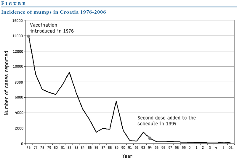
Mumps in Croatia, 1976-2006 (eurosurveillance.org)
Mumps in the United States, 1966-2010 (unsourced)
Pertussis in Great Britain vs. vaccination rates (1970-2009, unsourced, Gideon Informatics)


