Wednesday, April 27, 2016

Primary Vote Tallies: 4/27/2016

Last night the results came in from the Northeast version of the "Super Tuesday" primary for both parties, GOP & Dem: CT, DE, MD, PA & RI. Trump swept all states with percents in the 50s & 60s, while Clinton took four states. On one hand, it has been claimed that turnout is greater than in other recent primaries, indicating a surge in political interest this year, but on the other hand, 538 claims that turnout in the primary is unrelated to turnout in the general election. From the candidate's perspective, Trump has claimed that he has "millions more" votes than Cruz.

There are numerous ways to look at each of these claims. In general, each of the claims is true, and as of the most recent votes (4/26/16), they remain true. However, digging into the data can produce interesting results--I have provided two data table below of all of the state votes so far: the first are sum totals by candidate, and the second is all of the data at the state level. Total, Clinton has received the most votes of any individual candidate, and she can make Trump's claim, that she has "millions more" votes than Trump. She also has "millions more" votes than Cruz and Kasich combined. Sanders has more votes than Cruz or Kasich separately, but fewer votes than Trump. Clinton and Sanders combined have received more votes than Trump, Cruz and Kasich combined.

Clinton12,173,896
Trump9,972,683
Sanders8,980,077
Cruz6,777,746
Kasich3,641,272
Cruz+Kasich10,419,018
Clinton+ Sanders21,153,973
Trump+Cruz+Kasich20,391,701

Then table below is the data I used for this analysis. There are some important caveats in the totals I presented above. First, there are states where raw citizen vote numbers for one or both parties simply aren't published. For example, Alaska, Wyoming and Colorado provide only delegate convention votes for either the Dem or GOP side, or both. I have excluded those states from the table. Second, some states have only had a primary/caucus for one of the parties, such as Kentucky, Nebraska and Washington. I have excluded those states from the count as well. Third, I have intentionally excluded counts for any other delegates, like O'Malley on the Democrat size, or Rubio, Carson, etc, on the Republican side. I make no claims for the total GOP or Dem totals if you factored in those votes, or the votes from the states I excluded.

StateBernie SandersHillary ClintonDonald TrumpTed CruzJohn Kasich
Alabama7639930992837173518060837970
Arizona16340023569724991613214753040
Arkansas6486814458013314412387315098
Connecticut36659559501225192477960447
Delaware152895169763424721111014225
Florida56660310974001077221403640159412
Georgia21433254300850170730510972303
Hawaii2353010125680550631566
Idaho1864050656247810094216517
Illinois9820171017006556916434038282874
Iowa852558574545427516663474
Kansas264501259317062352077795
Louisiana7224022161512481811394919355
Maine22311232607085502270
Maryland28127553324723662382038100089
Massachussets58671660378431131360473113783
Michigan595222576795483751330015321655
Minnesota1181357351024018326846488
Mississippi3634818244719175514706535817
Missouri30907131060238209338036792533
Nevada5678631634531160792709
New Hampshire151584952521004063318944909
New York7634691054083524932126151217904
North Carolina460316616383458151418740144299
Ohio513549679266727585267592956762
Oklahoma17405413933813014115794116515
Pennsylvania719911918649892702340201304793
Rhode Island667205249339059639314929
South Carolina9597727151423985116479056206
Tennessee12033324530433270221115945243
Texas4755619350807576181239370120257
Utah61333156662486412256729773
Vermont1158631833519968592918543
Virginia27550750335835596017319396519
Wisconsin567936432767386370531129155200

Saturday, April 9, 2016

Regressing Kasich

I have been posting regression models that fit/predict the presidential primary races by state. Most recently, on the GOP side, four models that use between 3-5 variables each, correctly fit almost all of the states that had voted as of last week, and on the Democratic side, four models that use between 4-5 variables each, also correctly fit almost all of the states that had voted up to, but not including Wisconsin (all of which correctly predicted Sanders' win there). I have so far ignored Kasich, since it was clear early on that he would not gain enough state-level votes to get the presidential nomination on the first ballot. However, since the algorithm I developed makes it easy to plug in the other candidates, I decided to put Kasich through the models.

There is an important difference between all of the other models on both sides that I have produced so far, and the predictions to the right for Kasich. In prior models, I have used the dependent variable of the leading candidate minus the second candidate--thus, Clinton-Sanders, and Trump-Cruz. The resulting fits/predictions are of the difference between those two candidates, not a fit/prediction of the actual percent of win for the candidate. For Kasich, I have created the models based solely on his percent wins for each state. Using the same base of 3,000 variables, and preferencing models that have good statistical values, such as low residuals and BIC, and high adjusted r-squared, as well as a diversity of the "type" of variable used (jobs vs demographics, etc), to the right you will find the fit/predictions for all 50 states, and below you can find the statistical data about each model. All models have significance of p<.001, and all coefficients have significance of p<.01 (most are p<.001). Similar to the prior models, I used about 3,000 variables as the starting point, and while there were a number of very good models that were produced, I present one 2-variable, one 3-variable, and one 4-variable model. I did not test any higher order models.

There are some interesting, and unlikely predictions in some of the models. For example, Kasich2 & Kasich3 (the second and third models) both predict that Kasich will get 50% in New Jersey--a highly unlikely eventuality. Similarly, both models predict negative teens in North Dakota. Clearly, he cannot get negative votes, however, those models are very pessimistic at his success there. Both models provide fairly similar predictions, despite the fact that there is only one common variable between the two models--the percent of women in wholesale drug and chemical business in those states.

One of the unique features of the Kasich models, compared to both the Clinton-Sanders & the Trump-Cruz models, are that in the best Kasich models, I repeatedly found high ranking variables that described women in the workplace. For the previous models, the dominant jobs variables always described men in the workplace. The only male variable in the Kasich models is the broadest of the jobs measures I used, the change in the number of men's jobs from 2000-2013. The women's variables were specific to the last few years, and not a change in the jobs over time. For men, a decrease in the number of jobs, as shown in Kasich1, indicates that Kasich will do better in that state. In Kasich 2 & 3, more women in specific jobs compared to men, like wholesale drugs and chemicals, tends to signal better performance for Kasich.

There were several demographic variables in the high ranking models. The most common were those that designated a change in population and the percent of White Evangelicals. For population change, the second two models indicate that Kasich does better in states with decreasing populations, either from general population decline, or from out-migration. For religion, specifically the measure of White Evangelicals, Kasich does better in states with fewer of them. Economically, Kasich does better in states with higher costs of living. Interestingly, he does better in states where Black families have lower incomes. No other family income measure had a significant predictive utility for the Kasich models.

Thursday, April 7, 2016

Republican Presidential Primary Models: April

Last week I published new models for the Democratic presidential nomination race--here are the new Republican models, updated to include Wisconsin and a broader set of variables. Like the new Democratic models, I de-emphasized theory-building, and generated models that have the best fit of the states which have voted so far, specifically, by including models that use very specific types of jobs variables, like "men in agriculture, forestry and mining (2009-14)," & "change in the number of men in mining jobs (2000-13)." While one can plausibly build a theoretical case for why jobs data is related to the Republican race, it is far more difficult to explain why these specific jobs built statistically significant regression models, while related jobs variables did not. However, even including these jobs variables into the analysis, the best models were largely similar to the last set of models from March 23.

The first table, to the right, shows the state-level predictions/fits for the four models. The first column is the state, and the 2nd column shows the votes that have taken place so far. This is a simple subtraction of Trump-Cruz. It does not account for other contenders, such as votes that Rubio or Kasich have received. A positive number means that Trump beat Cruz by this margin, while a negative number means that Cruz beat Trump by this margin. The numbers highlighted in pink in the next 4 columns are the states this model incorrectly fits. So, for example, Rep1 got Louisiana and Maine wrong--it predicted that Maine would go for Trump, when it actually went for Cruz. Similarly, Rep4 gets 1 state wrong--also Maine. Rep2 and Rep3 correctly fits all 32 states that have voted so far in the Republican race. At the bottom of the page, the next table, lists the specific variables used in each model, and statistical information about each model.

The first model, Rep1, is the most efficient model--it uses only 3 variables, and only gets 2 states wrong, as mentioned above. It uses the percent of young women in the state, employment, and men in agriculture, forestry and mining. As with the previous models, employment & unemployment are important predictors of the Trump-Cruz race. In the prior models, I used unemployment, and the beta-coefficient was positive--meaning that in states where unemployment was high, Trump tended to beat Cruz, and vice versa. In the new models, I used employment, and as predicted, this coefficient is negative, describing that in states where employment is low, Trump does well, but in states with high employment, Cruz does better. This can be seen in specific jobs numbers found in each model. In Rep1, as the number of men in agriculture, forestry and mining (AFM) jobs goes down, Trump does better. In Rep2, as the number of men in mining jobs declines, Trump does better. Not all jobs had this pattern, or showed this level of statistical significance. The effects for women's employment was also not nearly as statistically significant in the Republican race, compared to the effects of men's employment. In Rep 1, the beta-coefficient shows that the AFM jobs variables is the strongest predictor, while the general employment variable is about half that. A test of the VIF (variance inflation factor) showed that while these two variables describe similar things, they do not influence each other in this model (vif<2 for both variables).

All of the models have an economic variable, in addition to the jobs variables. In Rep1 & Rep4, the economic variable is employment. In Rep2 & Rep3 it is family income. The results are consistent with the employment variable--i.e., in Rep1 & Rep4, when employment goes down, Trump does better, and in Rep2 & Rep3, when family income goes down, Trump does better. In that sense, all of the jobs and economic variables show a pleasing consistency--the worse the economy and jobs are, the better Trump does in that state.

Rep2 & Rep 3 are the most accurate models, in terms of correctly fitting all 32 states, and having the lowest residuals. But that comes at the cost of having to use 5 variables. In this case, both use two "political" variables, one "jobs" variable, a "cultural/demographic" variable, and an economic variable. Both models use a "tea party" measure, the strength of the tea party in Congress (the House), in 2011-12. In those states where the tea party did better, Trump does better. So while Cruz had a dominant history with the tea party, it could indicate that in states with stronger establishment voters, they are willing to deal with Cruz in order to avoid Trump.

Rep2 and Rep3 both use a second political variable--Rep2 uses the difference between the Obama and Clinton primary race in 2008, and Rep3 uses the percent of Democrats in the state-level senate (2014). The latter is positive-meaning that the more Democrats in your state senate, the better Trump does. The former represents a simple subtraction of Clinton-Obama, so a positive value indicates a win for Clinton. This beta-coefficient in Rep2 is positive, indicating that in states where Clinton did well in the 2008 primary, Trump does well in those states. Rep4 also has a political variable, results of the Republican vs Democrat presidential contests in 2000 & 2004, an average of a simple subtraction: Republican % - Democrat % in that state, meaning that a positive value indicates a Republican win by that margin over the Democrat. This beta-coefficient is negative, meaning that stronger Democrat wins in that state predicts stronger Trump wins. These latter two variables would seem to indicate that where you have a stronger Republican party, measured by stronger Republican margins in state and federal elections, Cruz does better. Perhaps this is indicative of Democrats willing to cross over to Trump, but not Cruz, and Independents, who might vote Republican or Democrats, are going voting for Trump (or are unable to vote at all in closed primary states, where they are required to register for a specific party).

Rep2, Rep3, and Rep4 also have "cultural/demographic" variables. Rep2 has a measure of race, the percent of the population that is Black. This beta-coefficient is positive, meaning that states with more African-Americans give Trump higher wins. Rep3 has a measure of a "Southern Culture Index" that I created--it also is positive, indicating that states with more "Southern Culture" tend to vote for Trump. This index is a combination of death rates, teen birth rates, slave population in 1860, and percent of the population that is White Evangelicals. Rep4 has a unique variable, provided by data from the British source, The Guardian, that counts how many citizens were killed by law enforcement in that state. This beta-coefficient is also positive, indicating that the more citizens killed by cops in your state, Trump does better. Predictably, this number is higher in Southern states, consistent with the prior two demographic/cultural measures.

There are very few "prediction" differences between these models and the models from March 23. Most significantly, from the April 5th Wisconsin vote, all four of the newest models show a Cruz win, while of the prior models, two of three showed a Cruz win. The "correct" model (M1R) is actually the same as the second model above, Rep2, and the beta-coefficients are very similar--this is expected, since the only difference in the new analysis is the inclusion of Wisconsin. However, most states show the same wins for both candidates. For example, all models, new and old, show strong wins for Trump in California, Connecticut, and New York, while giving Cruz wins in Montana and South Dakota. Some states have mixed predictions in the models, like Nebraska and New Mexico, so its anybody's guess there. Most models have Indiana going for Cruz (barely).

Saturday, April 2, 2016

More Primary Prediction Models--2016

For my third round of creating primary prediction models for the presidential nomination, I focused just on the Democratic nomination between Clinton and Sanders. Here, I publish four new models, two of which correctly fit all 32 of the Democratic votes, and two that have only missed one vote.

I have not recalculated Republican-side models. Previously, I generated two models that had, as of March 23, correctly fit all states that had voted to that point. Aside from that, it looks like no matter what happens with the primary results, the GOP convention will become an open/brokered process. In that case, regression models about the primaries would be pointless, so I did not invest the time to recalculate them.

My last Democratic models, created just prior to the March 26 caucuses where Sanders swept Hawaii, Washington an Alaska in landslides, used 3 & 4 variables to correctly predict fit almost all of the states which had voted prior to those caucuses, and in all cases except one, correctly predicted these three wins for Sanders (one of the three models predicted a large Clinton win in Hawaii). The first of those three models, M1D, use unemployment (Dec 2015), no religious affiliation, out of state migration, and an average of the 2008-2012 presidential election votes, and so far has only 1 error, Iowa, out of the 32 states that have so far voted. The second model, MD2, so far has only 2 errors, Iowa & Oklahoma.

In these new models I do two things. First, I updated the algorithm to include the three states that have voted since I generated my last models. Second, I used the "numerically best" models, regardless of their application to theory. For the previous models I published, I ruled out those models that may have looked good on paper, but used obscure variables, like "number of men who worked in sports, hobby and toy stores in 2013," "women who work in the pharmaceutical retail stores," or "men who work in tobacco stores." While those are, to some degree, economic variables, and I was giving preference to economic variables, it is hard to make a broader theoretical cased based on these variables, since you would have to explain why these three specific job variables did a good job fitting the voting patterns, and the other 800 jobs variables had far less success. However, for these models, I throw theory to the wind, and include the obscure jobs variables. I filtered out those models that used more than two jobs variables.

There are some differences in predictions between these models, and the models from March 23. For example, in the previous models, Delaware was firmly in the Clinton camp, and both Rhode Island and West Virginia had two models putting them firmly in the Sanders camp. However, these new models put Delaware firmly for Sanders, and now the latter two are firmly showing for Clinton. There are several other states, like Maryland, New Jersey, New Mexico, South Dakota, and Wisconsin, where the previous models were contradictory, and solidly for either Sanders or Clinton now, or where they were previously showing a trend for one, but now are less clear. Given that the more recent models include more data, I would tend to support the findings of the newer models. However, MD1 from the first set of models still only has one incorrect state, and MD2 still only has two incorrect states.

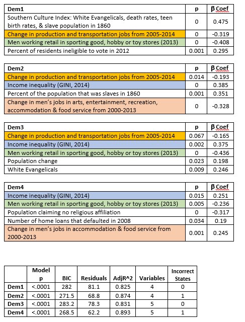
One of the most common variables that appeared in the best models, is the income inequality variable, GINI, for 2014. As this value increases (approaches 1), it signifies more inequality, and as it decreases (approaches 0), it signifies more equality. In all of these models, the Beta coefficient is positive, meaning that as the value of this variable increases, the value of the dependent variable also increases. The dependent variable in this case is the difference between the Clinton and Sanders vote, as a subtraction (Clinton-Sanders), so is positive when Clinton wins, and negative when Sanders wins. What that implies is that in the states where you have greater levels of inequality, they are voting in larger numbers for Clinton. One might propose that poverty or education might be at work, rather than inequality, as such. However, several measures for poverty and education were included in the algorithm, and even accounting for those, income inequality is by far the more powerful predictor.

In a prior effort to find patterns in the data, I attempted to control for "cultural" factors, specifically, "Southern Culture," since there seemed to be early differences between Sanders vs Clinton wins based on the latter's southern victories. This Southern Culture Index did not make any of the previous best models. However, it was useful in one of the current models, Dem 1. As was previously shown, this index consists of four variables: % of White Evangelicals, death rates, teen birth rates, and slave population in 1860. A higher value means that state has stronger characteristics of "southern culture." Since the Southern Culture Index is positive in the Dem 1 model, it describes that the "more southern culture" a state has, the more likely it is to vote for Clinton. This result is fairly obvious just looking at a map of the Democratic contest so far. However, in the Dem1 model, what the results show is that it is the strongest of the four predictors.

In Dem2, the slave population variable is present by itself, and unsurprisingly given the results of the Southern Culture Index, as the slave population of 1860 increases, those states vote more strongly for Clinton. Similarly, in Dem 3, White Evangelicals appears as its own predictor, and like these other two, as they increase, so does support for Clinton. Conversely, hose that claim no religious affiliation appears in Dem4, and as expected, it is negative, showing that as this population is larger, that state votes more strongly for Sanders.

There are three jobs variables that made it into the final models: 1) "Change in production and transportation jobs from 2005-2014," 2) "Change in men's jobs in arts, entertainment, recreation, accommodation, & food service from 2000-2013,", and 3) men working retail in sporting goods, hobby, or toy stores in 2013." The most conservative way to interpret these results, when put into the context of the large number of jobs variables that were used to test models, is that the patterns in these jobs were just coincidentally, mathematically similar to the pattern of voting in the first 32 states which have voted so far this year. That may be the most one can say. Even if one were to assume that these results aren't simply a coincidence, one would still have to come up with a rationale for why, for example, when it comes to arts & food service jobs, the important factor was the change from 2000-2013, as opposed to 2005-2014. Similarly, one would have to explain why the production & transportation jobs change was important from 2005-2014, but not from 2000-2013. And why, of all of the possible job types, why these--why arts & food service, or why transportation & production? Perhaps there is a good explanation for these patterns, but I do not have one. My best guess is that it is coincidence, until other evidence is produced--for example, a good theory is presented, or the models correctly predict the rest of the state-level votes.

The jobs variables are mostly negative, meaning that as this value goes down, the dependent variable goes up, and vice versa. As jobs are lost over time, these variables become more negative, or as jobs increase over time, these variables become more positive. Since these values are mostly negative, presuming the results aren't simply a coincidence, it shows that in these states, as jobs in these specific fields are lost, they vote more strongly for Clinton. As jobs in these specific fields are gained, they vote more strongly for Sanders. One exception, is between Dem2 and Dem4. In Dem2, this is the broadest jobs variable in this sector--it includes arts, entertainment, recreation, accommodation, and food, and as these jobs are lost, that state votes more strongly for Clinton. However, in Dem4, this is just food and accommodation jobs. This variable is positive, meaning that as these jobs are lost, these states tend to vote more strongly for Sanders.

As before, I gave preference to those models that had the smallest residuals, the largest adjusted R-square, the lowest model p-values and variable p-values, the lowest BIC, and correctly fit the most states. All four models presented here have an adjusted R-square above 82%, and correctly predict either 31 or all 32 of the states that have voted as of April 2. All have model p-values less than 0.0001, and all variables have variance inflation factors less than 2.5. All individual variables have p<0.05, except for Dem 3, where one variable has p<0.07.

Saturday, March 26, 2016

Brain Drain--Indiana is at the Bottom of the Barrel

According to recently released 2014 Census data, Indiana ranks at the very bottom of states, 50th, for "Brain Drain," a not-so-fancy social science term to describe the migration of people with advanced degrees out of one place and into another. Brain drain is typically related to that country or state having lower wages or professional employment opportunities and poorer quality of life. There are various ways of measuring brain drain, but the most typical measures involve simply counting the number of people with college degrees who are leaving your area compared to those who are moving into your area. For example, in the table to the right, the column "BA+Grad" is a subtraction of the number of people with bachelor's and graduate degrees who have moved into your state minus the number who have moved out of your state. A positive value means more college-educated people have moved into your state than have left, while a negative member means that state had a net loss of college educated people.

In the table I have included three additional columns. The 4th column, "BA+Grad," is the simple calculation described above. The 5th column, "No HS/Only HS," is a similar calculation, but measures the migration of people with only a high school education (no college at all), or with less than a high school education. A positive value means that poorly educated people are moving into that state at higher rates than they are moving out, while a negative measure means that state has a net loss of residents, but they are very poorly educated residents. The 3rd column, "Coll/ NoColl Migration, simply describes the sign of these two types of migration: +/+ indicates that both the highly educated and poorly educated are moving into your state, while -/- indicates that both groups are moving out of your state.

The first column, "Brain Drain Rank," ranks this migration process based on two measures. The primary ranking is the positive vs negative flows. If more educated people are moving into a state than leaving it (+/+), it has a higher rank. If more poorly educated people are moving into a state than leaving (-/-), it has a lower rank. The lowest rank in this list is for states who not only have negative migration of highly educated people, but have positive migration of poorly educated people--meaning that people with college degrees are leaving the state, while people with only a high school degree or less are coming into that state. Thus, a state could have a net gain of people moving into a state, but that gain comes entirely from poorly educated people.

Data indicates that there is a strong relationship between education and employment. People with college degrees have a far higher likelihood of finding jobs compared to people who only have a high school diploma or less. Further, those jobs tend to pay far more. Thus, an net in-flow into a state of people with only a high-school degree (or less), means that state could face greater demands on its social services budgets due to higher rates of unemployment of its residents, while a net out-flow of people with college degrees can mean there are fewer resources to increase the tax base and social service providers. On the one hand, it is of course problematic for a state to have net losses of a population--"dying states," as such--for example, Alabama, Kansas and Kentucky, who lost both the highly educated and the poorly educated in 2014. On the other hand, it becomes an even greater problem for a state's economy when the highly educated are leaving, but the poorly educated are moving in.

Indiana ranks the worst in this combined measure--states who lost people with college degrees, but gained people with only a high school education or less. Indiana had the highest rate of loss of college graduates. Six states had higher rates of loss of college graduates--New Jersey, Illinois, South Dakota, New York, Wyoming, and Alaska. However, these states lost both the highly educated and the poorly educated, with Alaska hemorrhaging both types of people. Fourteen states (including Indiana) had a pattern similar to Indiana, where they lost the college-educated, but gained the poorly educated--Indiana had the highest rates of loss of college graduates, and the 3rd highest rate of increase in poorly educated migrants, after North Dakota and Wisconsin.

Wednesday, March 23, 2016

2016 Political Primary Models

For the last month I have been working on statistical approaches to "fit" the presidential primary results in each state to some type of linear model. Initially, I was interested only in economic variables, such as unemployment rates, cost of living differentials, median income, rates of poverty, etc. These models had good success--as of March 2, three economic variables correctly fit 13/15 of the states who had voted (or caucused) up to that point on the Democratic side. I gradually started including other variables to make the models more complicated--education, race, rates of various industries in a state, changes in those rates over time, age, health, and violence, for example. In all, I incorporated over 3,000 variables into potential models. I present the final models below--three for the Democratic side, and three for the Republican side.

The Democratic models correctly fit 27-28 out of the 29 states who have voted as of March 23, 2016, using 3-4 variables. Two of the Republican models correctly fit all 31 states, and the third correctly fits 30/31 states, using 4-5 variables. The outcome variable in both cases is a simple subtraction of two candidates. On the Democratic side, Clinton-Sanders and on the Republican side, Trump-Cruz. I used these two separate variables as the dependent variables in two multiple regression equations, with economic, health, cultural (etc) variables as the independent predictors. Various statistical information is available to help determine which models are better than others, such as AIC, BIC, R-squared, the residuals, and in this specific case, the accuracy of the model in correctly finding the "winner" of the state-level contests, ie, whether the model correctly predicted a higher score for the winner versus their losing competitor.

Table A shows the three models for the Democratic contest for all 50 states. The second column shows the "Democratic Difference" score, while the 3rd-5th columns show the predicted values based on the three models. A positive Democratic Difference score means a win for Clinton by that margin, while a negative score means a win for Sanders by that margin. For example, Clinton won Arizona by 17.7 pts, so the score in column 2 is +17.7. However, Sanders won Kansas by 35.4 pts, so the score in column 2 is -35.4. Table B shows the same, but for the Republican side. A positive score means a win for Trump by that margin, and a negative score means a win for Cruz by that margin. I did not include any other candidates from either party in these models, and I made no effort to attempt to predict the results of the general election, just the primaries. The pink-shaded areas are the states that the model has incorrectly fit.

Tables C & D show the statistical results of each model, along with the variables used by each model that can be matched with the state-level model predictions from Tables A & B. For example, in Table A, model 1 (column M1D) predicts that Sanders will win Alaska by a wide margin (51.5 pts). Actually, all three models predict big wins for Sanders in Alaska--most of models have similar state-level predictions, but do so using different variables. Table C shows the three specific Democratic models. The left third of the table describes model 1 (M1-D)--it uses four variables: unemployment, "nones" (unaffiliated with any religion), the ratio of people who have migrated out of the state in 2015, and the difference between the Republican and Democratic votes for president, averaged over 2008-12. This latter measure is a simple subtraction of Republican-Democrat, so a positive value indicates a Republican win by that margin.

Interpreting Tables C & D can be challenging. The B-coefficients are the standardized coefficients. In model 1 (M1-D) you can compare the four variables to each other by the strength and direction of their contribution. For example, the strongest predictor in this model is the "nones," and it is negative, implying that it works in the opposite direction as the outcome variable, the Democratic Difference (DemDiff) measure, which is Clinton-Sanders. A higher positive value indicates a bigger win for Clinton, and a negative value indicates a win for Sanders. The negative value of the "no religious affiliation" implies that the higher the DemDiff score, the lower the rate of people who claim no religious affiliation, so in other words, Clinton tends to win in states with more people who claim to be affiliated with a religion, while Sanders tends to win in states where more people claim to be unaffiliated with a religion.

The unemployment variable is the next strongest variable in M1-D, and it is positive. This means that the higher the DemDiff value, the higher the unemployment variable. This implies that Clinton tends to win in states where there is higher unemployment, and Sanders tends to win in states with lower unemployment. The next strongest variable is the Rep-Dem presidential election results from 2008-2012, and it is negative. Since a higher value means that Republicans won by a larger margin, this means that Clinton tends to win in states where Democrats won with higher margins, while Sanders wins in states with lower Democratic margins, or even Republican wins. Finally, the out-migration variable measures how many people were leaving the state, compared to people moving into the state. This variable is positive, so that Clinton tends in win in states where more people have been moving out to another state, while Sanders tends to win in states where more people have been moving into that state from other states. In model 2, M2-D, the male-female ratio is a measure of the number of men versus women in the population. A higher value means a higher ratio of men than women, while a lower number means a higher ratio of women than men. In this case, thee is a negative value, meaning that Clinton tends to do better in states with a higher ratio of women compared to men.

The information on the bottom half of Tables C & D provide statistical information about the models. All of the six models have p-values that are very low, implying the possibility of strong confidence in the results of the models. Below the "Model P" row, I provide the number of states that each model got wrong, of the races that had been decided as of March 23. Two of the Republican models correctly fit all 31 of the state contests up to that point. The BIC is a Bayesian measure to help compare models to each other--the lower the number the better. Residuals provide a summary of how far the "predicted" values are from the "measured" values that actually took place, so the lower these values the better. Finally, the adjusted R^2 describes how much of the variability of the data is explained by the model, adjusted by the sample size (in this case, 51). So, for example, for M1-D, the adjusted R^2 is 0.729, meaning that this model explains around 72.9% of the variation in the data.

Table D describes the Republican models, where the outcome measure is the difference between Trump-Cruz, so positive values mean that Trump won by that margin, while negative values mean Cruz won by that margin. While race did not factor into the Clinton-Sanders models, several Trump-Cruz models are strengthened using race measures. For example, M1-R has a positive B-coefficient for "% population Black," which implies that Trump does better in states with a higher percent of Blacks compared to Whites. Changes in the number of mining jobs for men from 2000-2013 has a negative value--states where this number is higher gave Cruz stronger wins compared to Trump, implying that mining job losses in a state boost Trump's winnings there. In model 2, M2-R, the Gallup Well Being Index is an annual measure of how well the people in the states are doing--a higher number means they are doing better. This value is negative, meaning that as states to poorly in well-being, Trump gets higher wins, while as states do better, Cruz does better.

Model M1-D contains a variable describing the difference between Clinton vs Obama's primary victory's in 2012. This is a subtraction of Clinton-Obama, so positive numbers mean a win for Clinton, and negative numbers mean a win for Obama. In this model, the variable is positive, meaning that in states where Clinton won with larger margins against Obama in 2012, Trump does better in those states. Models 2-3 (M2-R, M3-R) have another political variable, the Republican-Democrat differences from the 2000 & 2004 presidential elections. Positive values mean a Republican win. In both models, this model is negative meaning that higher Democrat wins in those states (negative values), tend to provide stronger wins for Trump, while stronger wins for Republicans in those states give higher margins for Cruz.

Finally, model 3 (M3-R) includes a variables on slave ownership in 1860. This measures the percent of the population of that state that was slaves. I pulled together a number of variables that I used to create a "Southern Culture" factor that I believed would help predict primary results, and historical slave ownership in Southern states was one of those variables. The Southern Culture Index proved far less valuable in the models than I predicted, so was not used in any of the best models. However, the slaves variable was predictive of the Trump-Cruz contest. This variable is positive, meaning that as the number of slaves in that state in 1860 was higher, Trump does better in those states. Clearly there is a strong geographical feature to this variable, which is why I included it in the Southern Culture Index, where, as expected, it had strong associations with other measures that differentiate North vs South. However, the fact that the Southern Culture Index was poorly predictive of the Trump-Cruz model would seem to imply that the relationship of this variable to the Trump vs Cruz vote differences is more than just geography, but has a cultural residue from that history. It is beyond the scope of this paper to postulate a mechanism that links that slave history with higher win margins for Trump.

As a technical note, I used the open-source software R for this analysis. The 3000+ variables were processed by creating a script to do the following steps:
  1. Create all possible variables on the variables in ranges of 2-6 variables per model. I did not use any interaction terms, and I used only included variables that had correlations above abs(0.15).
  2. Process all of these combinations of variables as linear regression models.
  3. Eliminate all models that had and adjusted R^2 < 0.7, and any variable with a VIF (variance inflation factor) > 4.
  4. Eliminate all models that had 3 or more incorrect "fits" to the states
  5. Produce a summary report of the remaining models, listing the # incorrect, BIC, residuals, and Adj R^2
After R produced this abbreviated list (the original set of models was several million possibilities per outcome variable), I used Excel to ranked them according to the lowest number of incorrect fits, and lowest residuals, while also visually inspecting the BIC and Adj R2, although those patterns largely followed the trends of the lowest residuals. I eliminated models that had similar "types" of variables, such as multiple types of "jobs" variables, religion variables, voting variables, etc, even though the model and the variables had low VIFs and no indications of multicollinearity. I also eliminated models where individual variables had p-values over 0.2. Only one model above (M2-R) had a variable p-value above 0.1, and I retained the model because of its accuracy in having zero incorrect fits, and a reasonable residuals, BIC & adjusted R^2 compared to other models. I gave preference to models with lower numbers of predictor variables.

Friday, March 18, 2016

"Southern Culture" Index--Part 2

Earlier this week I described my first attempt to create a "Southern Culture" Index that relied on non-economic variables to facilitate generating a model to help predict the primaries. The purpose of this approach was to have one factor that I could use as a "cultural" factor to distinguish regional differences in US voting patterns, as opposed to economic factors, a separate approach. Two weeks ago I posted my early attempt at creating a regression model that fit the Democratic primaries that had taken place up to that point between Clinton and Sanders (and O'Malley). That model used two economic factors--cost of living, and rate of unemployment--along with rates of college attendance, and correctly fit 14/15 of the primary elections. Neither cultural nor race/ethnicity variables improved the model.

This post about creating a factor index for "Southern Culture" will be more technical than the first, but will also propose a revised and improved model. In both cases I used exploratory factor analysis (principal axis factor extraction) in R, specifically, the psych package, to reduce 15 variables down to a 4-variable model that has good statistical properties, moreso than the proposed factors I mapped in my last post. Here is the current map that represents the factor I am calling the "Southern Culture" Index, with states divided into four groups, with darkest red being "most Southern" and lighter shades being "less Southern."

Using R, and the original 15 variables chosen from the literature that seemed to correlate to Southern states, I created a script that would put all 15 variables into every possible combination, and tested each of those models against nine common measures of goodness of fit for exploratory factor analysis (EFA) approaches (one heavily cited reference in the literature on these issues is Hu, L., & Bentler, P. M. (1999). Cutoff criteria for fit indexes in covariance structure analysis: Conventional criteria versus new alternatives. Structural Equation Modeling, 6, 1–55). This produced just over 5,000 combinations of 2-6 variables per model. Typically with EFA a researcher wants to reduce a number of variables into a smaller number of factors. Say, for instance, you have a survey of 100 personality-related questions, and you want to create a small set of personality "factors"--like introversion, agreeableness, etc. In that case, you could run the answers to all of the survey questions through a statistical analysis and let the software find a few different factors based on patterns in how the 100 questions were answered by your respondents. In this case, I wanted just to generate just 1 factor, which is why I took the approach that I did.

I filtered the 5000 models based on specific cutoff criteria in the literature:

  • Moderate correlation of the variables: ideally between 0.3-0.8
  • Bartlett's test for sphericity: should be less than 0.05
  • Kaiser-Mayer-Olkin Index (KMO): ideally above 0.8
  • Tucker-Lewis Index (TLI, also called NNFI): ideally over 0.95
  • Root mean square error of approximation (RMSEA): ideally less than 0.05
  • Root mean square of the residuals (corrected for degrees of freedom, cRMSR): ideally less than 0.05
  • Bayesian Information Criterion (BIC): there is no standard value, but the lower the raw value the better, ie, if you have negative values, the more negative the better.
  • The communalities (h^2) of the variables in the factor: at least 0.32 (Tabachnick, B. G., & Fidell, L. S. (2001). Using Multivariate Statistics. Boston: Allyn and Bacon.), but the closer to 1 the better.
  • R2, the proportion of the variance explained by the factor: the closer to 1 the better, I chose a cutoff of 0.5 (a factor that explains 50% of the variation).

Using psych in R, the results are produced using the "fa" command, specifying principal axis factor analysis, fm="pa". Since I only wanted 1 factor, the rotation didn't matter, so I specified rotate="none". Neither KMO nor Bartlett's are automatically produced from the "fa" command in psych, but are available as separate commands: KMO(your variables), and cortest.bartlett(your variables). In this case, "your variables" would only be the specific variables you are testing in a specific model, not your entire dataset.

I pulled all of the resulting models into Excel to filter and peruse. After filtering using the above criteria, I was left with 400 models remaining. One of the variables that I felt had to be included in the model was the percent of the population in 1860 who were slaves. There is very little else that has so fundamentally shaped the history of the South in the last 200 years than an entire way of life built on slavery. This social model (slavery) did not completely end after the Civil War, since similar cultural practices continued for generations to subjugate race minorities, such as Jim Crow laws, lynchings, etc, and arguably, still has a profound impact on Southern culture today.

Even though I wanted a "cultural", non-economic model, I still included 5 economic and employment variables in this analysis, such as median family income (2014), income growth, unemployment, and levels of employment change in certain industries, such as manufacturing, over the last 15 years. Looking through the filtered models, many contained these economic variables, and while there were several models that ranked very high that included these economic variables, models that did not include economics were also highly ranked. After excluding all models that had economic variables, and that did not include the slave populations measure, I had less than 40 models remaining. These I ranked by BIC (lowest value), TLI (highest value), and KMO (highest value).

After controlling for the cutoff values listed above, the model produced is different from the one I posted earlier this week. This model has far better statistical properties, and is composed of the following 4 variables: White Evangelicals, death rates (2005-2014), slave population (1860), and teen birth rates (2014, 15-19 year olds). The factor loadings for each variable was strong and positive, meaning, in this case, that increases in incidence of what was being measured were more strongly associated with "Southern Culture," while decreases were more weakly associated with "Southern Culture." More specifically, research indicates that each of these variables is strongly associated with Southern states: higher rates of White Evangelicals, higher rates of teen births, shorter life spans (increased death rates), and of course the history slave ownership. The principal factor extraction statistical method pulled out these four variables, of the 15 tested, as best explaining the variability of these four measures across all 50 states (I did not include Washington DC or Puerto Rico). The analysis in R produced the following results:

VariablesFactor LoadingsCommunalities
White Evangelicals 0.84 0.71
death rates 0.95 0.90
slave population 0.64 0.41
teen birth rates 0.80 0.65
  • Bartlett's sphericity: p<0.001
  • KMO: 0.81
  • RMSEA: 0
  • cRMSR: 0.03
  • TLI: 1.04
  • BIC: -7.07
  • R2: 0.67
I did not include these tests in my filter, but they were produced by R, so I reproduce them here:

Correlation of scores with factors: ............. 0.97

Multiple R square of scores with factors: ....... 0.93

Minimum correlation of possible factor scores: ... 0.87

Wednesday, March 16, 2016

"Southern Culture" Index

In trying to generate models to predict/fit this year's election cycle, I wanted to eliminate cultural factors to focus on economic factors. Doing so meant that I had find a legitimate way to control for regional patterns of cultural difference--for example, differences between the South, Midwest, Northeast, and West, presuming such cultural differences exist. Various demographic maps lend visual credibility to the existence of regional differences, although rigorously disentangling economic from cultural factors is challenging. Prior literature indicates various factors associated with "Southern Culture," including several attempts to create a "Southern Culture Index."

Below are seven maps that show regional differences based on some of the more common factors that are mentioned in the academic literature that are associated with differences between the South and other parts of the country. Total, I found 20 variables that I included in an exploratory factor analysis, ranging from voting patterns (Republican to the South, Democratic to the North), occupational differences (manufacturing to the South, science and finance to the North), and income differences (higher to the North, and along the coasts, lower to the South). However, these variables tended to produce low statistical results as factors, so I did not create maps for them. The maps below represent the variables that produced the strongest results in terms of creating a "Southern Culture" Index. In addition, I produce four more maps of the best index models that were generated using various combinations of these 20 variables.

To summarize the data, the South has a number of challenges compared to the North, Midwest, and West. For example, in addition to lower income mentioned above (although the cost of living is lower, helping to compensate for income disparities), there are lower rates of college graduation and union membership. The South has significantly higher rates of firearm deaths, teen births, and death rates from various causes. Some researchers have identified a relationship between rates of violence in a region and large rates of Scotch-Irish ancestry in that region, both of which are found in the South. Similarly, the South has a long history of human rights abuses in terms of slavery, a history which continues to shape the South. These factors all contributed to the strongest indices. However, the final models did not use Scotch-Irish ancestry, income, or cost of living. The best models used combinations of the following six variables: death rates all causes (CDC, 2010-2015), firearm death rates (CDC, 2010-2014), union membership (BLS, 2015), teen birth rates 15-19 years (CDC, 2015), white Evangelicals (PRRI, 2015), and slave ownership as a percent of the population (1860).

I generated the following maps using the opensource software QGIS, and I used the opensource software R for the factor analysis to generate the indices. The package psych has several nice factor analysis features. The first seven maps show the individual factors, while the final four maps show the best index models (combinations of factors), along with technical information about the strength of the models. As can be seen, all four models produced results that are very similar. Red states are the most "South-like," blue states are the least "South-like," and purple states have mid-range "South-like" characteristics, according to each of the four models.

Death rates, all causes

Firearm death rates

Scotch-Irish ancestry

Slave ownership as a percent of the population (1860)

Teen birth rates

Union membership

White Evangelicals

4 factor index: White Evangelical + Union Membership + Death Rate + Slave Ownership

4 factor index: White Evangelical + Union Membership + Firearm Death Rates + Slave Ownership

5 factor index: White Evangelical + Union Membership + Firearm Death Rates + Teen Birth Rates + Slave Ownership

4 factor index: White Evangelical + Union Membership + Teen Birth Rates + Slave Ownership

Thursday, March 3, 2016

Regressing the Democratic Primary (Part 2)

Yesterday I posted a regression analysis that correctly predicts 13 of the 15 Democratic primaries/caucuses that have occurred so far this year. One of the most interesting aspects of the model is that it used no polling data or historical voting patterns--just 3 economic variables: median earnings from 2014, the cost of living for 2015, and unemployment for December 2015 (all of these are the latest available data for these measures). Based on a Facebook conversation that ensued, I added education and race through the model, specifically, the percent of residents in the state with a bachelor's degree or higher, and the percent Black population. Based on a specific recommendation, I also tried one interaction term, race with unemployment. The outcome variable is the difference between Sanders' votes and Clinton's votes. So, for example, in Vermont, Sanders beat Clinton by 72.5%, but in Alabama, Clinton beat Sanders by 58.6%.

I tried 36 different combinations of these 6 variables. While race was an important predictor, and in fact, when used by itself, correctly predicted 12/15 of the races. However, in several models it dropped out (it failed to reach statistical significance), and other models failed to see improved predictability. Education, however, proved to be a useful predictor. On its own, it was one of the worst predictors, missing almost half of the races. However, when combined with economic variables, specifically, the cost of living and unemployment, it produced the only model that missed just one state, Oklahoma. The rest of the models missed 2 or more states.

In addition to accuracy of prediction, I also produced results for AIC, BIC and the residuals. The 36 models, the p-value significance of each variable, and the AIC/BIC/Residuals data is in the image below. The column for B*U is the interaction term for %Black population * Unemployment. The last column is the number of states incorrectly predicted, and the table is sorted first by states predicted, and then by lowest AIC. In statistics, you can use AIC and BIC to compare different regression models--the lower the value, one has a better case to argue that it is a better model (lowest values highlighted in green). Similarly, lower residuals also tend to indicate a better model. As you can see from the chart, the top model does not have the best AIC/BIC/residuals, despite the fact that it has the best prediction history. In the models where I did not use a specific variable, that cell is highlighted in red and an "x." In models where the variable failed to reach statistical significance (p less than 0.05), I have crossed out the value and made the font red.

This image shows the predicted values of Sanders' wins in each state based on this model (cost of living, unemployment, and college education). The only state it missed is Oklahoma. A positive value is a win for Clinton (highlighted in red), and a negative value is a win for Sanders (highlighted in blue). In the "model prediction" column, the correct predictions are highlighted in green.

This image is from the actual R-output for this model, showing the p-values, model significance, adjusted R-square, the coefficients for each variable, etc.

(Addendum--Predictions)

This final image is a list of all 50 states + DC with the original data used to calculate the models, and predictions for the outcome of the rest of the primaries/caucuses. Model 1 is just the 2 economic variables + education. Model 2 is those same 3 variables, plus median earnings and % of the state population that self-identified as Black for the American Community Survey, 5 year estimate (2010-2014). It is, arguably, the 2nd best model--one of the problems with the model is that both race and education drop out of statistical significance. However, removing them from the analysis creates an inferior model, so for the purpose of comparison, I left this model intact alongside Model 1.

Wednesday, March 2, 2016

Economic Factors and the Democratic Primary

Political prognosticators use many factors to attempt predictions of elections, and there are many theories of what factors should predict elections. Over the last several weeks, the US has been starting to pick presidential candidates at the state level, through caucuses and primaries. On the Democratic side, 15 states have gone through this process and apportioned delegates of their choosing, at this point (March 2, 2016) narrowing the field to two candidates, Bernie Sanders and Hilary Clinton.

Of the factors proposed to predict how elections will go, economic factors and historical voting patterns are at the top of the list. Using these as a basis for a model to predict Democratic primary outcomes, I sorted through approximately 20 economic factors, presidential voting data since 1992, state-level voting data from 2014, and federal congress voting data from 2014. I also incorporated polling data, primarily from 538.com, which compiles and lists public polling data, as well as polling data from other sources when 538 did not list a particular state.

Using only economic and past voting variables as a basis, I constructed a regression model that explains 75% of the variation (the "adjusted r-square") of the primary & caucus results from the 15 states that have voted so far--this model correctly predicted 13/15 of the elections (missing Oklahoma and Massachusetts). In fact, the final model that I chose uses only 3 economic variables, and no past political voting or current polling data. A second model, using the same 3 economic variables, plus the state-wide results of the last presidential election (2012), explains 82% of the variation, however, it only predicted 12/15 of the primaries/caucuses. This second model gave results that were closer to the actual state-level results, however, it missed the vary tight race of Iowa (in addition to Oklahoma and Massachusetts, also missed by the first model). The dependent/outcome variable for this model, instead of the difference between the Clinton/Sanders votes, was the percent of the vote given to Sanders.

Model 1: Only economic factors (R-square=0.752, p<0.0001)

Difference between Clinton vs Sanders = Unemployment (Dec 2015) + Median Earnings (2014) + Cost of Living (2015)

Difference = -13.6 + 2805.6 x Unemployment + 0.0021 x Earnings - 0.0023 x COL

The three economic variables that I used were 1) Median Earnings for 2014 (this data is not yet available for 2015), 2) Unemployment for December 2015 (the latest data available), and 3) cost of living variation for 2015. Using the statistics package R, I used these three economic variables as my predictor/independent factors, and the raw difference between the percent of the vote given to Clinton vs Sanders in each respective state-wide primary/caucus. Using only these three economic variables, the regression model correctly predicted that Vermont, New Hampshire and Colorado would go for Bernie Sanders, while incorrectly predicting that Massachusetts would also go for Sanders. The model predicted that all other states would go for Clinton, which was correct, except for Oklahoma.

What is particularly interesting in this model, is that it does not use any cultural or political variables, not even past historical voting data or the expensive polling that newspapers and parties invest in. I expected that votes in the past several presidential elections would help make the model more accurate, and while the presidential election of 2008 was mathematically more accurate (smaller residuals, and larger r-square), it actually did slightly worse at predicting the outcome of the elections. Similarly, I presumed that the results of the midterm elections might be a good predictor, since there are common social patterns between midterm elections and primaries--specifically, you typically only get high-information, highly-motivated voters for both of these events. However, neither the federal congressional elections of 2014, nor the state-level house/senate votes created a better model. In fact, each of those midterm election variables produced a far worse model.

As for polling, I did not actually factor it into any of the final models. Part of the difficulty was determining which polls to use. Considering there is no one pollster that produces data available for all of the state, and no pollster uses the exact same methods, I did not believe it was reasonable, in the end, to include the polling data. In the table below where I show my data, I include an estimated average of the most recent polls listed at 538 for each state. Another interesting feature of the economic-based regression model I created, is that it has more predictive value than the polls--while this model predicted 13/15 state outcomes, the poll averages only predicted 12/15, missing New Hampshire, Oklahoma, and Massachusetts. If you include the margin of error in the Iowa polls as an incorrect prediction, the polling averages actually only predicted 11/15. These averaged did not take into account that certain individual polls may have had more predictive success than the average.

For each of the three economic variables, the correlations show that the better a state's economy was doing, the more likely they were to vote for Sanders. For example, the higher the median earnings for 2014, the more likely those states were to vote for Sanders. Similarly, the lower the unemployment rates for Dec 2015, the more likely they were to vote for Sanders. On the other hand, the higher the cost of living in a state, the more likely they were to vote for Clinton.

Finally, I have not tested the model for the results of the Republican primaries/caucuses, or any prior elections. Below is the data I used for this analysis (the "Model 1" values are the predicted difference between Sanders and Clinton, with a negative value favoring Sanders and a positive value favoring Clinton; the "Model 2" values are the predicted final percent in that state going for Sanders):

Saturday, February 13, 2016

SCOTUS Vacancies During an Election Year

SCOTUS Justice Scalia died earlier today. One of the first CBS Online interviews was a CATO Institute blogger who claimed it was unprecedented for a president during an election year to nominate a new SCOTUS justice. However, this is not true--I can give the blogger a break, since the interview was within 30 minutes of when the news broke.

My search of the coincidence of SCOTUS vacancies during an election year, limiting my search to the last 50 years, yielded up to 3 instances. There were prior instances--FDR had 2 SCOTUS nominations during 2 different election years, and Woodrow Wilson had 3 nominations during election years. But I want to focus on the post-WWII years. Since 1956, Eisenhower, Nixon, and Reagan have nominated a justice during (or just before) their election year--all three presidents were Republican and they had a Democrat Senate. Two were in their first term, and one was in his second term, about to be followed by his vice president.

The first was Eisenhower's nomination of William Brennan. Justice Minton retired on Oct 15, 1956, and Eisenhower acted quickly--he appointed Brennan by recess appointment the very next day, nominated him on Jan 14, 1957, and he was confirmed shortly thereafter. Eisenhower had been reelected by that point, in November, easily defeating the Democrat contender, Adlai Stevenson, by a 15% margin in the popular vote.

The second instance, only marginally relevant, was Nixon's appointments in late 1971. In September, 1971, two SCOTUS justices, Black and Harlan announced their retirements within days of each other, both for health reasons. Justice Black died shortly thereafter, and Harlan died in December. Nixon attempted to nominate several justices that suffered humiliating defeats. However, by mid-December, Justices Powell and Rehnquist had both been confirmed. The reason that Nixon's appointments aren't quite as relevant is that this all occurred the end of the year prior to the election, not during the election year itself. Nixon was reelected in November of 1972, wiping the floor with Democrat George McGovern, with almost a 25% margin of the popular vote.

The final instance was in 1987 when Reagan nominated Justice Kennedy. Again, this instance is only marginally relevant, since this occurred the year before the election. Justice Powell retired in 1987, and a very contentious confirmation process followed, where Bork was shot down, and Justice Kennedy, the current "swing vote" was nominated on Nov 30, and sworn in on February 1988.

This was Reagan's second to the last year in office, since he was nearing the end of his second term, with George H Bush, his Vice President, about to be reelected the following year. In that sense, this is the closest example to what might happen this year under Obama. First, it's most recent example, historically speaking. Second, both are in their second term (Nixon and Eisenhower were in their first terms). Third, as with the other examples, both Reagan and Obama face(d) a Senate of the opposite party--Reagan had a Democrat senate at this point, while Obama now has a Republican senate. However, all of this started in June of the previous year for Reagan when Powell announced his retirement, and Kennedy wasn't sworn in for another 8 months. Mitch McConnell, the current Senate Majority Leader, has already announced that Republicans will stonewall any attempts by Obama to get a new SCOTUS justice appointed.

There is a fourth instance, that might be closer than the other three, but in fundamental ways is different--Justice Warren announced his retirement in June of 1968, the year Nixon ran against Humphrey and Wallace. The retirement was to take effect when Johnson appointed Warren's successor. This process was stymied by Strom Thurmond in what is known colloquially as the "Thurmond Rule." Justice Burger was nominated in May of 1969, the year after Nixon won the election. I don't consider this a reasonable parallel to the situation of Scalia's death, in the sense that there was no vacant seat in Warren's case--he agreed to stay on until his replacement was found, so there was no national imperative. In the case of Scalia, the new term is about to begin, and the seat is empty. Further, Warren announced his retirement in June, while we are 4 months earlier in the cycle at this point.

Friday, November 20, 2015

Two Problems Solved with One Fix--Disabling HTML5 in Chromium

Ever since I "downgraded" from the wretchedness which was Windows 8 back to Windows 7 (Dell Inspiron did not allow me the choice to get my new laptop with Windows 7, so 8 was foisted onto me), one of the problems I have faced with Chromium (the open-source version of Chrome) is that about 80% of any videos I try to watch have an awful screeching static sound rather than the actual audio from the video. I've searched for 2 years to find a solution, with no success. Another annoyance is that when I go full-screen in videos there is a pop-up idiot warning that I have gone full-screen, and it won't go away unless I click on "approve." Having briefly worked in internet security, I never click pop-ups anywhere, anytime, for any reason--if I can't 'escape' out of a pop-up, or use AdBlock or NotScripts to get rid of it, I go to task manager and shut down the entire browser. I NEVER click pop-ups, and neither should you.

Anyway, today I found a way to get rid of the "you are in full screen" popup: disable the HTML 5 dll file, "ffmpegsumo.dll" by renaming it to something else. In my case, whenever I want to rename a file to disable the computer from accessing it, I put "RENAME" at the beginning of the name, so in this case, it became "RENAME-ffmpegsumo.dll" -- that way I can always find it easily if I need to undo this step.

The exciting news is that this also solved the problem of the awful, screeching, static noise!! Now I don't have to switch to firefox everytime I do searches for online videos!

Saturday, June 27, 2015

ANOVA-Regression, and the GLM--Comic Pedagogy

In my Intro to Statistics course, one of the tasks I feel obliged to do is to introduce the students to how two of the main topics of the course--linear regression and ANOVA--are linked, since they seem to be completely unrelated, other than the fact that we spend 75% of the semester on doing these two tests. Regression was first explored in the late 1890s by Pearson, applying the procedure to genetics, and similarly, ANOVA (analysis of variance), pioneered by Fisher, was also applied to genetics some decades later, in the 1920s. Both tests have somewhat different assumptions that must be met before they can be applied correctly, and both tests require different types of data. Because of these, and other differences, it isn't obvious that both of the two tests are based on the same math, linear/matrix algebra. At a later point in statistical research, their linkages were discovered, and now both are subsumed under the General Linear Model.

After studying these two separately in the Intro to Statistics class, I present this finding--that not only are these two tests based on the same math, but some statistical packages are moving to unify them. For example, in SPSS, there are some ANOVA tests that you can no longer find under the ANOVA tab--you must look under the GLM tab. Additionally, any data that ordinarily seems amenable only to an ANOVA test can be transformed into being amenable to regression. At the end of this lecture, I show my students one of my favorite geeky math cartoons--it sometimes goes around on Pi Day. I explain that after hearing that ANOVA and linear regression are fundamentally the same test, subsumed under the GLM, that their faces, I'm sure, all look like this, that they will rush out to twitter the discovery to all of their friends, and use the information to pick up dates at parties.

Friday, May 1, 2015

Prager "University" and Racist "Educational" Videos

I recently ran across a video from Prager "University," of which I have never heard--it's actually just a conservative think-tank founded by Dennis Prager, which has tacked the word "University" to his name. The title of the 5-minute video is "Don't Judge Blacks Differently," filed under the "Political Science" section of the "University." Production is a combination of a still-shot of the single speaker, and primitive South Park style animation. It's a fairly typical conservative approach to race--i.e., the "color-blind" approach, that if we ignore race then the problem isn't really there, and it's academics who are the "real racists." However, while claiming to be academic, being affiliated with a "university," the video not only fails to present any kind of evidence-based claims, the theories that it uses to present its ideology is contradicted by decades of sociological and economic research.

Because of the farcical nature of the video, I created a spoof of the video, using the same video, but overlaying it with the built-in Microsoft text-to-speech voice of Anna using the software Balabolka. The text-to-speech isn't always as clear as I had hoped, and I am considering adding in a sub-titled track. But that would be a lot of work, so maybe I will, maybe I won't...

I don't have a title for the remade video, but here it is on Youtube:

Prager Spoof Video of "Don't Judge Blacks Differently"

Wednesday, April 1, 2015

Social Movement Tactics--Integrating Symbols for Mutual Benefit

I had a recent unfortunate Facebook encounter. I posted the image above, and an interlocutor argued that the function of the image was to "erase" the Black civil rights movement by the "co-opting" of the iconic imagery of segregated water fountains by the LGBTQ movement. The catalyst for the image was the March passage of the Indiana's version of the Religious Freedom Restoration Act, causing a tidal wave of opposition nationwide, and is rightly seen primarily as a counter-offensive against the increase in LGBTQ rights, including a recent federal court decision striking down Indiana's attempt to enforce anti-gay marriage law. I have seen similar arguments appear based on individuals using other Black civil rights symbols in the current series of protests against Indiana's RFRA law. Language such as "co-opting," "dilution" and "erasing" of the symbols of racial injustice are being deployed to prevent LGBTQ activists from using any such imagery. Granted, I believe that such a practice has occurred in the wake of the Ferguson, "Black Lives Matter" slogan, when its counterpart, "All Lives Matter" became a point of controversy.

The issue in that case seems to be based on the false narrative of "reverse racism." This idea relies on an overly-simplistic understanding of the concept of "racism," which presumes that any type of discrimination or prejudice by one "race" or ethnic group against another can be called "racism." However, racism is neither a behavior, nor a belief/opinion--it is a systemic pattern of oppression built on unequal social power relations. While this blog post is not the place to argue that complex case, and while it is true that members of any race can have prejudices about another, and can discriminate against another, there is no such thing as "reverse racism," nor is there such a thing as "Black against White racism," specifically because of the fundamental structural inequalities between Blacks and Whites in the United States. Racism is about broad structural power, not individual acts.

So when the "Black Lives Matter" language was altered to "All Lives Matter," I believe that activists rightly argued that this represents an erasing of the importance of the race component of the broad social problem that started the "Black Lives Matter" movement. Given that the "Black Lives Matter" slogan was 1) new, so did not have the culturally iconic nature of symbols from the 1950s civil rights movements, such as the image of the segregated water fountains; and 2) that the revised slogan failed to link to any oppressed group or specific incident of injustice, I believe the opposition to "All Lives Matter" was justified. In that sense, "dilution" and "erasure" seem like an appropriate description. While it's certainly true that "All Lives Matter," movement success depends on the ability to highlight specific repression and motivate target groups. The revised slogan seems, at best, to merge all social problems into an abstraction, and at worst, tries to argue that, "sure, Black people get harassed by police, but so do White people, and you don't see us whining about it." That argument, ubiquitous among those who enjoy, but fail to identify, White privilege, fails to recognize the profound and specific disenfranchisement of race minorities in the US, and rightly needs to be vigorously confronted and rebutted.

I don't know where the specific image above came from--it seems to be a recent design. I can only track it back to a Facebook page from March 26, 2015. A similar image from 2010 points back to the 2008 California Proposition 8 campaign to prevent gay marriage in that state. However, the process of integrating movement symbology is not new. For example, the Black Power movement's primary symbol of the raised fist, which we see used at the 1968 Olympics by Tommy Smith and John Carlos, and other Black Power motifs of the 1960s-1970s, draws from a long history of "raised fist" imagery.

It more widely represents movements of mass solidarity against repressive states. For example, the following images are from the early 1900s, for the Russian Communist party, a 1917 union poster, and the cover of a 1948 Mexican resistance magazine. The Black Power movement's utilization of this early imagery I would argue, neither functions to, nor is intended to, "dilute" or "erase" the prior movements that had used these symbols, but rather, to pay homage to the fact that the movements are sharing in similar repression, and thus functions to link into the broader social consciousness and reinforce the connections between the movements.

Within social movements theory, a widely recognized phenomenon is the "protest cycle," where several movements often arise in tandem with each other, often preceded by the creation of a salient "master frame." For example, in the mid-late 1800s, Black civil rights gained significant ground during the Reconstruction Era, only to get quickly submerged and largely rolled back. The first wave feminist movement had much success in the late 1800s-early 1900s, then seemed to disappear. In the 1950s, the Black civil rights movement was revived, and the inclusion of university students into the movement, plus other explicit strategies to link it to other groups, broadened the movement into a national force, and created much broader and long-lasting effects than had the previous, and isolated movements. A broad anti-nuclear weapons and peace movement had been simmering in response to WWII, the Korean War, and the Cold War. Martin Luther King, Jr. was successfully able to connect those movements, largely White, middle class, together in a broader discussion about minority repression in the US, as is evidenced by his focus on non-violent actions in the protests he organized. This linked his movement constituency and goals to much wider groups than had been previously incorporated.

Specifically, the master frame that developed within this cultural milieu was rooted in the idea of civil rights and justice for all people, and was able to link many movements together--peace movements argued true peace requires social equality and justice; environmental movements argued that civil rights included a sustainable set of public policies that created livable spaces for all people; clearly, women and sexual minorities were able to draw from this frame to understand their own treatment by society, and join the broader movement for rights; similarly, class disenfranchisement can be understood as a basic civil rights-type issue of being treated with equality. When these varied groups were able to see each of their forms of repression under a common rubric, or 'frame,' then they were able to more effectively share experiences, leadership and tactics to resist, to protest, and to work together for broader social change. This synergy helped to produce the decade of mass protests in the 1960s, a 'protest cycle.'

Rather than "diluting" or "erasing" each other, these varied movements were able to create a larger mass movement by sharing their symbols, integrating them, and working together. The image at the top of the page is unmistakably a reference to the iconic image of the 1950s segregated water fountains, and the Black civil rights struggle that went into remediating the "separate but equal" fallacy. In a similar way, the Indiana RFRA creates the fallacy that all people will be treated equally, even though certain groups of people may be relegated to separate facilities of public accommodation, if one of those facilities is operated by a private individual who is offended by members of specific social groups. While it is claimed that current law prohibits discrimination based on race, so purportedly, even a religious objection to interracial marriage would not allow a restaurant to restrict access to an interracial couple (this is a disputed contention), no such protections exist for sexual minorities, so such groups, or any other non-protected classes of people, could legally be excluded from facilities of public accommodations--i.e., privately owned businesses which serve the public.

The historic image of the segregated water fountain overlaid with LGBTQ symbolism, points to the connections between these movements that were recognized at least as far as the 1960s. The linkage reminds the audience of the racist history of the United States, especially in the context of the current upsurge in recognition of continued race minority disenfranchisement in the wake of the Black Lives Matter movement. That reminder sensitizes the audience to that movement, while also raising the spectre of a revisitation of the past, both for the potential implications of this law for LGBTQ individuals, as well as any other minority group, including race minorities. I would argue, therefore, that, while there are ways that the majority can dilute and erase the power of minority resistance to oppression, such as the "All Lives Matter" counter-campaign, there are also powerful ways that movements can link arms together to support each other, show their solidarity with each other, and therefore benefit from each other's power. The segregated water fountain graphic above, from my perspective, works toward the goal of solidarity by connecting, in the popular consciousness, the same master frame of civil rights that unites all oppressed groups, and broad social repression that they face.